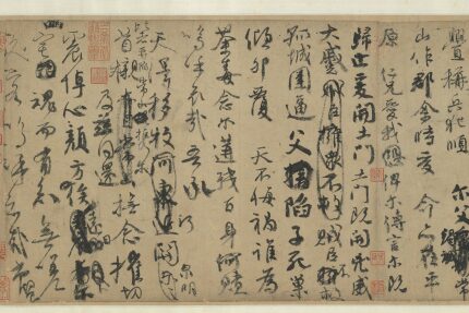
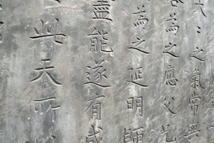
Hanzi - Chinese Characters
The historical development of the Hanzi, one of the oldest continuously used writing systems in the world, with a history spanning more than three millennia.
No results found
No results were found for "" with the selected filters.
Try searching for something else or use different keywords.
You can also try removing some filters to broaden your search.
Search
Find competitions, events, insights, and more.
Type at least 2 characters to start searching
Use filters above to narrow down your search
News, findings and blog posts—Insights is where the GRANSHAN editorial team shares interesting facts, views and curiosities from the global world of script, type design and typography with a special focus on all matters beyond Latin. Various authors from the community get a word here, as do experts on special topics and selected professionals from other sectors.
The historical development of the Hanzi, one of the oldest continuously used writing systems in the world, with a history spanning more than three millennia.
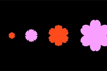
From seed to bloom — introducing the new visual identity of the Bloom Awards by GRANSHAN, the first global communication design award dedicated to scripts beyond Latin.
New Delhi-based multidisciplinary designer and creative entrepreneur Anant Ahuja — better known as »typethug« — works at the intersection of typography, culture, and contemporary design.
One world. But so many realities — drifting apart depending on where you are. GRANSHAN President Boris Kochan on new timelines, the postponed conference, and why GRANSHAN's mission matters more, not less, in times like these.

Irene Vlachou's work includes lectures and workshops on Greek typeface design and variable fonts, as well as the creation of technical manuals for the Greek script.

Sovichet Tep lives in Cambodia's capital Phnom Penh. With his studio Anagata, he specializes in typeface design and brand identity.

Toshi Omagari is an award-winning typeface designer and Chairman of the GRANSHAN Type Design Competition.
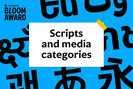
The GRANSHAN Bloom Award is built around two pillars: Media Categories and Script Groups. Together, they ensure every entry is judged both within its creative context and its cultural-linguistic context.
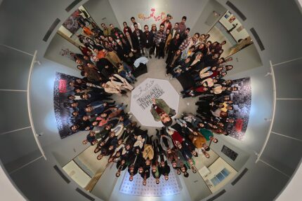
Together, GRANSHAN and Tehran Type Week reaffirm the importance of sustained, cross-script exchange, where type becomes a space for understanding, comparison, and collaboration.
The world’s first international competition for Communication Design Beyond Latin - a celebration of the world’s writing systems and the designers who bring them to life.
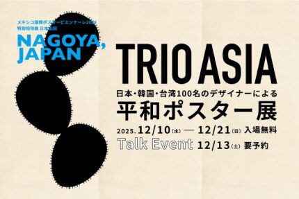
From 10-21 December 2025, Nagoya’s International Design Center (Design Gallery, NADYA PARK) hosts the next stop of TRIO ASIA, presenting 100 posters on the theme of peace created by designers from Japan, Korea, and Taiwan.
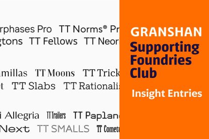 Supporting Foundries Club
Drawing on their own experience, the specialists at TypeType explain how type foundries and designers can stop unlicensed use of their products and get additional revenue while avoiding reputational risk.