
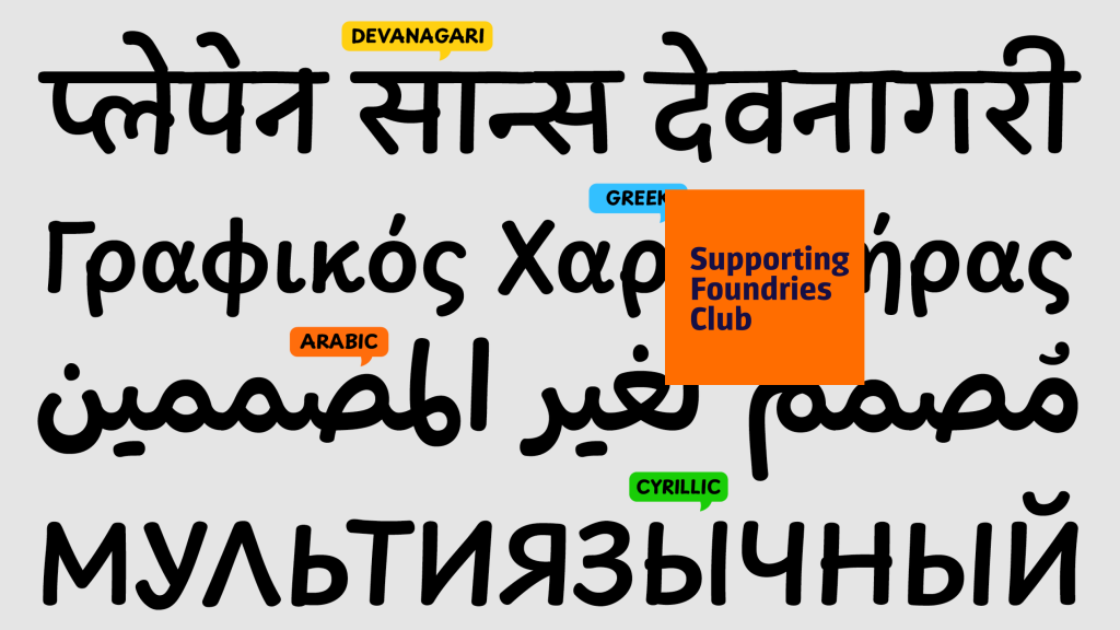
Content provided by GRANSHAN Supporting Foundries Club member TypeTogether.
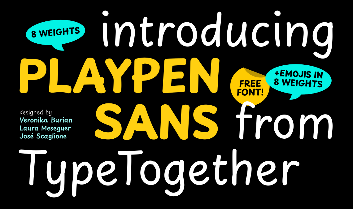
Most typefaces begin with one script and stay there. Playpen Sans didn't.
What started as a casual Latin typeface - designed to solve the repetition problem that makes fonts like Comic Sans feel mechanical - has grown into a superfamily spanning Arabic, Hebrew, Devanagari, and Thai. Each script carries the same core idea: a typeface that genuinely feels handwritten, not simulated. And all of it is free.
For the non-Latin type design community, this trajectory matters. It is one thing to design a Latin typeface with a multiscript extension tacked on. It is another to build a system where the handwriting logic - the research, the variation mechanism, the aesthetic philosophy - transfers authentically across scripts with fundamentally different structures. TypeTogether did the latter.
The Problem They Were Solving
Casual typefaces suffer from a specific flaw: repetition. Every time the same letter appears, it looks identical - because that is how typography works. But handwriting doesn't work that way. No two instances of the same letter from the same hand are exactly alike. The gap between these two realities is what makes casual fonts feel fake.
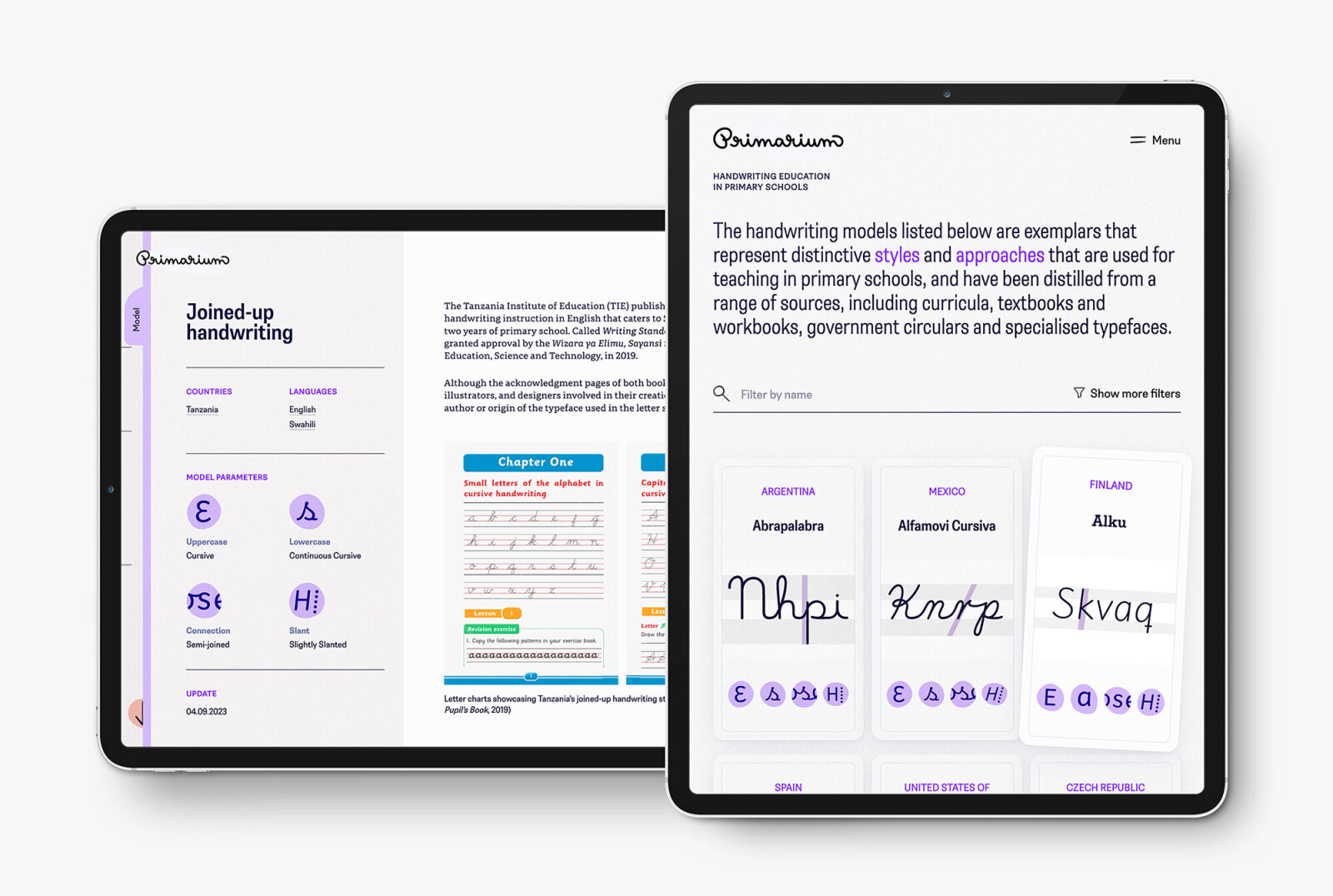
TypeTogether's approach was research-grounded from the start. In 2022, they launched Primarium - a two-year study of handwriting education methods for Latin-script children across five continents, now freely available at primarium.info. The research examined how children transition from printed letters to handwriting, and what type design could learn from that process.
The answer became a typographic system with two families: Playwrite, a suite of educational fonts built directly from the research; and Playpen Sans, an informal everyday typeface that borrows the same structural logic but applies it to casual, non-educational use.
Seven Versions of Every Character
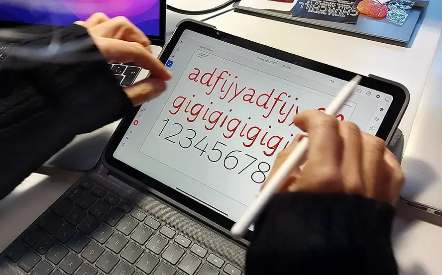
The design solution was labour-intensive by design. Letterer Laura Meseguer drew up to seven distinct versions of each alphanumeric character by hand, using a tablet and digital pen, working at different speeds and weights. These weren't optical variants produced algorithmically — they were drawn, with the inconsistencies that come from that.
A custom OpenType shuffler, built by type engineer Joancarles Casasín, then controls when each variant appears. No shape repeats consecutively. Even word spacing varies. The result is text that reads differently each time - an illusion of handwriting that holds up at the level of the individual line.
The Question That Followed
Once the Latin family was complete, a question became difficult to ignore: could the same logic work in other scripts?
Handwriting is not a Latin phenomenon. Every writing system has its own casual register, the way a script looks when someone writes quickly, informally, from habit rather than intention. What Playpen Sans had captured for Latin, it had not yet captured for the hundreds of millions of people who write in Arabic, Hebrew, Devanagari, or Thai. The decision to extend the family was a serious one.

Arabic
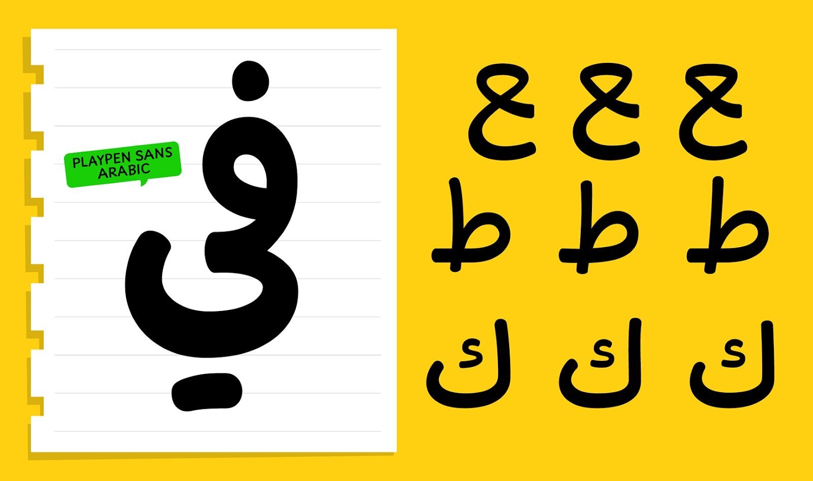
Arabic presented the first and perhaps most structurally distinct challenge. Unlike Latin, Arabic letters change shape depending on their position within a word - initial, medial, final, or isolated. Capturing handwritten variation across those positional forms required solutions that had no Latin equivalent.
The extension introduces subtle shifts in diacritic positioning alongside the letter shape variations, adding a layer of organic texture that mirrors how Arabic is actually written by hand. It also includes Ruqʿah alternates — a distinct calligraphic style rooted in everyday informal Arabic writing, the closest the script has to a casual register. The result covers six Arabic-based languages, carrying the same shuffling logic that made the Latin feel alive.
Hebrew
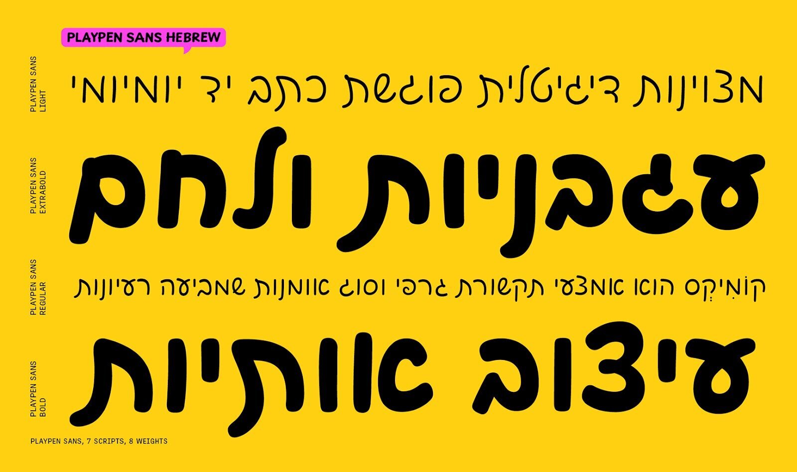
From Arabic, the move to Hebrew brought a different set of questions. Hebrew shares the right-to-left directionality and some of the cultural context of informal writing in the region, but the letterforms are structurally distinct - block-shaped rather than connected, with a visual rhythm that requires its own interpretation of the handwritten casual.
Playpen Sans Hebrew takes a warm cursive approach. Its organic forms and irregular curves give it a friendly, approachable personality that sits comfortably alongside the Arabic and Latin members of the family. The extension covers four Hebrew languages, and the eight weights are optically balanced so the handwritten feeling holds from light text to heavy display use.
Devanagari
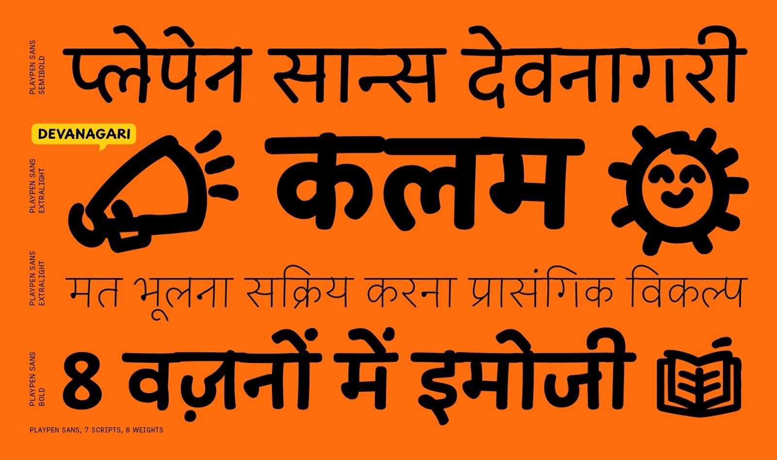
Devanagari introduced a complexity that neither Arabic nor Hebrew required: the headline - the horizontal stroke that runs along the top of letters and connects them into words. In formal type design, the headline is treated as a continuous, unbroken rule. In handwriting, it isn't. People lift their pen, vary their pressure, and leave small gaps.
Playpen Sans Deva leans into this. Subtle gaps in the headline, imperfect joins, deliberate overlaps - details that formal calligraphic convention would correct, but that make handwritten Devanagari feel like itself. The extension covers three Devanagari languages and was built, as the designers describe it, on countless hours of drawing and redrawing letters by hand to find the shapes that felt most natural rather than most correct.
Thai
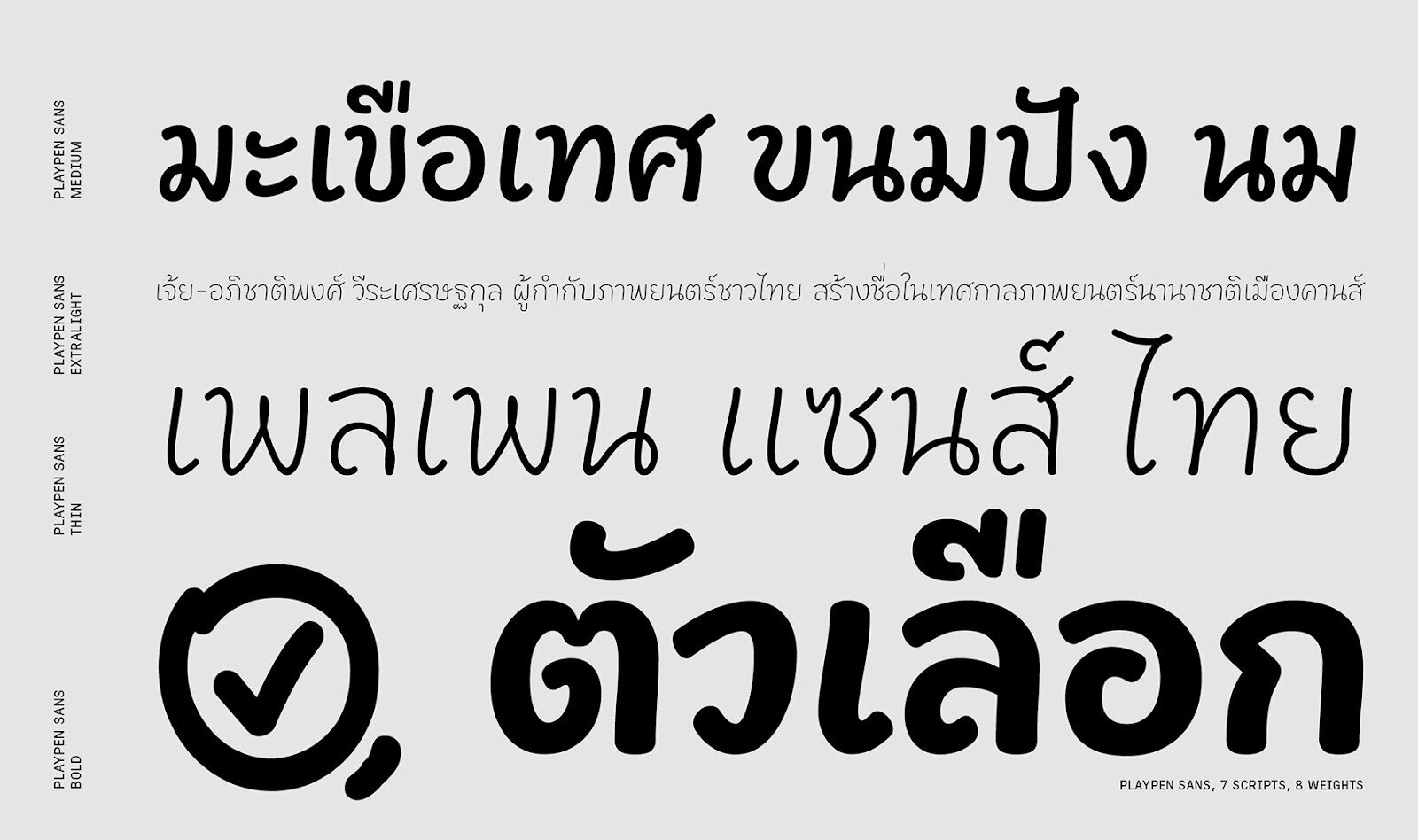
Thai was the final and, in some ways, most formally inventive extension. Most Thai typefaces use either looped or loopless terminals -a binary that has come to define the genre. Playpen Sans Thai does neither.
Instead, the design introduces hook-shaped terminals that hint at the natural starting point of each letter - the place where a pen would touch paper before beginning a stroke. The idea came from research into legibility for graphic novels, a context where personality and readability have to coexist at small sizes and fast reading speeds. The flowing strokes capture the continuous, fluid nature of Thai writing without feeling rushed. The result is a typeface with a specific rhythm: casual but steady, playful but clear.
TypeTogether is a Supporting Foundry of GRANSHAN. This article was produced in the framework of the GRANSHAN–TypeTogether partnership.