
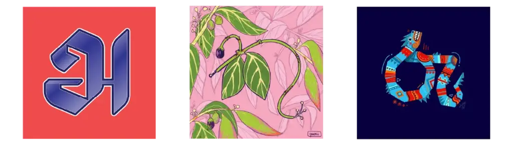
Every script carries a visual identity of its own. For the past seven years, a growing creative movement in Sri Lanka has invited artists, designers, and enthusiasts to explore that identity through a simple challenge: reimagine a letter every day for a month.
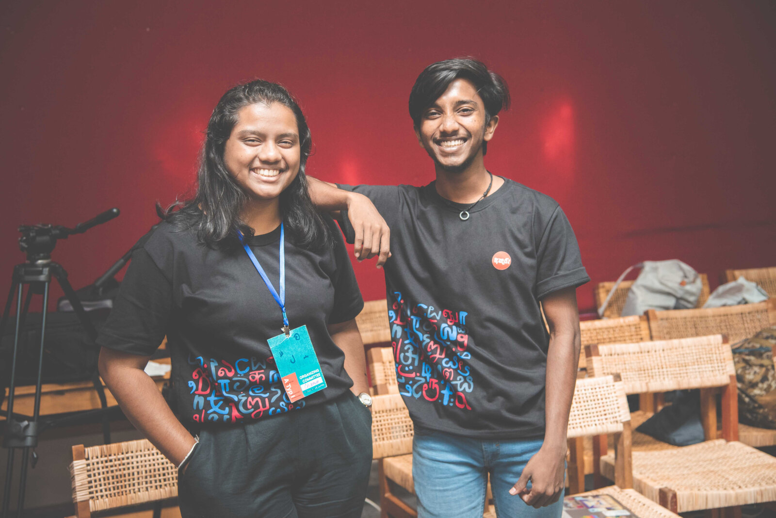
What began in 2019 as a month-long social media initiative between designers Chamodi Waidyathilaka and Vihanga Samaradiwakara has since evolved into one of the most recognisable celebrations of Sinhala and Tamil typography. Today, the challenge is organised under the Akuru Collective and supported by a growing network of volunteers and contributors who help drive the initiative forward each year. Known as the 30 Days of Akuru, the annual challenge has attracted participants from around the world, creating a growing digital archive documenting the evolving visual language of Sri Lankan letterforms.
At first glance, the concept is straightforward. Participants are given a letter each day and invited to create their own interpretation of it. But the challenge is built around one important rule: don't use an existing font and remake it. That simple restriction changes everything.
Instead of relying on familiar typefaces, participants are encouraged to look at the structure of a letter itself, its curves, rhythm, balance, form, and reinterpret it through their own creative lens. The results range from hand-drawn illustrations and calligraphy to photography, 3D rendering, motion graphics, sculpture, and digital art. In the process, letters stop being purely functional. They become visual stories.
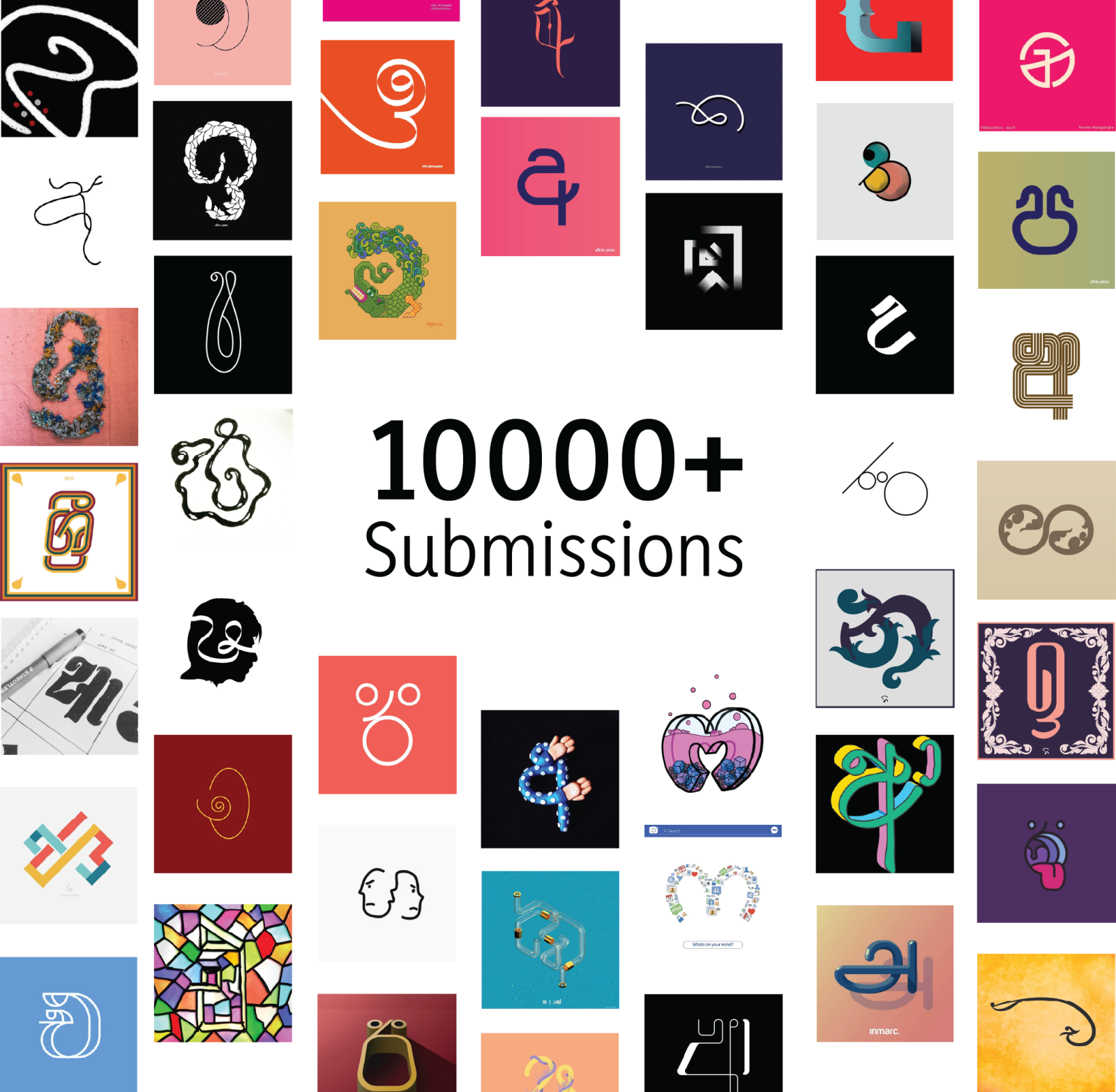
Commenting on the movement, Chamodi & Vihanga, Founders of 30 Days of Akuru, stated, “What has made 30 Days of Akuru particularly distinctive is its accessibility. Unlike many creative initiatives, it was never designed as a competition. There are no winners, rankings, or prizes waiting at the finish line. Professional designers, students, hobbyists, writers, and first-time creators all participate on equal footing. That openness has helped build a community where experimentation is encouraged, and participation matters more than perfection.”
The challenge took on an even broader dimension when Tamil letterforms were introduced alongside Sinhala characters. What began as a typography project gradually became something larger, a space where participants could engage with scripts beyond their own linguistic backgrounds. Designers found themselves studying unfamiliar forms, learning the nuances of different writing traditions, and discovering common ground through creativity.
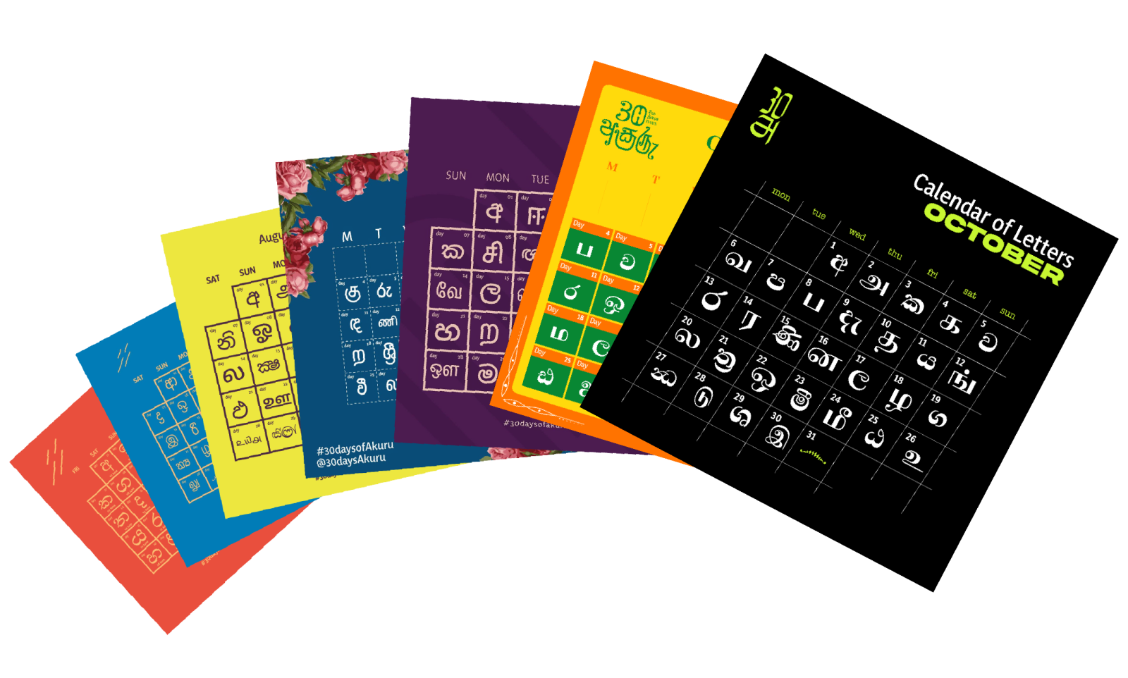
The initiative has steadily attracted creators from around the world. To help newcomers engage with unfamiliar scripts, organisers introduced animated stroke-order guides that demonstrate how each character is traditionally formed. What followed was a growing body of work from creators across different countries, united by a shared interest in the artistic possibilities of letterforms.
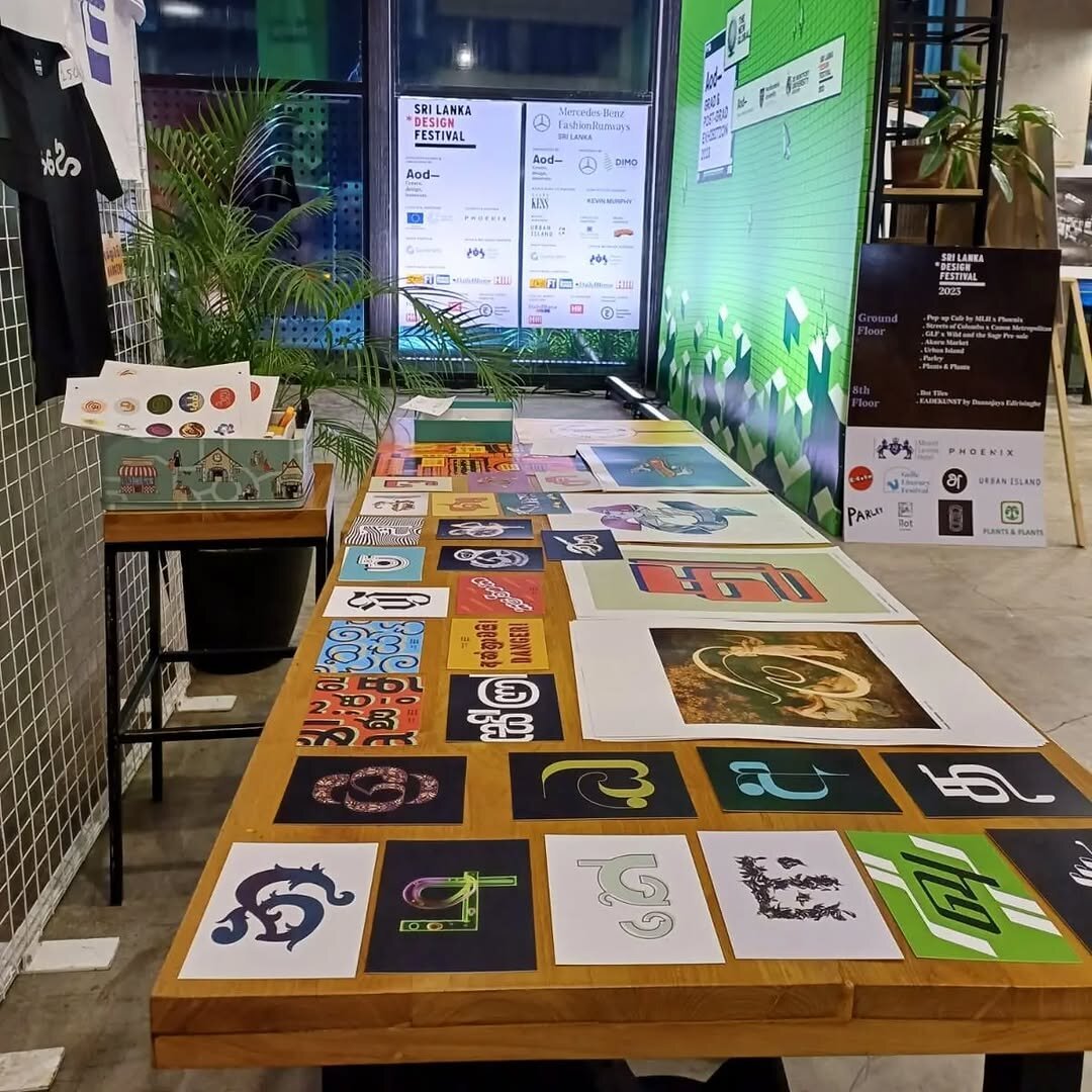
In a country shaped by multiple languages and cultural influences, typography has now become an unexpected meeting point. While much of the movement lives online, its influence has extended beyond the digital space. Selected works have appeared in exhibitions, installations, and collaborative projects, demonstrating how letterforms can exist not only on screens and pages but also within contemporary art and public spaces.
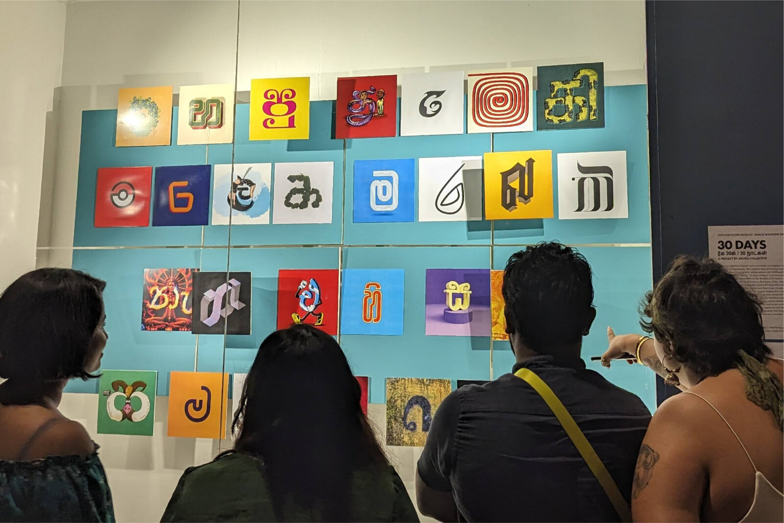
One notable example was the 30 Days of Akuru x SNAFU Window Showcase, where experimental typography created through the challenge was presented as part of a public exhibition. It offered a glimpse into how traditional scripts can be reimagined within modern cultural contexts while retaining their unique visual identity.
Despite its expansion, the spirit of the challenge remains remarkably unchanged. It continues to welcome anyone willing to experiment with a letterform, whether they contribute for a single day or complete the full thirty-day journey. There is no requirement to be a designer, no expectation of expertise, and no single definition of what a successful submission should look like.
Seven years on, 30 Days of Akuru has become far more than an annual creative challenge. It stands as a living archive of contemporary Sri Lankan typography, a platform for artistic exploration, and a reminder that scripts are not static symbols confined to language. They are cultural expressions that continue to evolve through the people who use them.
And with every new interpretation, the story of those letterforms continues to grow.
For more information, updates on future editions, and to join the movement, visit 30 Days of Akuru and the Akuru Collective on Instagram and Facebook.