Terminology: Hanzi
While the term “Chinese characters” is the most widely used designation in English, the original romanised term Hanzi provides a more precise reference to the Chinese writing system. The word “Han” refers to the Han ethnic group—the largest population group in China—while “zi” means “character.”
Using the term Hanzi also helps avoid potential ambiguity when discussing writing systems currently or historically used within the region of China. Given China’s long history and ethnolinguistic diversity, encompassing 56 officially recognised ethnic groups, the region has employed not only scripts that remain in active use but also numerous historical writing systems that are no longer extant. Hanzi represents only one of these scripts and functions today as the official writing system of the People’s Republic of China. The expression “Chinese characters” may be interpreted broadly as referring to “the scripts of China,” a definition that would logically extend to historically used non-Han writing systems such as the Tangut script, the Khitan script, the Jurchen script, and the Nüshu script. Using the specific term Hanzi, therefore, helps emphasise the distinct identity of the script while respecting the historical diversity of writing traditions in the region.
Historical development of the script
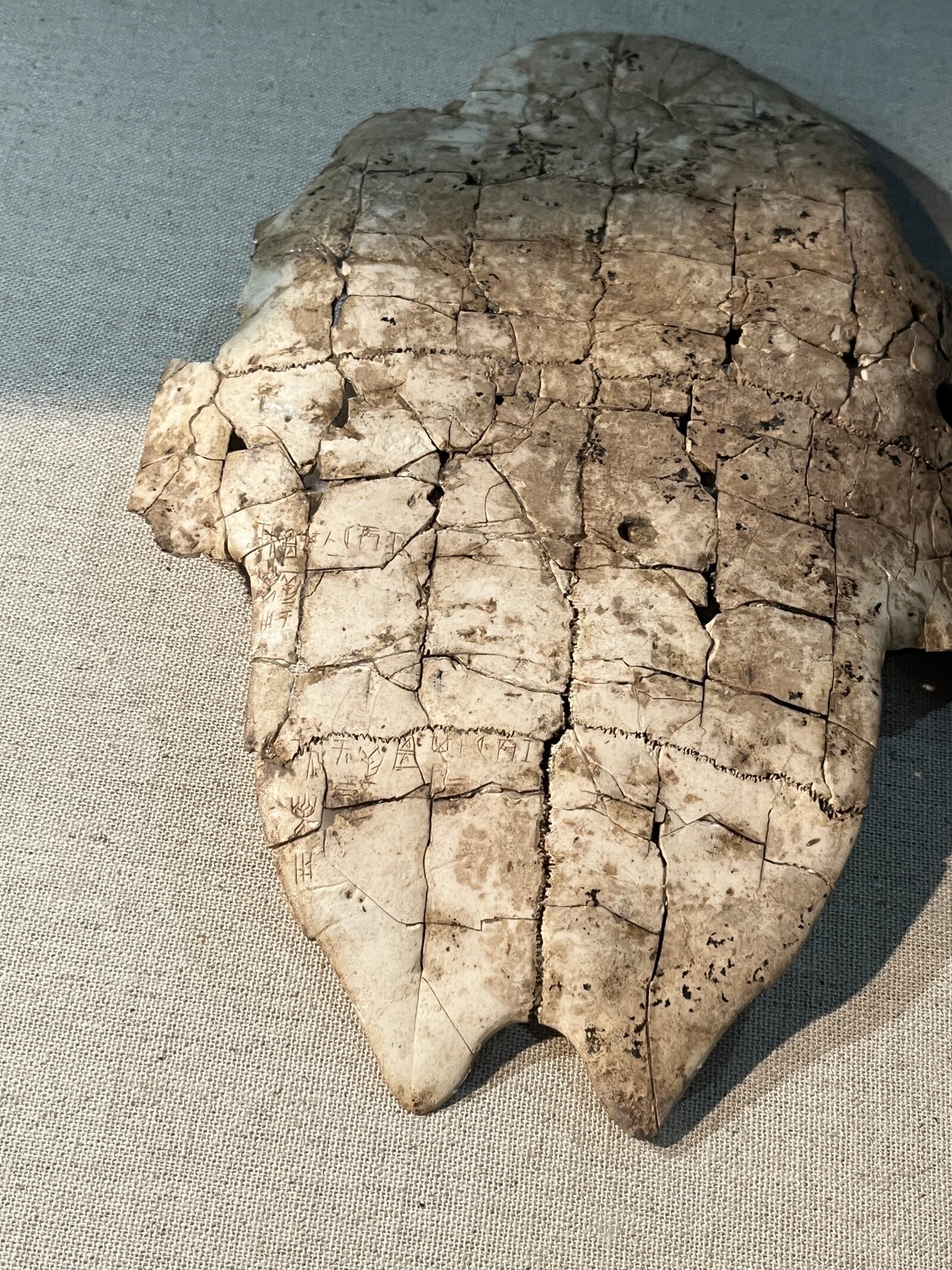
Hanzi is one of the oldest continuously used writing systems in the world, with a history spanning more than three millennia. The earliest known forms appear in oracle bone inscriptions dating to the late Shang dynasty (c. 1200 BCE). These inscriptions were carved onto turtle plastrons and animal bones used in divination rituals (Fig. 1). Although many early characters retain pictorial qualities, they already display structural principles that would later become fundamental to the script.
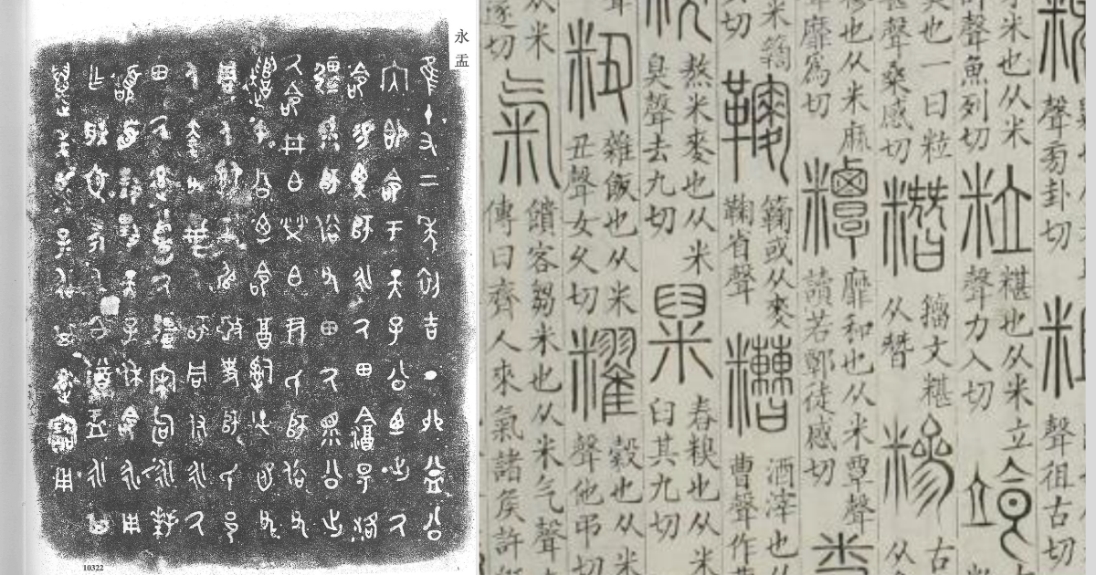
During the Zhou dynasty, inscriptions on ritual bronze vessels became widespread. These bronze inscriptions show characters that are more regularised than earlier oracle bone forms, reflecting the gradual stabilisation of the writing system.
A major stage of standardisation occurred during the Qin dynasty (221–206 BCE), when Small Seal script was established as an official writing style. Seal script is characterised by relatively even stroke thickness and balanced proportions, producing characters with a controlled visual rhythm (Fig. 2).
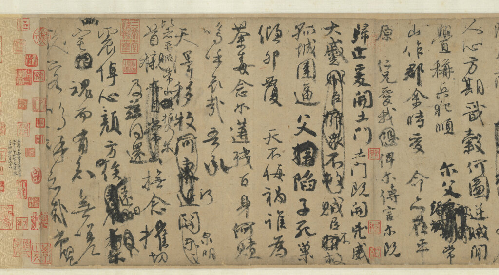
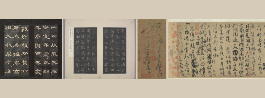
The pursuit of greater writing efficiency led to further stylistic developments, giving rise to Lishu (clerical script), Kaishu (regular script), Caoshu (cursive script), and Xingshu (running script). Lishu emerged during the Han dynasty. Because its forms were faster and more practical to write than the earlier seal script, it gradually spread and eventually replaced seal script as the dominant writing style. The development of Lishu marks an important transition in the history of the Chinese script, bringing an end to the earlier “ancient script” phase and establishing the structural foundations of the writing styles used in later periods.
The emergence of these styles was not a sudden or isolated process. While one style might dominate during a particular historical period, new forms often developed simultaneously and gradually evolved over time. During the Han dynasty, for example, when Lishu was widely used, early forms of Kaishu were already appearing in everyday writing.
Kaishu later became the dominant structural model for writing Hanzi and has had a profound influence on subsequent printing characters and most contemporary Chinese typefaces.
Writing practices and layout traditions
For much of its history, Chinese writing was produced using a brush and ink on materials such as bamboo slips, silk, and paper. The brush played a central role in shaping the visual structure of characters, allowing strokes to vary in thickness, direction, and rhythm. Many typographic stroke forms still reflect these calligraphic origins.
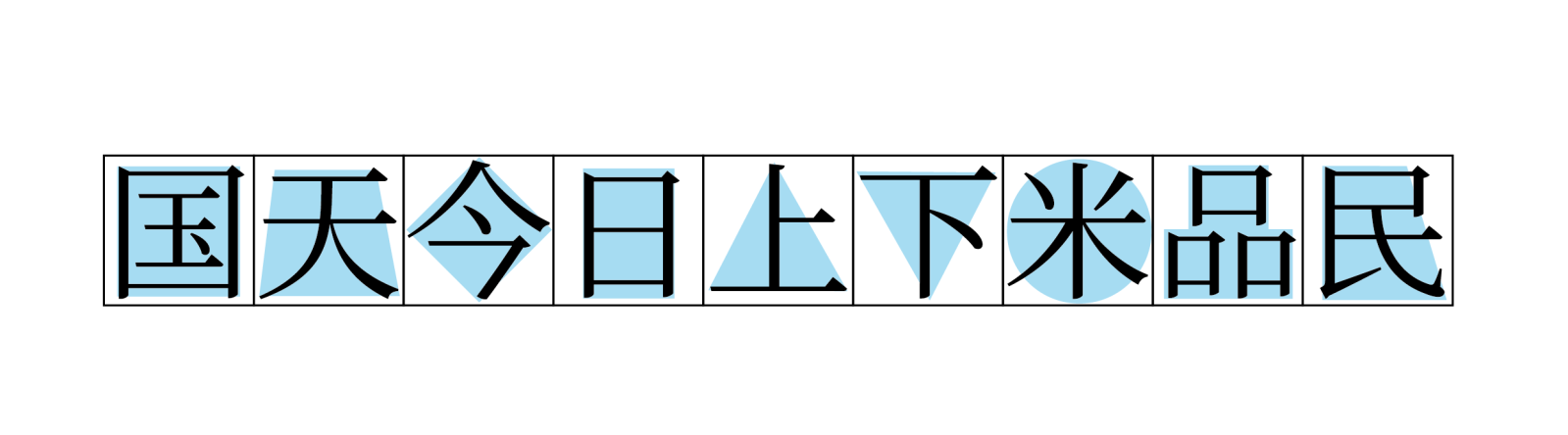
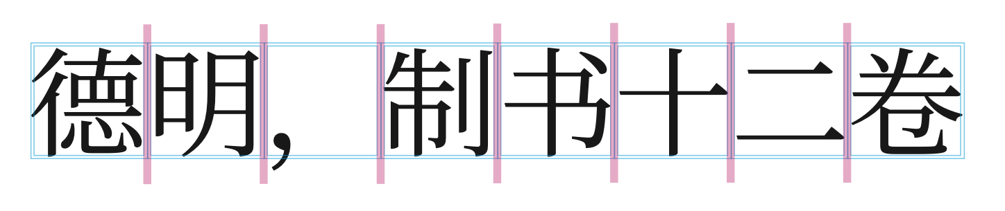
Another defining feature of Hanzi is its organisation within an imaginary square frame. Although characters may vary internally in shape and complexity, they are conventionally composed to occupy a square writing space (Fig. 4). When arranged in text, this produces a rhythm of evenly aligned character units, creating a grid-like visual structure across lines of text.
Historically, Chinese texts were written in vertical direction, with characters arranged from top to bottom and columns ordered from right to left. This format dominated manuscripts and printed books for centuries. From the late nineteenth century onward, horizontal writing from left to right gradually became widespread under the influence of contemporary printing technologies and international publishing practices. Today, horizontal composition is dominant in most contexts, although vertical layout remains common in certain traditional and cultural settings.
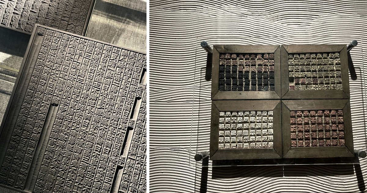
Printing technologies also played a crucial role in shaping Chinese typography. For many centuries, texts were reproduced primarily through woodblock printing, in which entire pages were carved into wooden blocks. In addition, movable type was also invented in China and used in certain printing contexts (Fig. 5). These methods influenced the visual conventions later adopted in Chinese typefaces.
Structural principles of Hanzi
Hanzi are often described as logographic, or more precisely morphosyllabic, meaning that each character generally represents a morpheme and corresponds to a syllable in the spoken language. The system contains a large inventory of characters, with several thousand required for contemporary literacy.
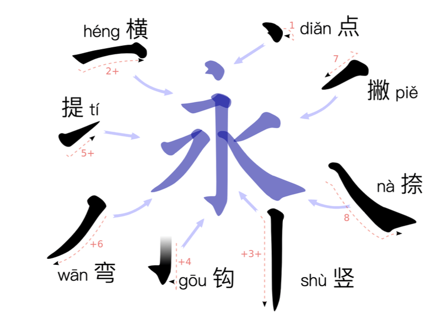
Characters are constructed from strokes, the smallest graphical units of the script. Common stroke types include Heng (horizontal), Shu (vertical), Dian (dot), Gou (hook), Pie and Na (sweeping strokes) (Fig. 6).
Strokes combine to form components, which in turn form complete characters. Many components function as semantic indicators suggesting meaning, while others serve as phonetic elements providing clues to pronunciation. The majority of Hanzi are therefore phono-semantic compounds, combining meaning and sound within a single graphical structure.
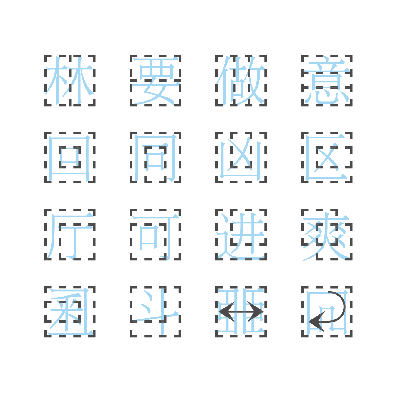
Within the square character frame, these components are arranged according to several common structural patterns. Typical configurations include left–right, top–bottom, and enclosing structures, though more complex compositions also occur (Fig. 7). These structural relationships determine how strokes and components are proportioned and balanced within each character and are important for both handwriting and typeface design.
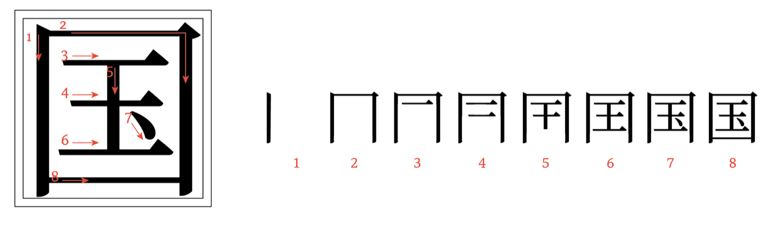
Closely related to this structural logic is stroke order, the writing sequence in which strokes are written (Fig. 8). While primarily associated with handwriting, stroke order reflects the structural organisation of characters and can provide useful insights for designers when analysing and maintaining the structural balance of characters.
Typographic styles
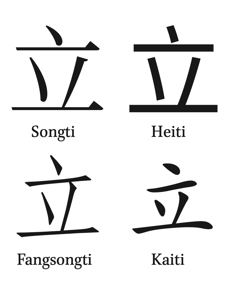
Contemporary Chinese typefaces include several major styles derived from historical calligraphy and printing traditions. Among the most influential are Songti, Fangsongti, Heiti, and Kaiti (Fig. 9). Songti typefaces are characterised by strong contrast between thick vertical strokes and thin horizontal strokes, along with triangular stroke terminals, and are sometimes compared to serif typefaces in the Latin tradition. This style developed from the conventions of woodblock printing and later became one of the most common typeface styles.
Fangsongti is a related style that combines the structural clarity of Songti with visual features derived from Kaiti. It is often used in formal documents and publications requiring a traditional appearance.
Heiti styles, sometimes compared to sans-serif typefaces in the Latin tradition, feature strokes of relatively uniform thickness and minimal contrast. They are widely used in contemporary graphic design, signage, and digital interfaces.
Kaiti typefaces are based directly on Kaishu calligraphy and preserve clear brush-derived stroke structures. They are frequently used in educational contexts and in situations where a handwritten aesthetic is desired.
Typographic structure in digital design
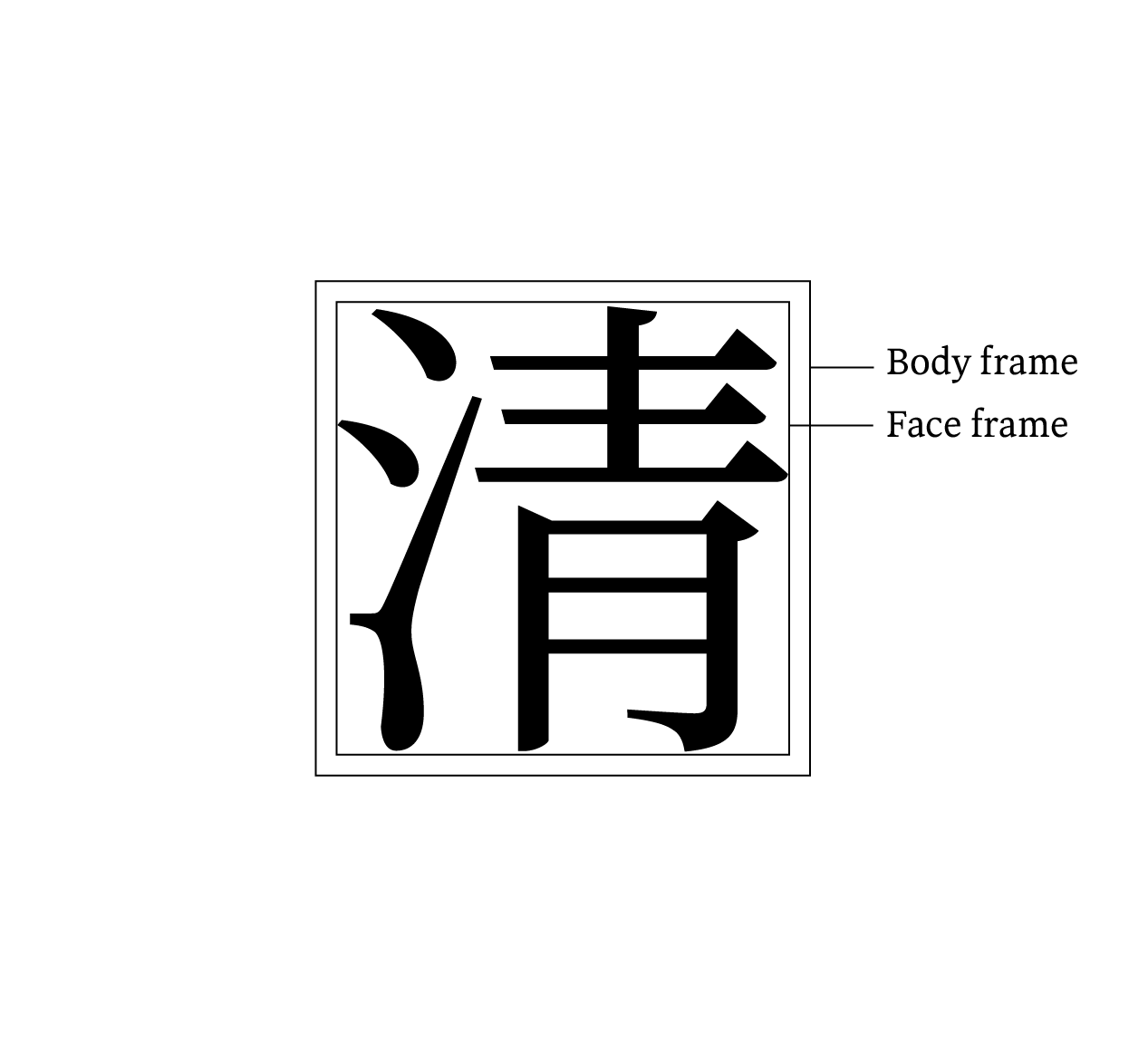
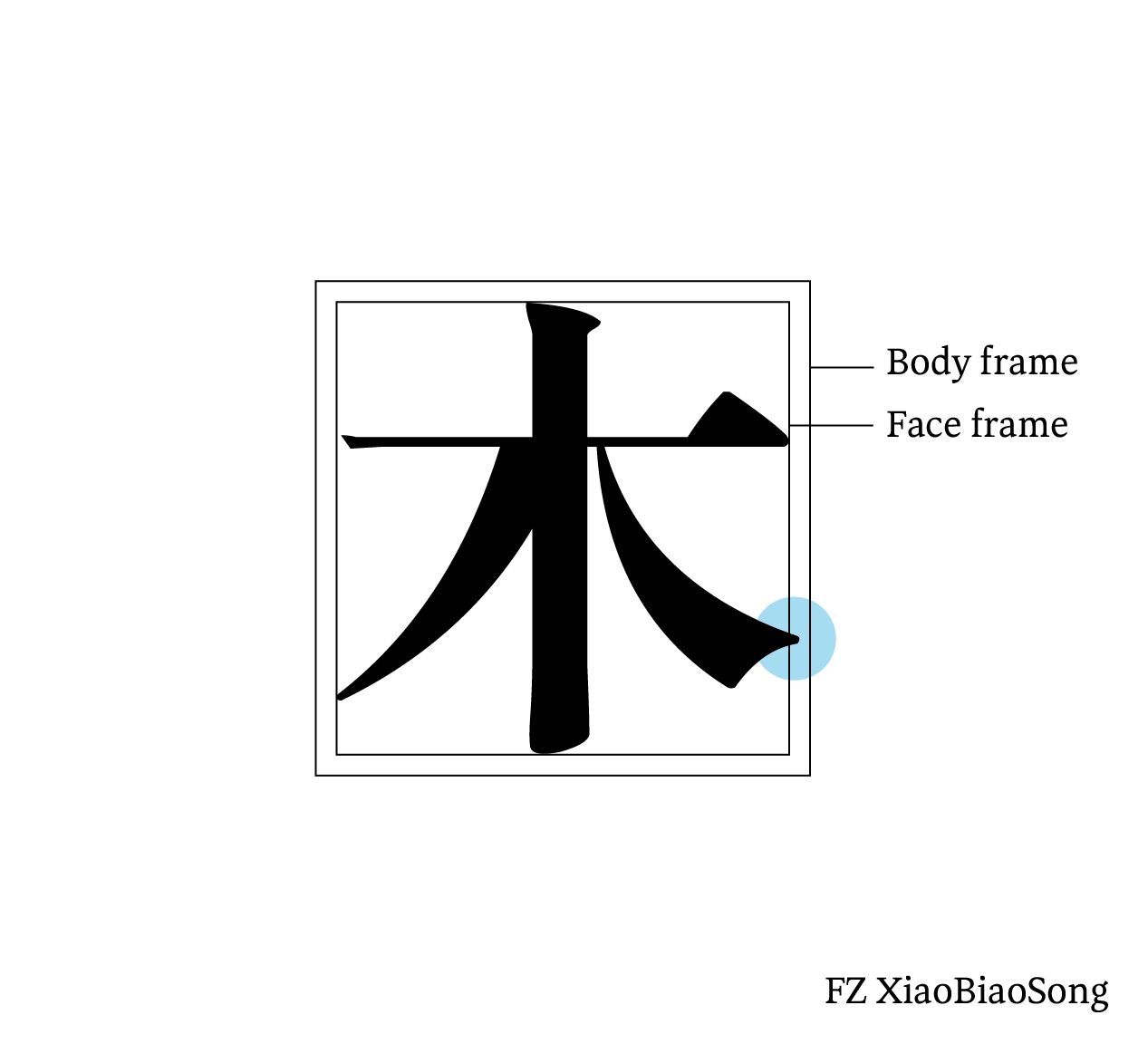
In digital typeface design, Hanzi characters are typically constructed within a square body frame, often corresponding to the em square defined in font editors. Within this space designers define a slightly smaller face frame, which determines the perceived size of the character and influences both legibility and stylistic appearance (Fig. 10 and 11). In addition, designers may also allow certain strokes to extend slightly beyond the face frame as overshoot to achieve optical balance (Fig. 12).
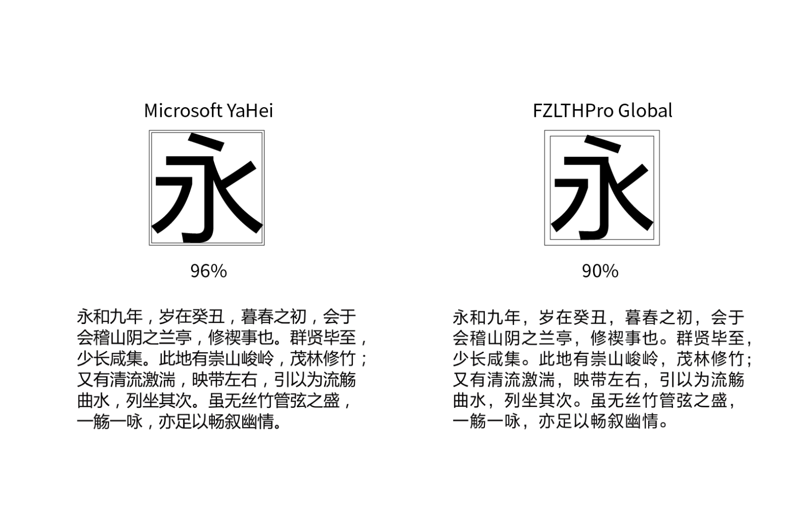
Unlike many alphabetic scripts, the relationship between the body frame and the face frame naturally defines the spacing between characters (Fig. 13). Therefore, sidebearings do not require special adjustment in Hanzi typeface design. Because a complete Hanzi typeface may contain thousands of characters, designers often rely on component-based construction methods. Reusing structural components and maintaining consistent proportions across characters helps manage the complexity of large character sets while preserving visual coherence.
Geographic and linguistic use
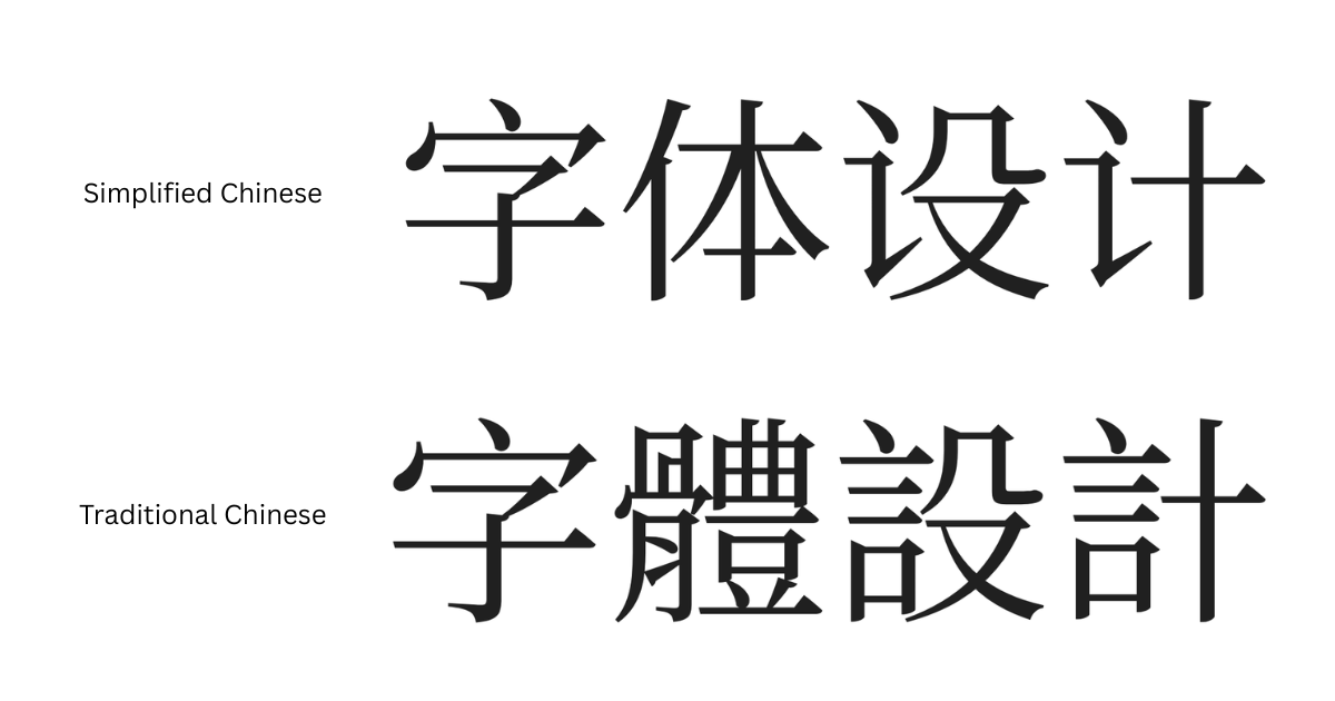
Today Hanzi is used across several regions where Chinese languages are written. Two major standardised forms exist: Simplified Chinese and Traditional Chinese (Fig. 14). Simplified characters were introduced in mainland China in the mid-twentieth century as part of language reform efforts aimed at increasing literacy. Traditional characters continue to be used in regions such as Taiwan, Hong Kong, and Macau, and are also retained in mainland China in specialised contexts, including historical scholarship and the digitisation of classical texts. Despite differences in character forms, both systems share the same structural principles. Readers familiar with one system can often recognise many characters in the other, although certain forms differ significantly. Beyond mainland China, the influence of Hanzi extends across East Asia. Hanzi form the basis of Kanji in Japanese and historically influenced writing traditions in Korea and Vietnam. As a result, Hanzi has had a profound and lasting impact on the written culture of the region and remains one of the most widely used writing systems in the world.
References
Liu, Gaolei 刘高磊 and Li, Sunan 李苏南. “The evolution of Hanzi forms and the development of printing (汉字字体的演变与印刷术的发展)” Art and Times (Middle), no. 8, 2010.
Lu, Xixing 陆锡兴. A History of Chinese Character Forms (汉字形体史). Shanghai: Shanghai Education Press, 2023.
Shen, Kuo 沈括; annotated by Hu Daojing 胡道静. Dream Pool Essays (Annotated Edition) (梦溪笔谈校证), vol. 18. Beijing: Zhonghua Book Company, 1957.
Unicode Consortium. The Unicode Standard, Version 16.0, Chapter 18: East Asia. https://www.unicode.org/versions/Unicode16.0.0/core-spec/chapter-18/
Wang, Yong 王镛, ed. A Brief History of Chinese Calligraphy (中国书法简史). Beijing: Higher Education Press, 2004.
Zhou, Youguang 周有光. A Primer on Comparative Writing Systems (比较文字学初探). Beijing: Language & Culture Press, 1998.