As part of GRANSHAN’s mission to celebrate global typographic diversity, we continue our interview series Talking with GRANSHAN Script Experts.
In each edition, we speak with the people shaping the future of the world’s writing systems, exploring their stories, challenges, and visions for type design across cultures.
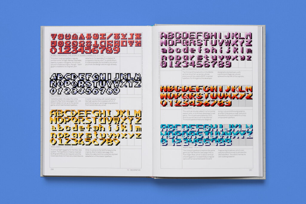
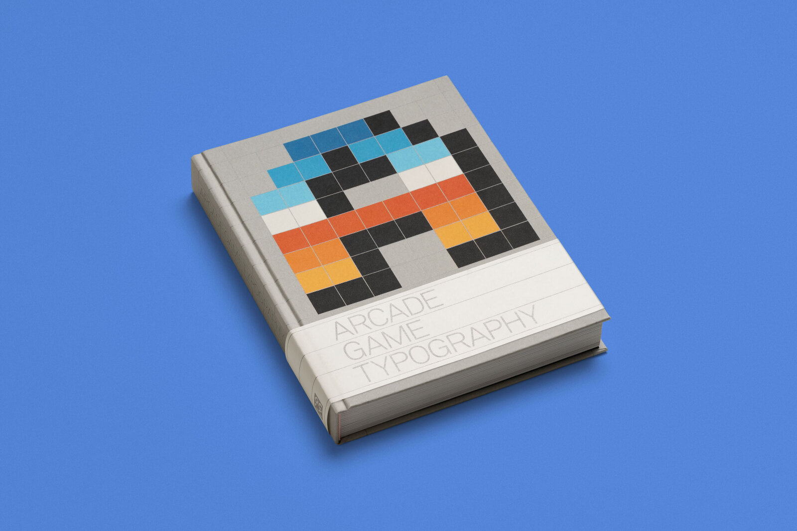
Our fourth interview features, Toshi Omagari, an award-winning typeface designer and Co-Chairman of the GRANSHAN Type Design Competition, the Base Award. He graduated from the Visual Communication Design course at Musashino Art University in Tokyo in 2008 and the MA Typeface Design program at the University of Reading in 2011. Toshi joined Monotype in 2012 and left the company 2020. Since then he works as an independent Typedesigner in London and gives lectures at design conferences and university classes. Furthermore he is a passionate gamer. His book Arcade Game Typography, published in 2020, is a tribute to the pixel fonts of the 70s, 80s, and 90s.
Your type design skillset includes Latin, Greek, Cyrillic, Arabic, Tibetan, Mongolian, Tengwar, etc.. Japanese type design or calligraphy is not your specialty. That sounds a bit weird how did that happen?
I am a rather rare breed who does a lot of non-Japanese script but not my native Japanese itself. My father, also from a creative background, always told me to be unique. And Japan has been rather fortunate in the global typography scene, and it has been in fairly constant supply of new designers (though lower in number compared to today). When I decided I wanted to become a typeface designer, I thought I would only become »another one of many« if I were to make the obvious choice. I just followed my father’s mantra and decided to pursue non-Japanese. I also wanted to learn typeface design in an academic environment which led me to Reading and learning Latin, Greek, Cyrillic, and Mongolian. The teachers there might have wanted me to do Japanese, but I thought »what is the point of a Japanese student coming all the way to UK just to do what he can do best in Japan?«. Instead, I wanted to use my specialty in service of the underrepresented scripts, ones that hopefully a Japanese designer might be able to understand better, hence the choice of Mongolian as my first true non-Latin attempt.
Could you briefly describe the script you represent?
The Japanese script is more like three scripts in one. Starting off with the adopted Chinese Kanji, people made two forms of phonetic letters, whose respective origins are associated with male and female demography. Today, the three scripts are used together, Hiragana, the female script, being the dominant of all.
What are some unique or distinctive features of the Japanese script compared to others?
In terms of writing directions, it was always written vertically but nowadays in LTR (Left-to-Right) horizontal direction too, often in one design layout. Like the Chinese, the Japanese is mostly considered a monospaced system with many thousands of unique letters. Of the two Japanese Kana scripts, Katakana (the masculine one) is more similar to the original Chinese, whereas Hiragana is highly abstracted form of their origin, therefore particularly tricky to learn the correct forms. The traditional writing tool, the pointed brush, also poses challenges when learning.
You have a passion for monospaced fonts and have founded your own foundry, Tabular Type, dedicated solely to such fonts. What are the reasons for this enthusiasm for monospaced fonts?
The genesis of the foundry could be associated with my background. I am a designer from a country whose writing system is essentially monospaced (just in general. I know the history and exceptions, so no correction is necessary). I also grew up with video games whose typefaces were almost always monospaced, not only because of technical limitations at the time but probably because they were made by Japanese developers. While doing a research for my book »Arcade Game Typography« (https://tosche.net/non-fonts/arcade-game-typography) I went through hundreds of games every night and weekend besides my day job. Through this process that can only be described as insanity, I have learned just how much you can do within the limitation, let alone the low-resolution one. And lastly, I became more and more involved in Python coding. It seems that every typeface designer who also writes code will want to make their own coding typeface. In my case, one wasn’t enough so I founded Tabular Type
Two years later, you founded Omega Type, a second foundry for proportional fonts. Isn't it a bit crazy to have a foundry for each group of fonts?
Maybe it sounds a bit weird to basically split my library by styles. But type foundries with specific category are not unheard of; Ale Paul’s Sudtipos (https://www.sudtipos.com)and Laura Worthington’s foundry (https://lauraworthingtondesign.com) are primarily script foundries that enjoy great success, and there are those who only make sans serifs, consciously or otherwise.
Back to Japanese: What are the major technical challenges in working with this script?
The Japanese script has a similar challenge to that of Chinese, that is the number of glyphs you need to make in a font for any serious purpose, typically 6000 and above. On top of that, you need to consider vertical alternates, proportional alternates, vertical kerning, and so on. It’s quite challenging technically, and in terms of the amount of background knowledge necessary to do the correct job. Due to the steep requirement, it's rather rare for professional type designers and engineers who work on Japanese to work any other scripts, maybe with the exception of Latin.
Looking ahead What would you say are the biggest needs or opportunities for your script group in the next few years?
My answer is maybe not PR-friendly, but Monotype bought everyone’s favourite foundry, the japanese company Fontworks in 2023 and subsequently raised the price. We are eagerly waiting for a new and exciting independent foundry to emerge.
We are seeing the gap for more smaller and mid-sized foundries increasing in the industry. I think there is a good room for aspiring type designers for success!
What current or upcoming projects are you excited about?
That would be Tsukushi AN Maru Gothic by the well-known japanese typedesigner Shigenobu Fujita from Fontworks. He is adding a much-requested UltraLight and posts his progress a lot on X.
Interview by Antje Dohmann