As part of GRANSHAN’s mission to celebrate global typographic diversity, we continue our interview series, Talking with GRANSHAN Script Experts.
In each edition, we speak with the people shaping the future of the world’s writing systems, exploring their stories, challenges, and visions for type design across cultures.
Our Sixth interview features type designer Irene Vlachou, who splits her time between Athens and the Cycladic island of Syros. She holds an MA in Typeface Design from the University of Reading and has collaborated with international type foundries and corporations. Her work includes lectures and workshops on Greek typeface design and variable fonts, as well as creating technical manuals for the Greek script. She specialises in OEM system fonts and currently works as a full-time freelance type designer, consultant and instructor. Since 2025, Irene Vlachou has been the chair of the GRANSHAN Greek Script Group and a PhD candidate in the Department of Product and Systems Design Engineering at the University of the Aegean, Syros, Greece. The title of her thesis is »Greek fonts on screens: Digital readability research«.
The Greek Script Group has become one of the largest and most active script groups within GRANSHAN. How did this come about?
I have been a member of the Greek Script Group since 2013 or 2014—I can't remember properly. Since then, the group has grown significantly. The existing committee made this collective decision, motivated by two primary objectives. First, the group wanted to broaden its scope by including users of Greek typography – practitioners who don't design typefaces, but actively select and use them in professional contexts. The second objective was to raise awareness and initiate sustained dialogue between type designers (as producers) and typographers and graphic designers (as users). The aim was to identify shared priorities and improve collaboration
In 2012, Colvert Arabic and Colvert Greek were awarded first prizes in the GRANSHAN competition. The family also included a Cyrillic and a Latin variant. Visually, the four fonts were not particularly homogeneous. Was that unusual at the time?
Absolutely. The design team consisted of Kristayn Sharkis (Arabic), Natalia Chuvatin (Cyrillic), Jonathan Fabreguettes (Latin), and me (Greek). Each script was designed by a native user of the corresponding writing system. This approach to the relationships between different writing systems was unconventional at the time. Instead of pursuing visual homogeneity, we intentionally developed the four script families to be as visually distinct as possible while maintaining minimal optical continuity. This approach allowed each script to express its specific structural and cultural characteristics. Winning First Prize in their respective categories at the GRANSHAN competition was a significant achievement for the project. Afterwards, I became a member of the GRANSHAN committee.
Could you briefly describe the Greek script?
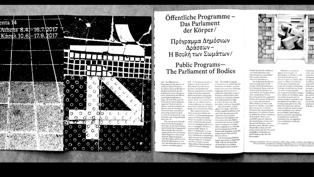
It is one of the world's oldest continuously used writing systems. Historically, it has played a central role in the development of Western literature, philosophy, science, and mathematics. It also played a key role in the formation of other scripts, most notably Latin and Cyrillic. Today, the Greek script is primarily used to write the Greek language in Greece and Cyprus, as well as by Greek-speaking communities worldwide. In addition to everyday communication, the script remains deeply embedded in academic, scientific, and symbolic contexts, where Greek letterforms are widely used across disciplines. Its long history, combined with contemporary usage, makes Greek a script with strong cultural continuity and ongoing typographic relevance.
What unique or distinctive features distinguish this script from others?
The Greek script is distinguished by its combination of rounded and angular letterforms, relatively low stroke contrast, and distinctive characters, such as θ, φ, and ξ. It uses diacritical marks, such as the tonos and diaeresis, to indicate pronunciation. Additionally, Greek serves a dual role as a writing system for the language itself and as a symbolic script in mathematics, science, and technical contexts. This shapes how Greek is designed and used typographically.
To my untrained eye, some Greek letters look pretty similar to Latin letters. But I suspect this is a misunderstanding. Could you clarify?
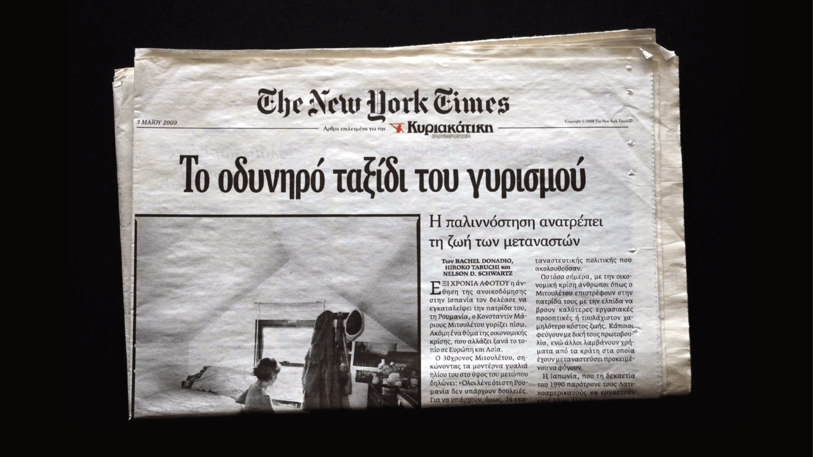
Due to its historical relationship with the Latin script, Greek is often mistakenly assumed to be closely related to Latin. While some letterforms share common shapes — Latin having descended from Greek — many Greek characters are distinct. Their superficial resemblance can mislead the untrained eye into thinking that Greek letters can be partially or fully substituted with Latin letters. In past decades, this misconception was widespread, resulting in numerous Greek typefaces based on Latin designs and reflecting the broader trend of » Latinising « world scripts.
The Greek script has a history spanning many centuries and has been used across diverse regions and for a wide range of applications, including literature, liturgical texts, music notation, and mathematics. However, adequate technical support is still lacking. What are the major technical challenges in working with this script?
Despite its rich heritage, its technological requirements are often overlooked. Consequently, many digital platforms—both online and desktop—feature misused Greek letterforms, limited typographic support, and a lack of properly localized features. After encountering these issues for years, we formed a dedicated team of type designers, developers, and experts to identify and document the most common misuses of Greek typography in digital contexts. The team members are Kostas Bartsokas, Eleni Beveratou, Natalia Qadreh, Gerry Leonidas, Emilios Theofanous, Irene Vlachou and Alexios Zavras. Our goal was to provide concrete examples to raise awareness among audiences and technology companies alike and encourage the development of practical solutions. We first presented our findings at the ANRT Nancy conference, where we highlighted the scope and impact of these typographic challenges. We later delivered shorter presentations at Fontstand 2025 in The Hague and ATypI 2025 in Copenhagen to reach a wider audience. Through this work, we aim to improve the quality of Greek typography in digital media and foster a deeper understanding of the script's unique requirements and ongoing relevance in contemporary design and technology.
As a large and active GRANSHAN script group, how do you support designers, linguists, and users of the script?
We support them through a combination of research, consultation, and practical guidance. We are full-time type designers, consultants, and researchers who are all actively engaged in Greek-related projects. Most of us maintain close contact with Greek users, allowing us to understand their needs, challenges, and expectations. We provide support through workshops, publications, and direct consultation. We offer expertise on script design, typographic best practices, and technological implementation. This helps both creators and users work more effectively with Greek typography.
And the other way round: How can GRANSHAN and the wider typography community best support your work?
GRANSHAN was one of the first – if not the first – competitions to put the spotlight on scripts beyond Latin. It gave designers, whether native users or not, a rare chance to showcase and share their work, which had long been difficult, especially for those outside Europe and North America. Fifteen years after the first competition, GRANSHAN has grown into a vibrant platform that inspires international exhibitions, conferences, publications, and interviews while continuing to celebrate the rich diversity of the world’s scripts.
What current or upcoming projects are you excited about?
The project I mentioned before. Together with my colleagues, I work to ensure the correct representation of the Greek script across all platforms, as well as on various research projects related to Greek typography. One more personal project will become my Ph.D. thesis. It is a new research project that began a couple of months ago at the Department of Product & Systems Design Engineering at the University of the Aegean in Syros, Greece. Gerry Leonidas is a committee member. The project focuses on the function and legibility of Greek letterforms on digital platforms. We will investigate which principles from Latin-based legibility research can be applied to Greek and how the concept of »similarity« is defined and expressed in a typographic context.
What are the most important needs or opportunities for your script group in the coming years?
One of the most exciting things ahead for the Greek script group is exploring all the hidden aspects of the script that haven’t been fully utilized yet. There’s so much left to discover, experiment with, and bring to life – both in research and in design. At the same time, Greek still faces some digital headaches, from misused letterforms to missing typographic features. By addressing these challenges, we can help the Greek script stay true to its rich heritage while thriving in the modern, digital world – where it can showcase its unique character.
Interview by Antje Dohmann