
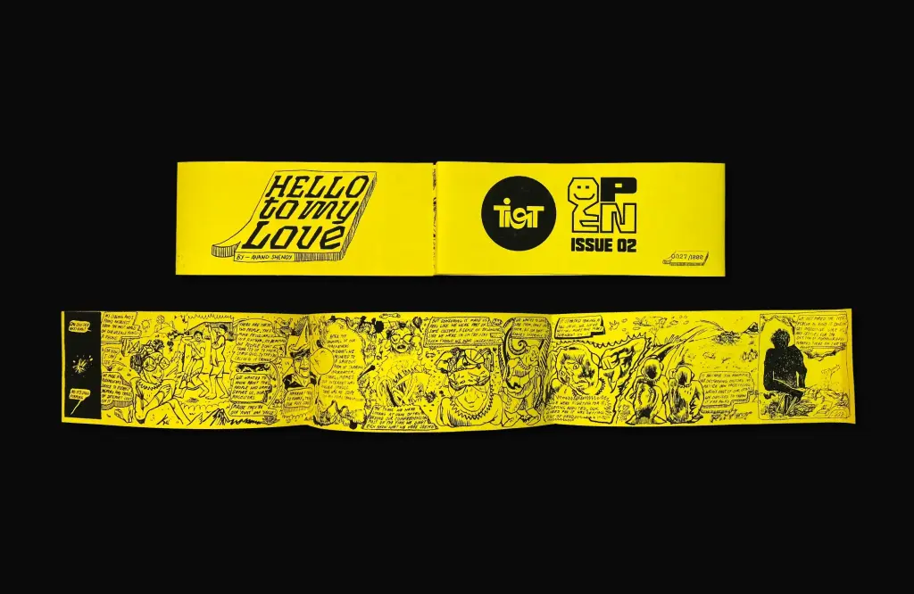
Our seventh interview features multidisciplinary designer and creative entrepreneur Anant Ahuja, also known by his distinctive Instagram username »typethug«, who is a graduate of the Whanganui School of Design in New Zealand, now based in New Delhi. As Managing Partner at The Irregulars Alliance, he works at the intersection of art, design, and culture.
Could you tell us a little about your background? Where do you come from?
I am classically trained as a graphic designer and studied in New Zealand. I enjoyed drawing, but I had no idea that design could be a profession. When I enrolled at the Whanganui School of Design, I initially wanted to study animation because I was fascinated by films such as King Kong and The Lord of the Rings. However, when I encountered software such as Maya and ZBrush and saw the level of technical complexity involved, I realised it was not for me.
In my second year, I took a typography class and became deeply interested in typesetting. That is where my passion for typography really began.
You now run Irregulars Alliance and Irregular Studios. What do you do there?
We are a group of creative, risk-taking individuals with a human-first approach to our work. At the studio, we create distinctive brand identities and communication systems for companies of all sizes, both nationally and internationally.
In addition, we operate as an independent creative alliance and an artist representation agency. We place great emphasis on attention to detail, and we see ourselves as true partners to our clients, rather than simply service providers.
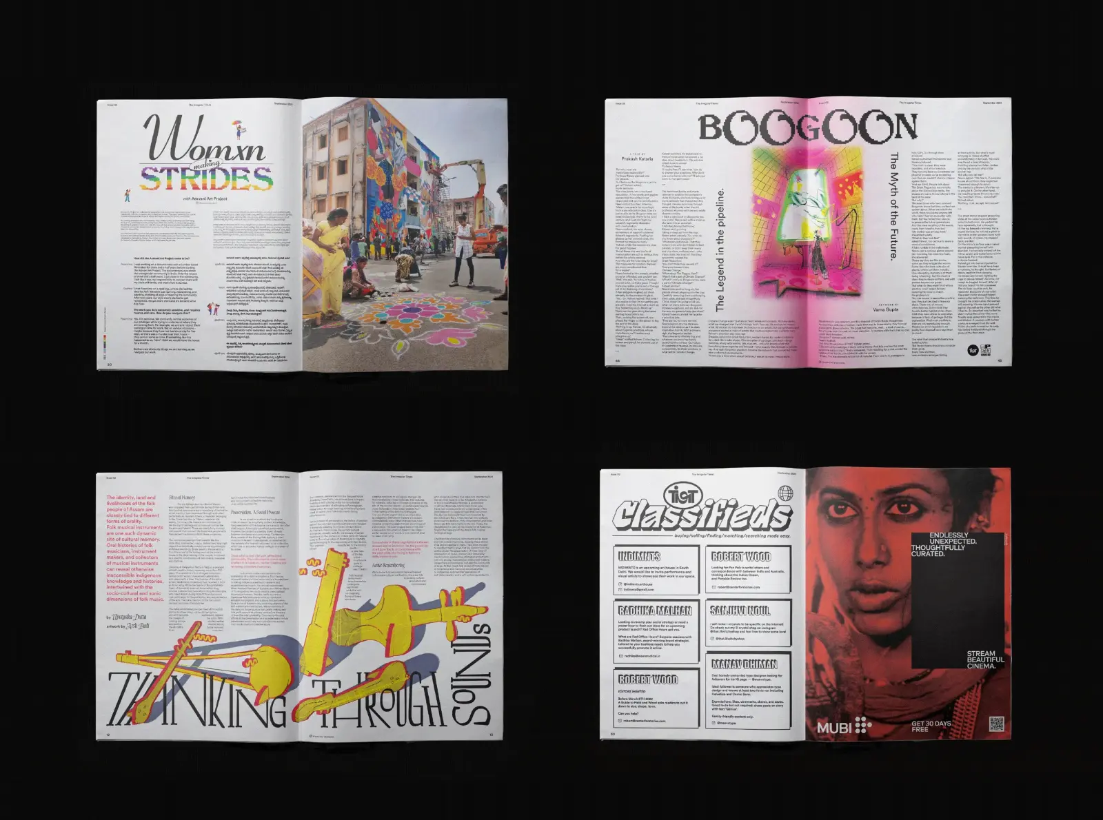
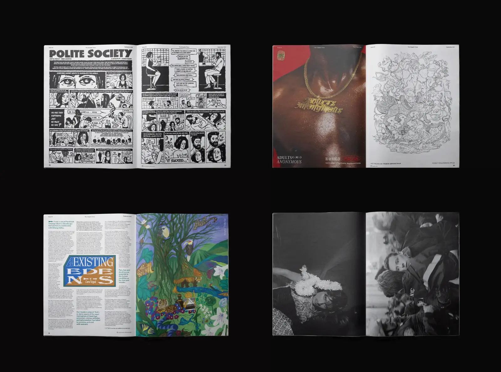
You also produce the magazine »The Irregular Times«. What is the idea behind it?
During the pandemic, people could not come to us, so we thought perhaps we could create something that reaches people instead.
My final-year project in design school involved branding our degree show and creating a newspaper, so I was already very interested in typography and tabloid formats. My typography lecturer was Kris Sowersby, founder of Klim Type Foundry (https://klim.co.nz ) whose work I greatly admire—particularly his typeface Klim. I collected many of his specimens, and the idea of creating a publication stayed with me.
Together with my partner Dharani, who is exceptionally skilled in editorial design, we decided to create a tabloid that we could take to people. Essentially, it is an homage to the publications we grew up reading, interpreted through our own art and design perspective. We did not have a specific goal; we simply made it because we wanted to.
How have you managed distribution?
We sell the magazine online and have also worked with several stockists in India. Interestingly, it performed particularly well in Western markets. We sold significantly more copies in the United States, Canada, and Europe than in India.
For the magazine, you collaborate with creative professionals from around the world. How do you manage to organize all these people?
It can be challenging, but we enjoy it. These collaborations are actually a key reason for the publication’s success. We simply reach out to people—often somewhat nervously, expecting they might say no.
So far, however, no one has refused. People are generally enthusiastic about taking part. We ensure that everyone receives an honorarium, and we carefully manage licensing so that usage is limited to the publication. If there is no reproduction, contributors are compensated more.
It is important to us that everyone is fairly paid for their work.
And the revenue from sales covers these costs?
Yes, it is a cyclical model. Each issue funds the next one. The first issue required an investment from our own pockets, but since then the publication has sustained itself.
There are five issues so far. When can we expect issue number six?
We have taken a break since last year because a lot has changed, but we hope to return to it soon.
I’m curious to understand the Indian market better—especially from a typographic perspective. You have lived in New Zealand and London, so you can view the Indian market from both the inside and the outside. How do you assess its development?
It is a double-edged sword: there are both positive and negative aspects. The Indian design scene is highly pluralistic. The demographic diversity is immense—languages, dialects, and even scripts can change every hundred kilometres. This makes it impossible to apply a single design logic across the entire country.
Over the past 10 to 20 years, however, the acceptance of typography and design has grown significantly. When I first returned to India and began working as a freelancer, most people were unfamiliar with typography. When I told them I was a typographer, they often did not understand what that meant.
Today, things are changing. There is a broader awareness of graphic design and typography, and people are beginning to recognize their value. However, these concepts still sometimes function more as buzzwords than as deeply understood tools.
I believe it will take another 10 to 15 years for typography—and our own design identities—to fully mature in India.
Which languages and writing systems are you familiar with?
My own education was primarily in Latin-based typography. Only after returning to India did I realize the importance of reconnecting with my roots. Understanding where I come from has allowed me to create work that feels authentic, rather than something tailored solely to global expectations.
This shift is now becoming more widespread. Designers are increasingly comfortable expressing their identities and incorporating them into their work—something that was less common before.
I can also understand Devanagari, which is used for Hindi. I can read a few other scripts, although I do not fully understand them. I also understand Punjabi, but I am no longer very comfortable with Gurmukhi, the script used to write Punjabi, which I learned as a child.
And, of course, English.
Regarding GRANSHAN, what interests you about the organization?
What excites me about GRANSHAN is that it is not simply another traditional design award that celebrates work for its own sake. It focuses on the social and cultural dimensions of type design, which is something I care deeply about.
For a long time, I felt like an outsider in many design circles, partly because of my socioeconomic background and where I came from. Those factors did not always feel »cool« within the industry. However, as the value of authenticity and identity has grown, that perception has begun to change.
I think it is important to respect your roots and take pride in them—not in a narrow or purely linguistic sense, but as an essential part of your identity. Recognising that is something GRANSHAN actively supports through its work.
What could GRANSHAN do to better engage with the Indian market?
Being present on the ground, understanding local contexts, and engaging directly with designers will make a significant difference. India is extremely diverse, and perspectives can vary dramatically even over short distances.
What I say reflects my own experience, but it may not represent the reality just 100 kilometres away. Understanding these local nuances is essential for meaningful engagement.
We met a designer in Bangalore who told us that a bank employs around 800 designers. Is that typical, or an exception?
Banks in India are often very large because they serve an enormous population. At the same time, design as a service has grown rapidly, particularly in areas such as UX and UI design. Bangalore, as a major tech hub, plays a central role in this development.
So yes, such numbers are not unusual.
At the same time, design is often viewed in economic terms. When parents send their children to study design, their main concern is often the expected salary after graduation.
The rise of product design—particularly UX and UI—has provided clear answers to that question. That is where the financial opportunities lie, and many designers are moving in that direction.
I have seen many talented designers work on boutique and corporate brands before pursuing product design studies abroad and eventually joining banks or media organizations. There is nothing wrong with that—it reflects how economies of scale function.
Which letter do you like most in your language?
I particularly like the letter known as »Sha«. It is complex and combines two distinct phonetic elements into a single form. In English, you would need multiple letters to represent the same sound.
So you appreciate complexity?
Absolutely.