Content provided by Supporting Club member Cadson Demak.
Very Well Selected: Cadson Demak and the Modern Thai Typeface
“Why do we need new fonts? A type designer’s job is to make new fonts. But why is it necessary to keep making new fonts? Don’t we already have enough fonts around?”
Anuthin Wongsunkakon

At first glance, this question posed by Anuthin Wongsunkakon, one of the three founders of Cadson Demak feels rhetorical. But in the context of Thailand’s typographic evolution, it’s both urgent and revealing. In a region where script complexity intersects with fast-changing digital demands, Cadson Demak has emerged as a vital force in reshaping how type communicates culture.
Typography Wears a New Face
To explain why Thai typography needs to evolve, Anuthin offers a simple but sharp analogy: fonts are like clothing. Just as we dress to express identity and adapt to occasion, typefaces too shape and shift meaning.
“Fonts are basically packages for communicating ideas, but they can also express mood, atmosphere and personality,” he writes. “While the basic function of clothes is to cover us, we use them to express mood or status. Fonts do the same.”
In Thailand, that expression is layered literally. The Thai language contains 44 consonants, 16 vowels, often positioned above, below, or around the main character, along with numerous tone marks that determines the tone of the word. The Thai script is not just linear; it is architectural. And that structure is governed by the rules of an Abugida script system, shared with neighbors like Khmer and Lao.
This complexity becomes more than a linguistic challenge. It’s a typographic one.
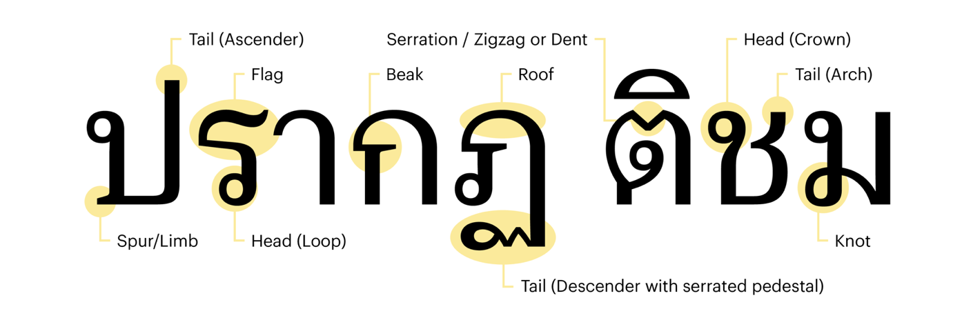
Looped and Loopless: Thai’s Typographic Classification
One of the most visible distinctions in Thai typography is between looped and loopless designs. Looped typefaces are often mistakenly equated with Latin serifs, while loopless designs are commonly grouped with sans serifs. However, looped and loopless are distinct structural classifications unique to the Thai script and should be understood on their own terms. Looped typefaces represent the traditional form of the Thai script, with many letters featuring distinctive loops and knots. Loopless styles have long existed in Thai typography, particularly in headlines and display use. They were not widely adopted for mainstream applications in the past. Cadson Demak played a key role in refining and popularizing the Loopless style, making loopless typefaces more accepted in broader Thai visual communication.
Cadson Demak’s early reputation was built on custom loopless fonts created for major Thai corporations such as AIS, formerly known as GSM Advance. This typeface is considered the first custom Thai digital font designed for branding use by a major telecommunications company.
This positioned the foundry as a modernizing force. But Anuthin and his team understood that style should not come at the cost of heritage. While Loopless Thai was trending, it risked crowding out the looped forms that are so central to Thai identity.
Explore More: https://www.cadsondemak.com/thought?page=3
References
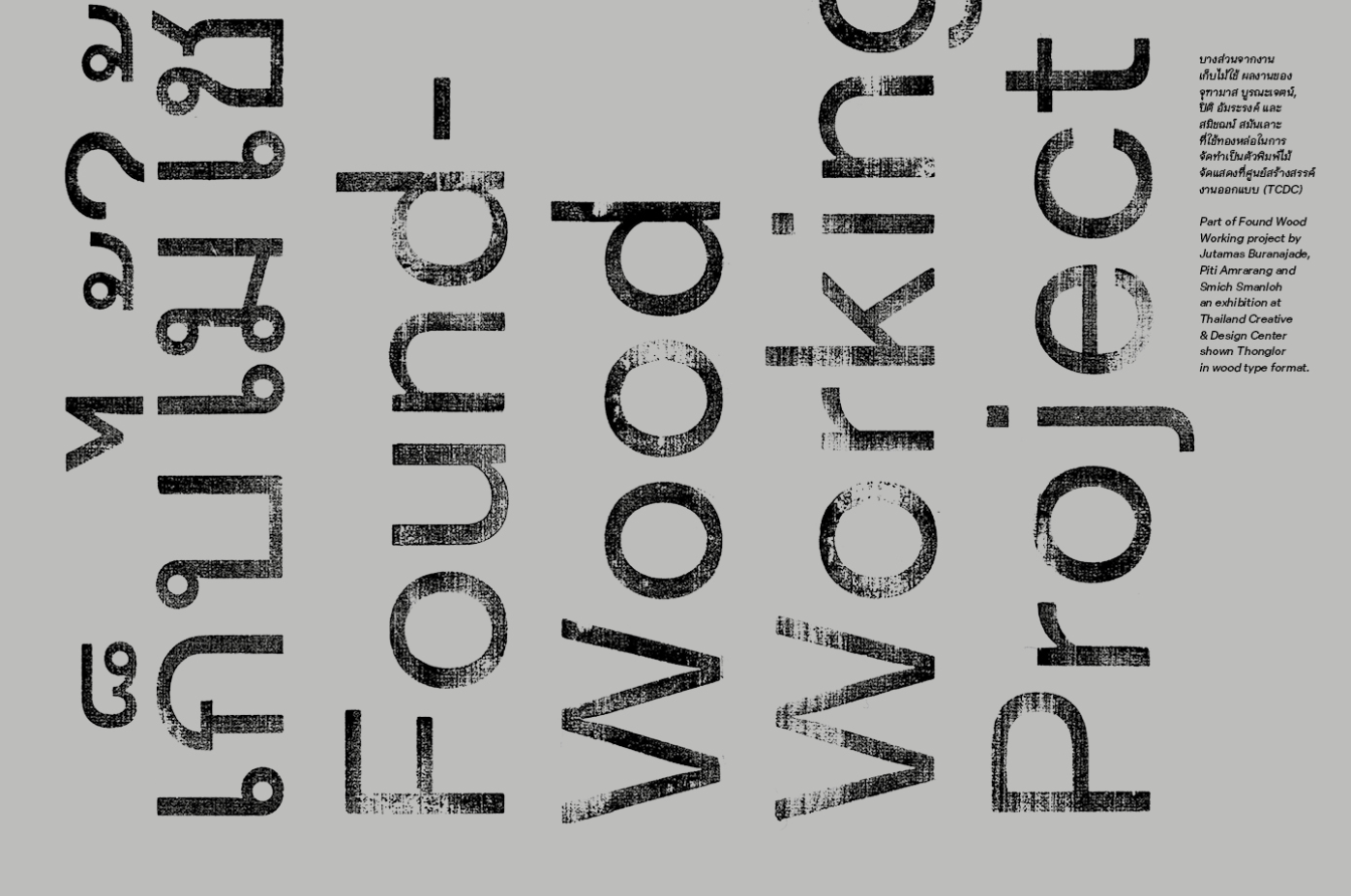
Wongsunkakon, A. (2019, April 5). Thong Lor: The Way Back Into Loop (Part 1). http://anuthin.org/2019/04/05/thong-lor-the-way-back-into-loop-part-1
Cadson Demak Official Website: https://cadsondemak.com
Graphik Thai (2020). Commercial Type x Cadson Demak
BITS Bangkok (Bangkok International Typographic Symposium). https://bits.cadsondemak.com
The content of this article is provided by the Supporting Foundry Club member Cadson Demak. GRANSHAN is not responsible for its accuracy or for any opinions expressed.