As part of GRANSHAN’s mission to celebrate global typographic diversity, we are launching a new interview series talking with GRANSHAN script experts.
Each conversation brings you closer to the creative minds shaping the future of the world’s writing systems - their stories, challenges, and visions for type design across cultures.
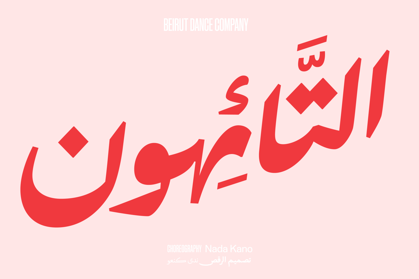
We begin with Lara Captan, a type designer from Beirut, has been running her own company, Ama Foundry, since May 2023. She was a member of the jury for GRANSHAN’s Type Design Competition in 2022 and 2024.
In our conversation, Lara shares her path from architecture to type design, her insights into the beauty and complexity of Arabic script, and her vision for the future of Arabic typography.
You dreamed of becoming an artist, but astrophysics and architecture were also options for you. How did you end up in type design?
Arabic type design combines my love of art and science and gives my life an additional cultural mission. So my working days are full of joy, except when I have to take care of marketing (or think about it), then I bury my head in the sand!
Thank goodness we’re doing some of the marketing work for you here, then! How did you first come into contact with GRANSHAN and this typeface community?
I entered my Falak ACE typeface to the GRANSHAN competition in 2019; it was commended with a Special Mention. I have long appreciated GRANSHAN for focusing on the diversity of our planet’s writing systems, and for honouring the contemporary type experiments of designers from regions where creating type can be a real challenge. In 2022 and 2024, I had the privilege of judging fonts myself as a member of the jury.
You were born in Beirut and grew up in Al-Khobar in Saudi Arabia. After the civil war, you moved back to Beirut and have lived in Amsterdam since 2013. How did the move to Europe come about?
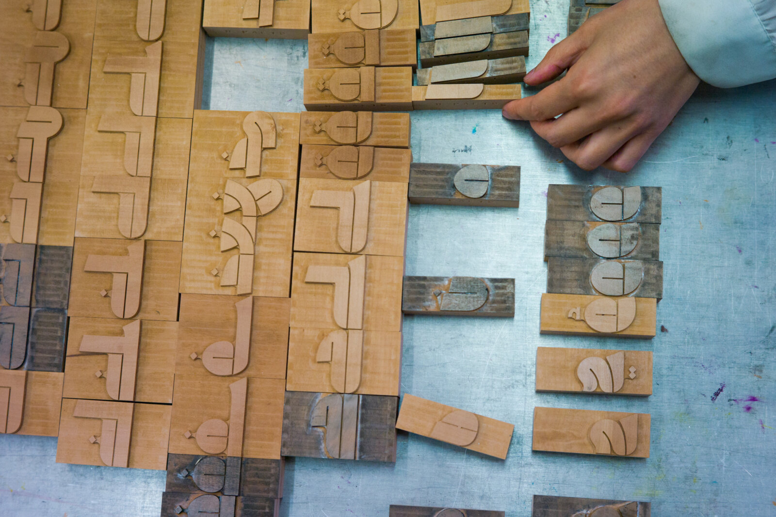
In the years leading up to my move, I felt that my career had reached a plateau. I was dissatisfied with my lack of typography skills, as well as my limited knowledge of the capabilities and limitations of type technology. I had plenty of ideas, though! So, I moved to Barcelona to study for a Master’s degree, during which time I got in touch with Mirjam Somers and Thomas Milo of DecoType. They showed me how they design their fonts, based on letter parts of not full characters, and how the text layout engine they had invented in 1984 (called ACE) is put to work via a now discontinued InDesign plug-in (called Tasmeem). They had made my dream come true. I packed my laptop, said farewell to the sunshine and moved to Amsterdam to learn DecoType’s methods of designing and computing Arabic type.
What are the characteristic, perhaps even unique features of Arabic script compared to others?
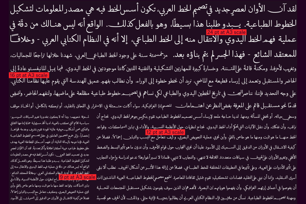
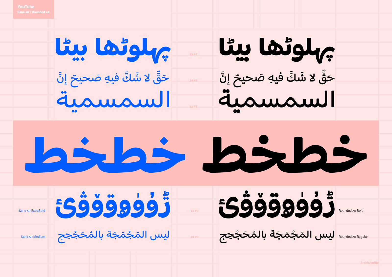
The beauty of Arabic is that it has a wide array of distinctive features compared to other scripts. To name a few: Letters can have different forms for the same letter, some can swash or elongate at variable widths, which are freely defined by the scribe or designer. One of my favourite unique features of Arabic is the way it uses contrast. Unlike most global scripts where the thicks are in the vertical strokes, in Arabic, horizontal strokes are where the thickest parts of the letters are. Also, up to five contrast phenomena are sometimes at work within the same letter when creating a letter. For example, when writing the isolated letter Jeem in Naskh, one must resort to pen translation, pen rotation, pen shift, drawing and filling. Understanding contrast and how it works in different Arabic calligraphic styles can really inform how to position (and play with the positioning) of the thicks and thins of glyphs in a typeface.
Has font technology advanced to the point where it can realize all these visualisation possibilities?
All of them no, part of them yes. It’s not all to blame on technology, our understanding of how the diverse Arabic scripts work, our knowledge of the histories of script and type, and methods we use to create Arabic fonts must also evolve. This would then encourage further dialogue between design possibilities and type technology. We have a lot of work to do!
What are the biggest challenges facing the Arabic writing system in the coming years?
I believe that we need more fonts from (and for) all the diverse communities that use the Arabic script, and in diverse graphic flavors. We need more researchers. We need to support students, educators and each other (as type designers) because knowledge is scarce and dispersed, and there is much to learn from everyone’s individual experiences. Lastly, I believe we need to be able to type Arabic (in the multitude of languages using the script) with full script grammar support if required by the typeface or the client, using all the properties of Arabic script if desired, whether in traditional, contemporary or totally rule-breaking styles, and that these typefaces don’t »break« online or offline (as they still do today).
You founded your own foundry, Ama Foundry, two and a half years ago. What is the focus of your foundry and what do you value most when designing fonts?
I publish Arabic fonts exclusively made in-house and provide custom Arabic type services. I also share my knowledge to enable the creation of authentic, expressive and contemporary designs. Ama Foundry is named after and dedicated to my mother Amale as a homage to continuity and forward-thinking Arab women.
In my practice, I try to work on three »pillars« that are constantly evolving: I seek for my typefaces to be historically-sound, well crafted, and offer something unique or educational to the world. These three aspects have equal priority to me and are kind of inseparable.
Which current or upcoming projects are you particularly looking forward to?
I’m excited to be working on a large personal project. It’s a geometric low-contrast Arabic variable font, in which I’m exploring and testing all the parametric axes I can think of that are specific to Arabic script, along with the more common registered axes of weight and optical size. This project has been generously supported by David Berlow.
That sounds like a creative and technical challenge. When will we see the first results?
I’m hoping to show a working prototype sometime between mid or end 2026.
Interview by Antje Dohmann