Content provided by Supporting Club member Parachute Typefoundry.
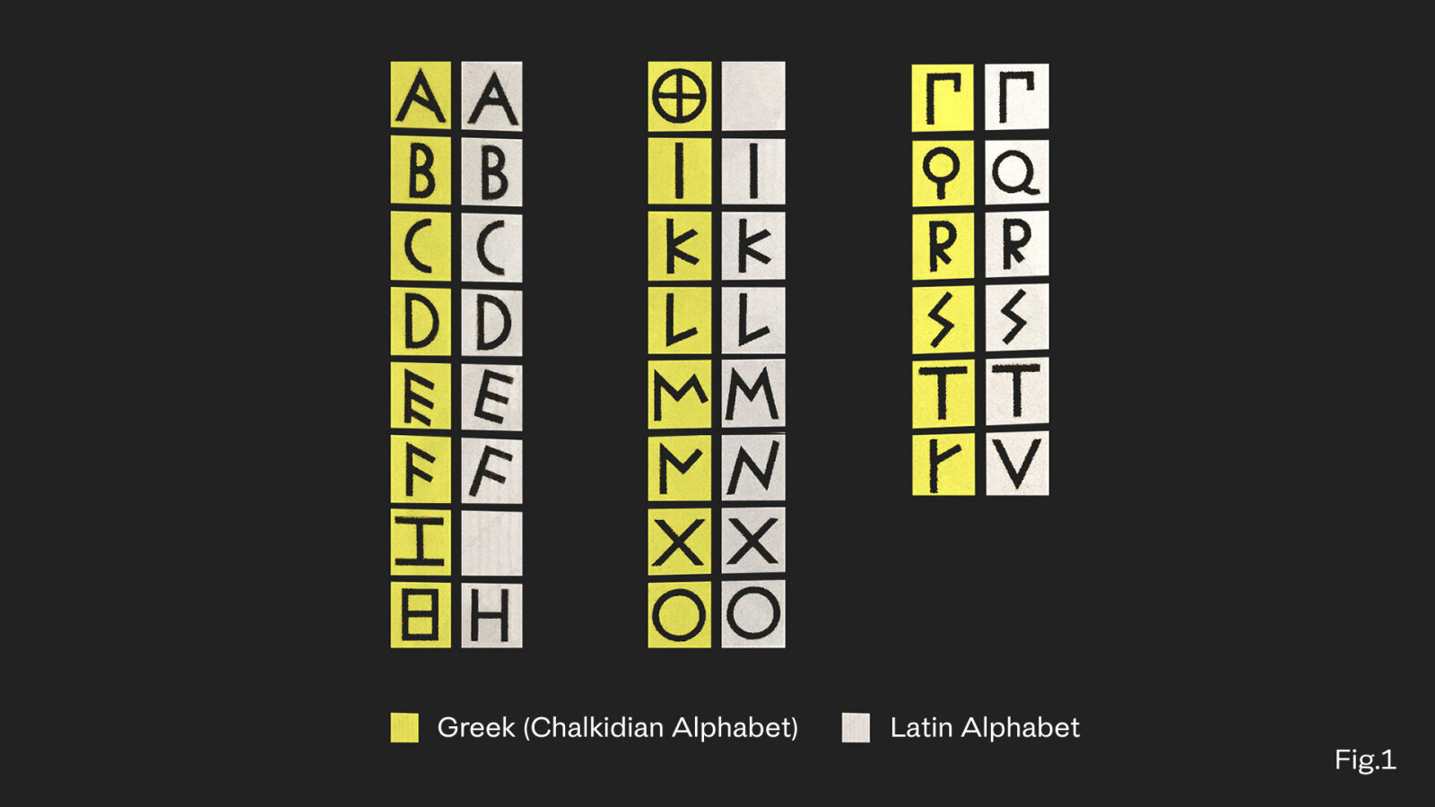
To design in Greek is to engage with a living continuum, from the carved inscriptions of antiquity to the fluid scripts of Byzantine manuscripts, and onward to the digital grid of the 21st century. Each era added a layer of nuance in proportion, rhythm, and motion, shaping a script that is both historic and alive. Although Greek and Latin share a common origin (Fig.1), they have diverged into distinct visual systems. Latin evolved from stone-cut capitals - geometric, modular, and architecturally stable with a consistent vertical rhythm - whereas Greek developed through handwriting, yielding forms that are calligraphic, fluid, and inherently dynamic. This structural and gestural distinction underlies every typographic decision.
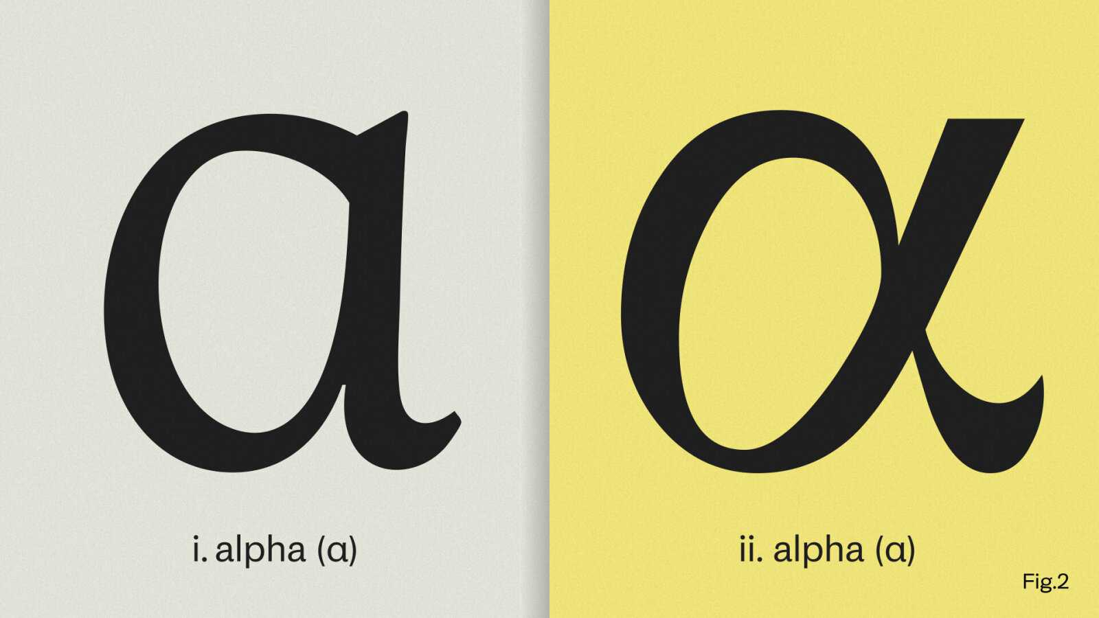
Among lowercase letters, the alpha (α) frequently reveals the first imbalance between the two scripts (Fig.2). It is often the primary reason Greek text produces a darker tonal “grey” than its Latin equivalent. While distantly related to the Latin a, the Greek alpha evolved into a looped, handwritten form - a fusion of omicron and iota that embodies the script’s cursive heritage.
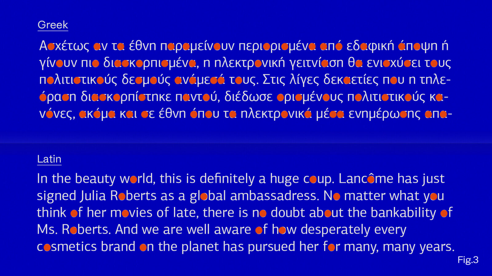
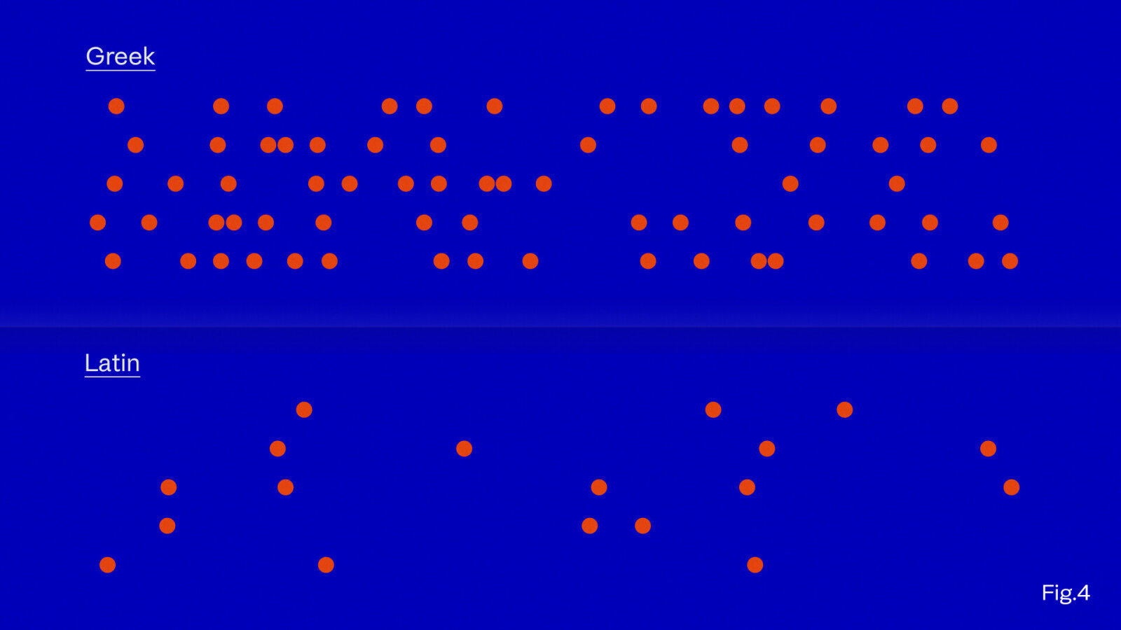
In addition, Greek employs a greater number of rounded forms - notably ο, σ, ρ, and ω - which occur more frequently than comparable shapes in Latin (Fig.3). Whereas the Latin o accounts for roughly 10% of a text, in Greek that percentage effectively doubles: not only through omicron itself but also through the rounded portions of alpha (Fig.4). This abundance of circular structures contributes to a denser overall texture. Achieving visual equilibrium on a bilingual page requires designers to open counters, lighten joins, and refine proportions so that Greek and Latin coexist harmoniously not as strangers, but as siblings. The objective is not formal imitation but tonal balance and rhythmic coherence.
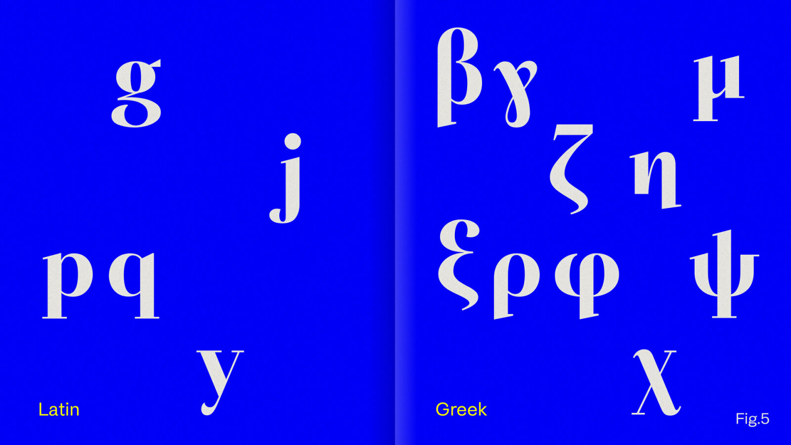
Another significant structural divergence concerns descenders. Greek contains nearly twice as many letters extending below the baseline (β, γ, ζ, η, μ, ξ, ρ, φ, χ, ψ) as Latin, introducing greater visual activity beneath the reading line (Fig.5). Since the eye primarily follows the upper zones of text, long descenders can disrupt reading rhythm and spacing. To preserve optical stability, designers often moderate their length or adjust vertical positioning, especially in continuous text settings.
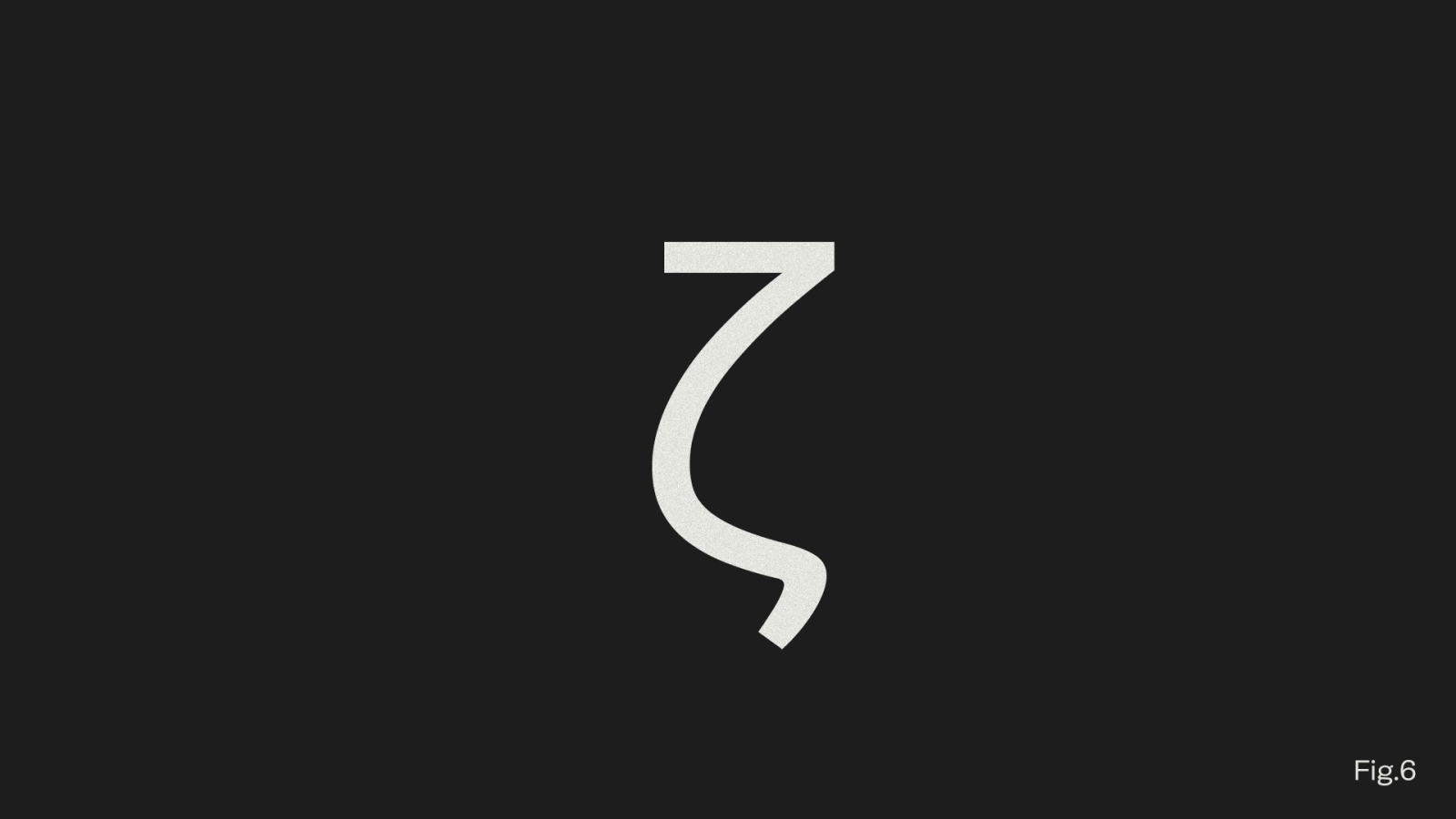
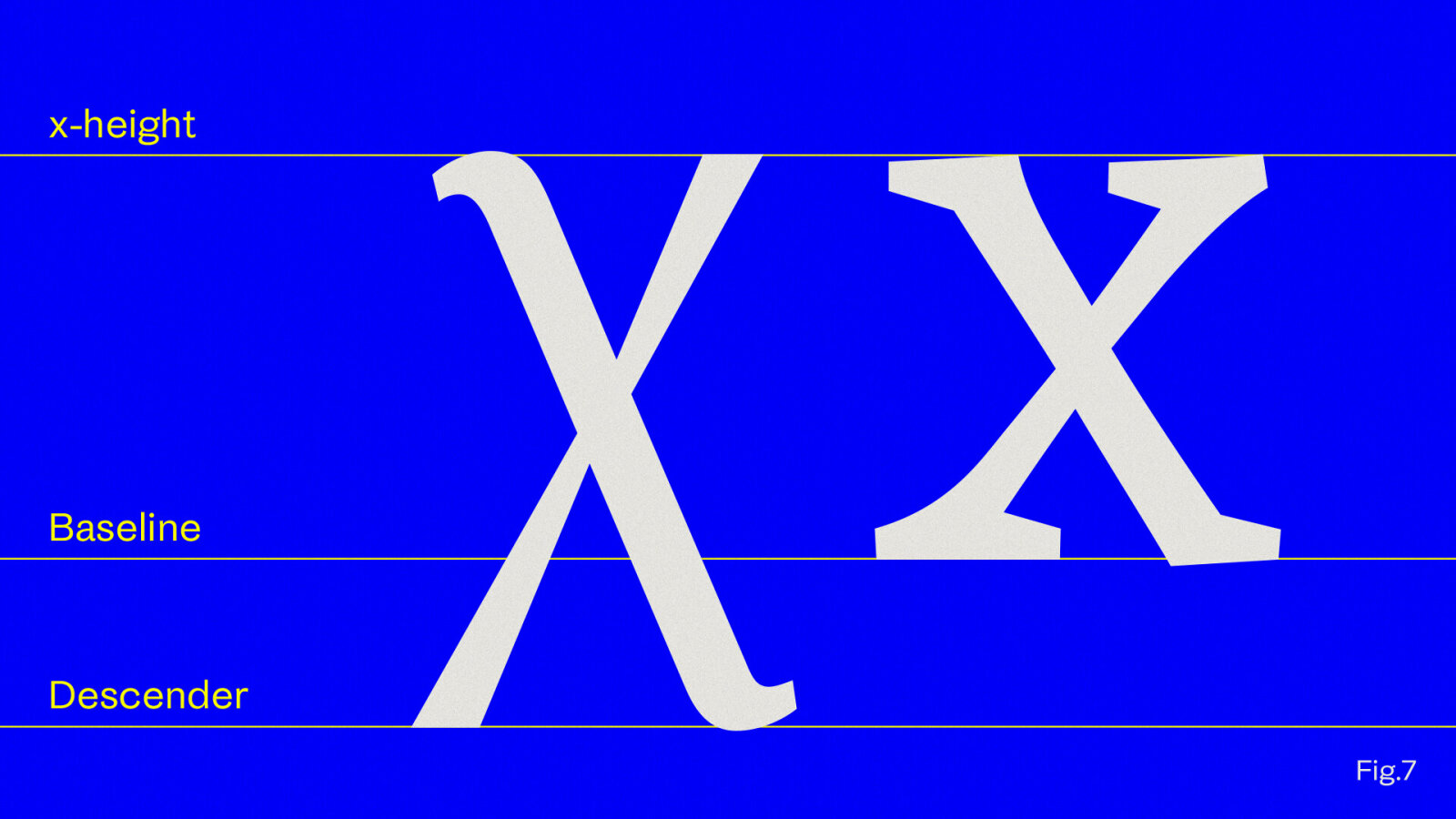
Certain letters such as ζ, ς, λ, ξ, η, χ, and δ, are particularly diagnostic of a typeface’s Greek character (Fig.6). Each admits multiple, equally legitimate interpretations depending on stylistic intent. A chi (χ) that dips below the baseline conveys an expressive, traditional tone, while one that aligns neatly with it evokes modernity and precision (Fig.7). Consistency, however, is paramount: every form must adhere to a coherent internal logic.
Form follows Context
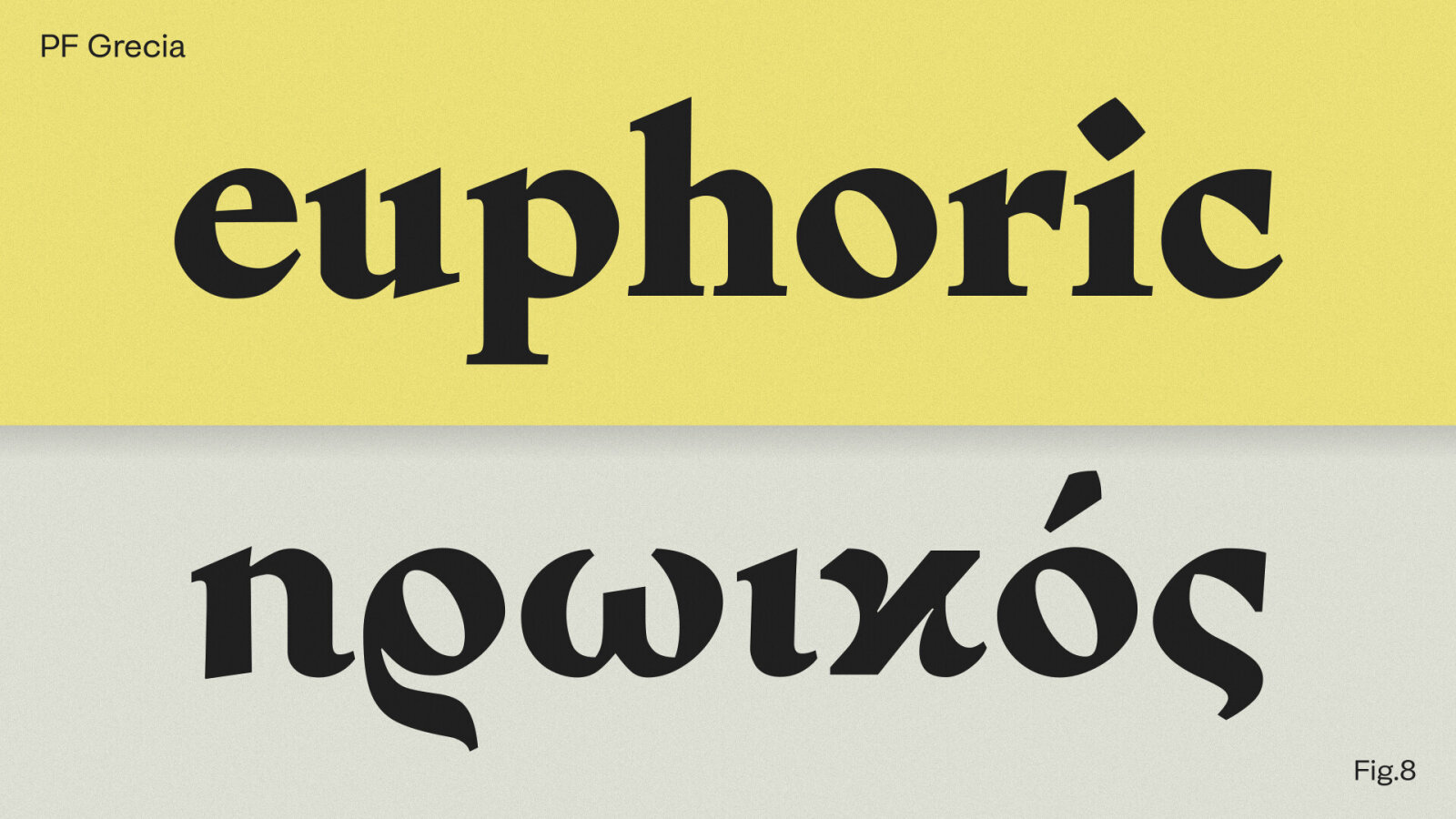
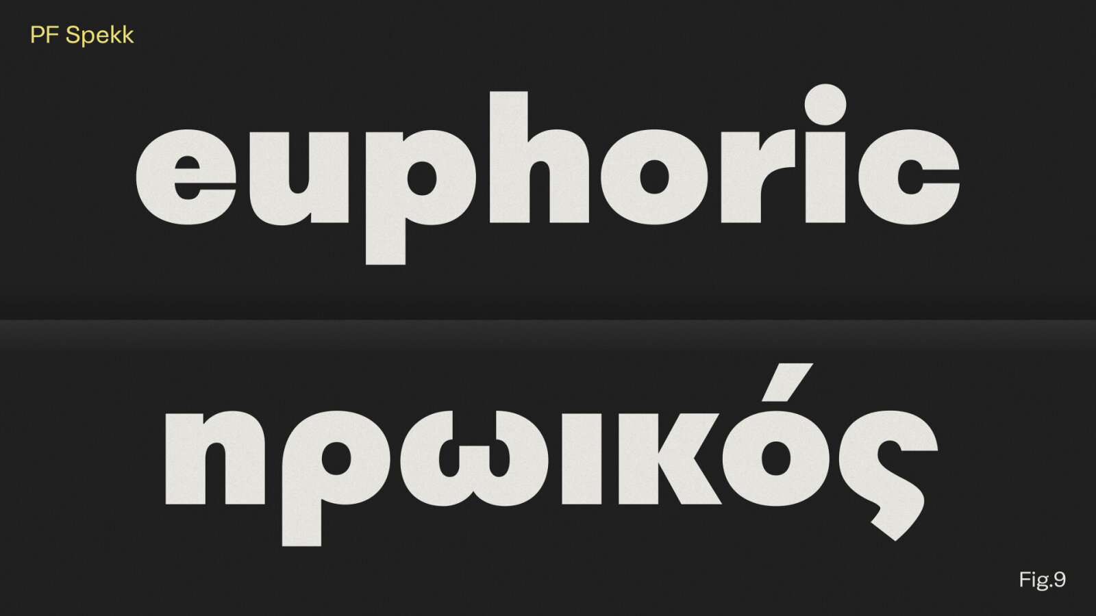
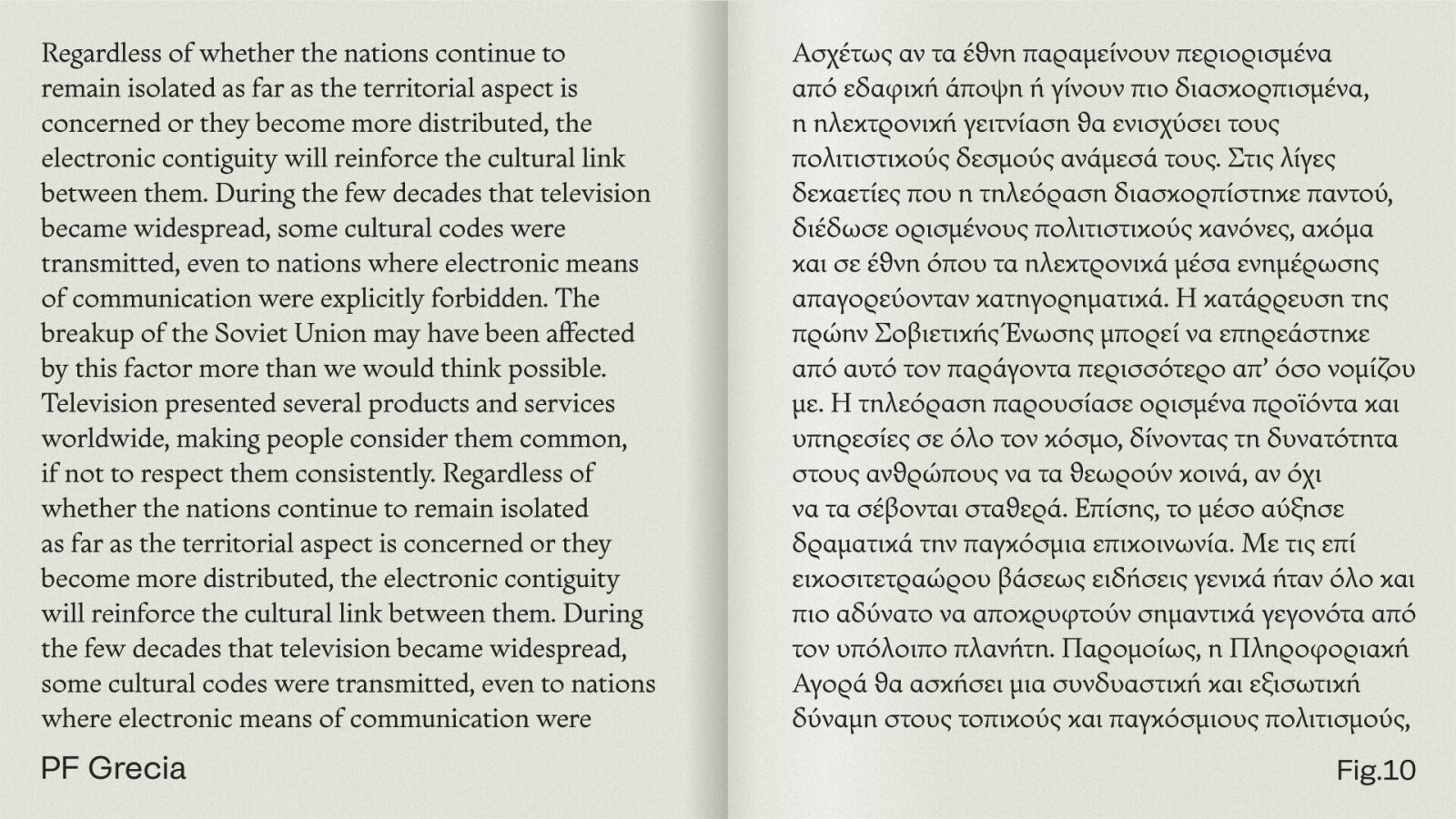
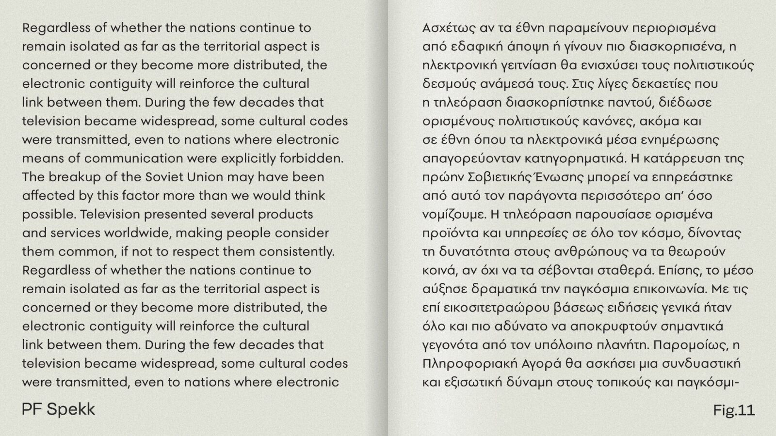
Designing for Greek, therefore, is not an act of translation but of informed interpretation. It demands sensitivity to rhythm, proportion, and the calligraphic DNA that defines the script. Form should follow context: a fluid, organic construction may serve editorial or classical projects (Fig.8/Fig.10), while more modular, Latin-adjacent structures may suit corporate or contemporary use (Fig.9/Fig.11). To design well in Greek is to accept that - depending on the context - some letters such as rho (ρ) and kappa (κ) carry weight and emotion far beyond their Latin analogue.
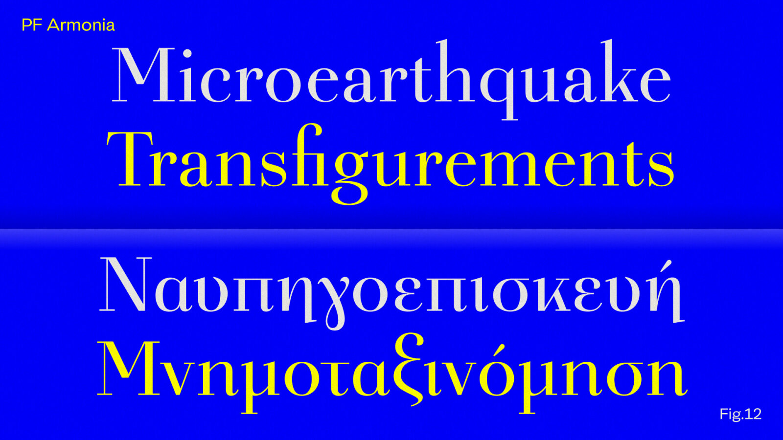
Finally, the long-held assumption that “Greek must lean” no longer holds true; upright forms are not foreign intrusions but authentic expressions of the script’s evolution (Fig.12). Ultimately, the designer’s task is to balance rhythm and texture, to let Greek and Latin breathe the same air, share the same tonal value, and speak in harmony, each retaining its own accent (Fig.13). To design Greek type is not merely to preserve history, but to reinterpret it through form, one letter at a time.

Explore More:
Modular and Geometric - PF Spekk
The content of this article is provided by the Supporting Foundry Club member Parachute Typefoundry. GRANSHAN is not responsible for its accuracy or for any opinions expressed.