Content provided by Supporting Club member Typotheque.
The story of Typotheque’s Thai typeface project began nearly a decade ago - not with software or shapes, but with a question: What does it mean to design Thai type that feels both native and modern?
In response, the studio embarked on a long-term, research-driven initiative to create Thai fonts that are more than just technically correct. Working closely with native experts, studying historical materials, and integrating cognitive legibility research, Typotheque sought to design Thai typefaces that respect cultural nuance while answering today’s typographic needs.
In a field often marked by surface-level adaptations, this project sets a new standard: type design as a process of dialogue, empathy, and cultural depth.
Their latest Thai type project - the result of nearly a decade of sustained effort — demonstrates how type design can be both a cultural artefact and a tool for shaping contemporary visual identities. In a field often dominated by technically "correct" but culturally detached adaptations, Typotheque offers something rarer: type design informed by cognitive research, local collaboration, and historical understanding.
A New Thai Type: Where Tradition Meets Research
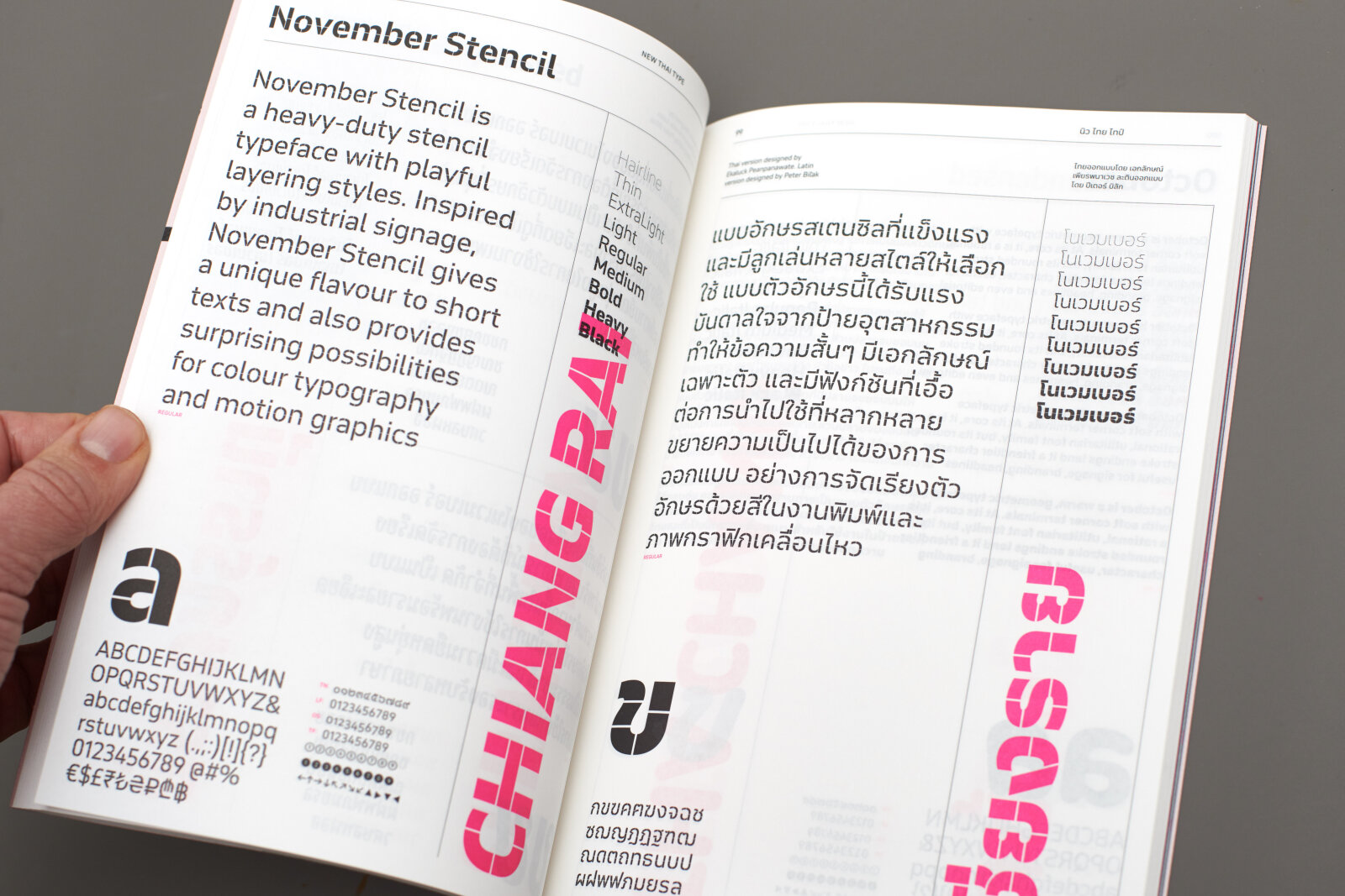
In 2017, Typotheque began their journey into Thai typography not by drawing glyphs, but by listening - to Thai type designers, educators, and historians. Recognising that Thai is not a monolith but a living script with diverse stylistic traditions, they chose not to develop a single generic font. Instead, they committed to creating a full typographic system: 50 distinct Thai font families, each attuned to the cultural, emotional, and functional nuances of the script.
Working with figures like Pracha Suveeranont, Thailand’s leading historian of Thai typography, Typotheque grounded their design process in historical and cultural understanding. Their collaboration reached beyond aesthetics into questions of user experience, language learning, legibility, and the emotional impact of type - subjects rarely addressed in beyond-Latin script design at this depth.
The Research: Loops, Legibility, and Perception
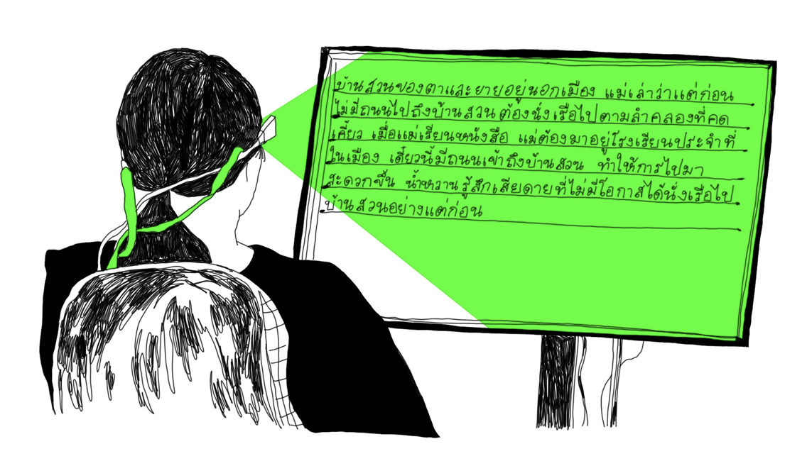
At the heart of Typotheque’s Thai initiative lies a comprehensive research project conducted at Chulalongkorn University in early 2024. The focus? The enduring debate over looped vs. loopless Thai script styles - a topic central to Thai visual culture.
The study - the most granular ever conducted on this subject - involved over 180 native Thai readers and tested how the presence or absence of loops affected reading speed, comprehension, and cultural perception. Results showed a clear pattern: looped Thai significantly improved paragraph reading speed and was perceived as more readable, especially for longer texts. At the same time, loopless Thai was often associated with modernity and design-forward environments - particularly by younger users.
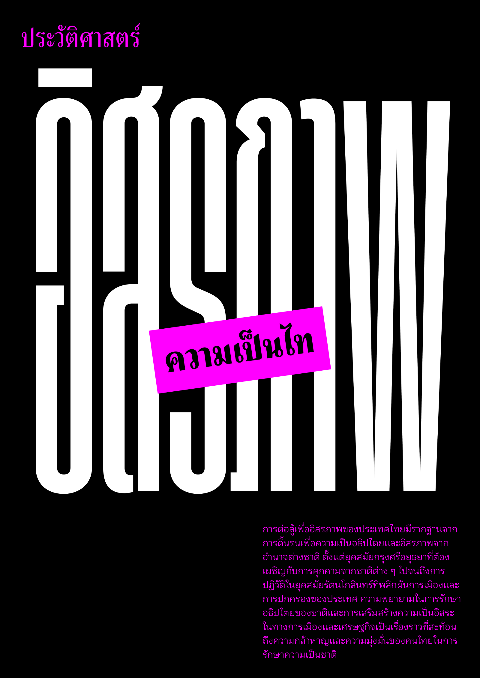
The research surfaced a striking generational shift: younger readers, exposed from an early age to loopless text in signage and digital media, showed greater reading acuity with loopless forms at small sizes. In contrast, older readers continued to favour looped Thai across all conditions. These findings hint at how urban visual culture and multilingual exposure (particularly to Latin scripts) may be subtly reshaping reading habits in Thailand.
Designing With Insight, Not Assumption
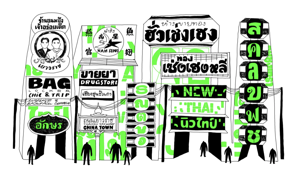
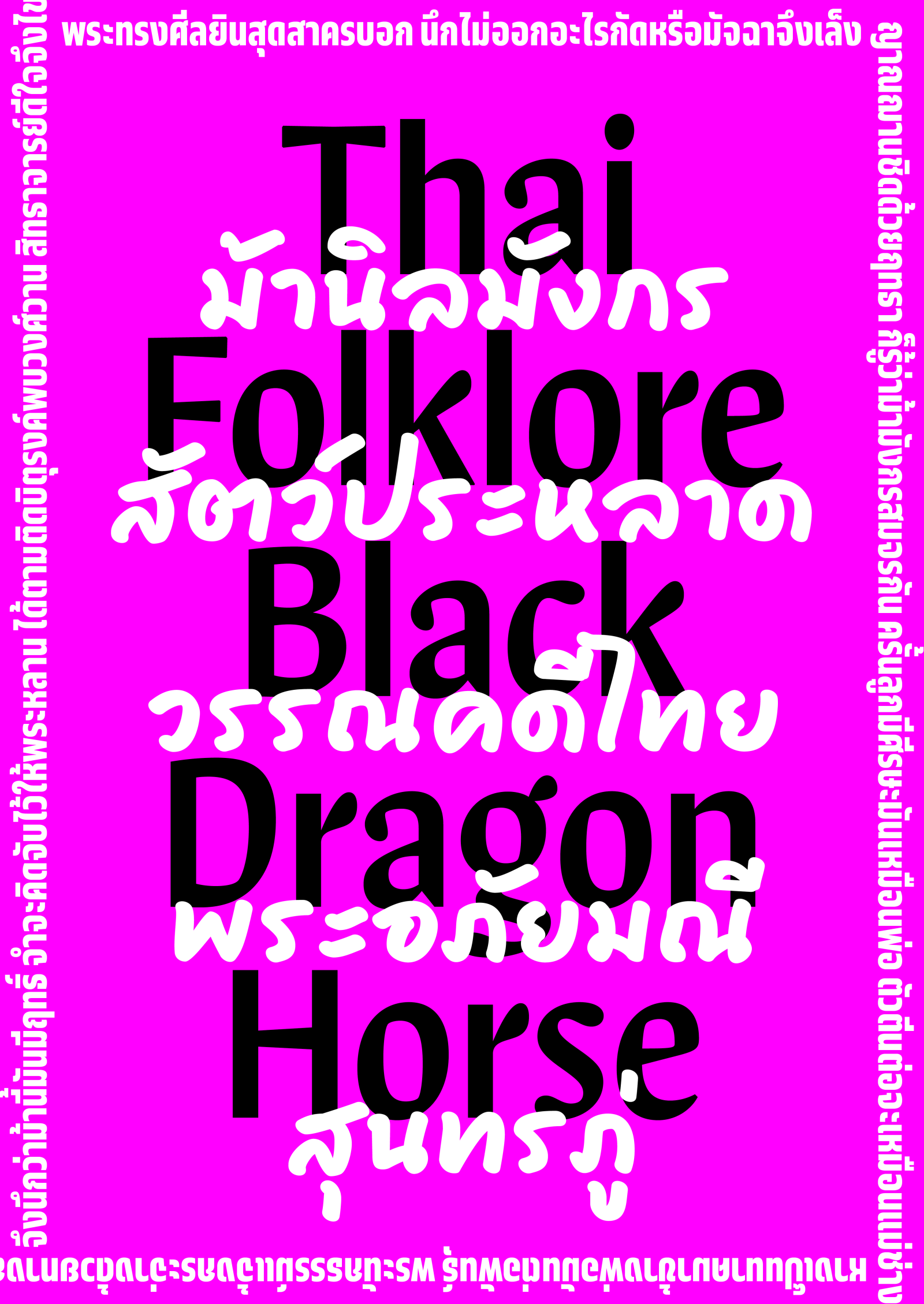
Rather than forcing a one-size-fits-all solution, Typotheque’s findings led to a typographic collection that reflects the script’s diversity. From the award-winning November Thai, celebrated with a Red Dot: Best of the Best award in 2023, to Greta Sans Thai and Ping Thai, each typeface is crafted with use case, user perception, and cultural context in mind.
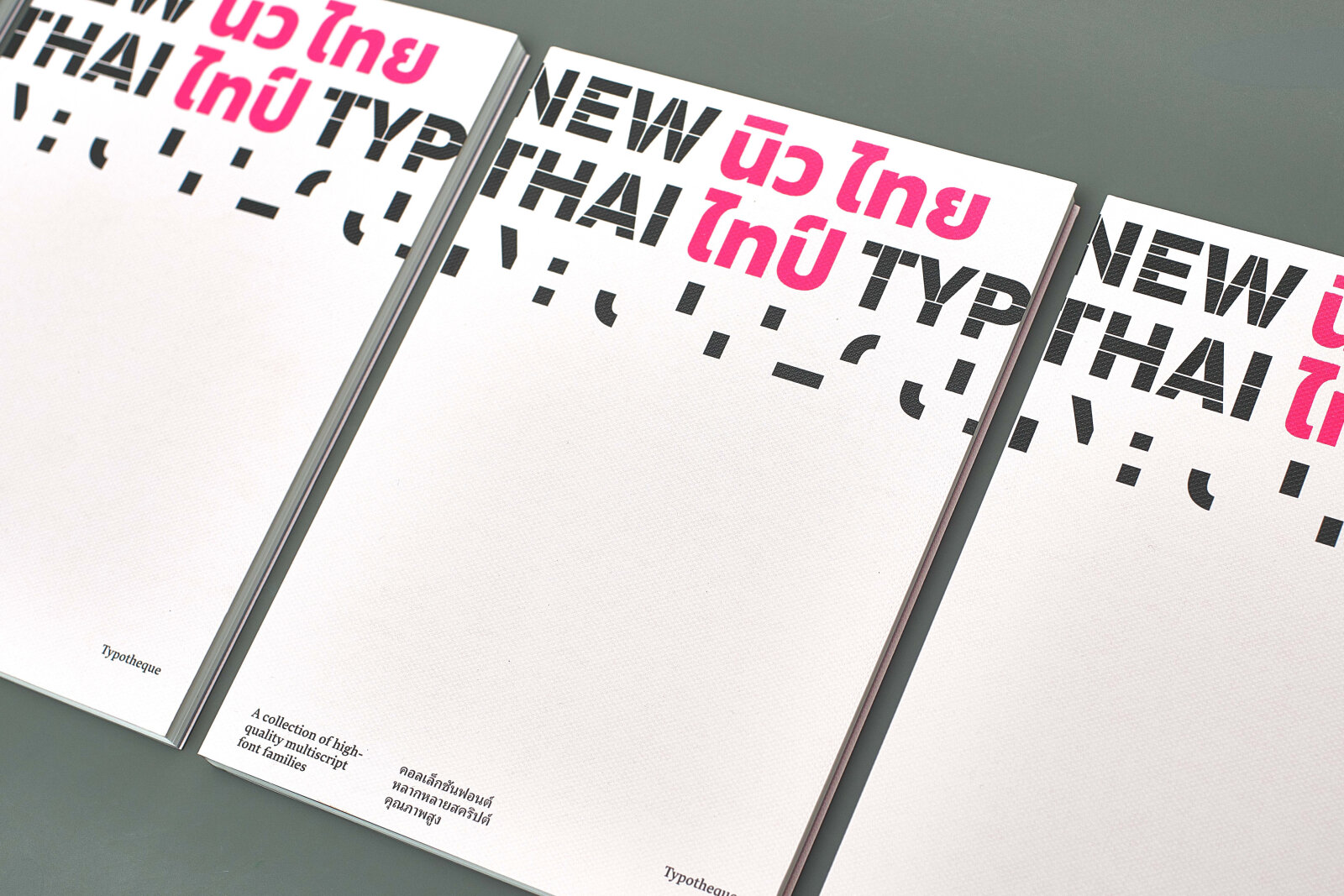
Typotheque also compiled their findings in a dedicated publication, combining academic research with practical design insights - a rare contribution that bridges the gap between type design and user research in beyond-Latin contexts.
Explore More:
References
Punsongserm, R. (2020). Comparative effectiveness of homologous Thai letterforms on visual word recognition: Thai Universal Design font versus familiar Thai text fonts. Archives of Design Research, 33, 19–43. https://doi.org/10.15187/adr.2020.08.33.3.19
Beier, S., Oderkerk, C. A. T., Bay, B., & Larsen, M. (2021). Increased letter spacing and greater letter width improve reading acuity in low vision readers. Information Design Journal, 26, 73–88. https://doi.org/10.1075/idj.19033.bei
The content of this article is provided by the Supporting Foundry Club member Typotheque. GRANSHAN is not responsible for its accuracy or for any opinions expressed.
