Supporting foundries are essential to GRANSHAN’s daily operations. This partner plays a crucial role in our success, and we are grateful for their support. Explore this page to learn more about the foundry that helps make our work possible.
U+Type
Founded in 2025 by Jérémie Hornus, U+ Type designs and engineers brand typefaces that work in every market a brand speaks to. Ten years of designing Chinese, Japanese and Korean from scratch, a pan-CJK glyph database, and Fontra, our variable-first collaborative font editor, let a small team take on scripts that usually need a very large one.

Custom typefaces for global brands
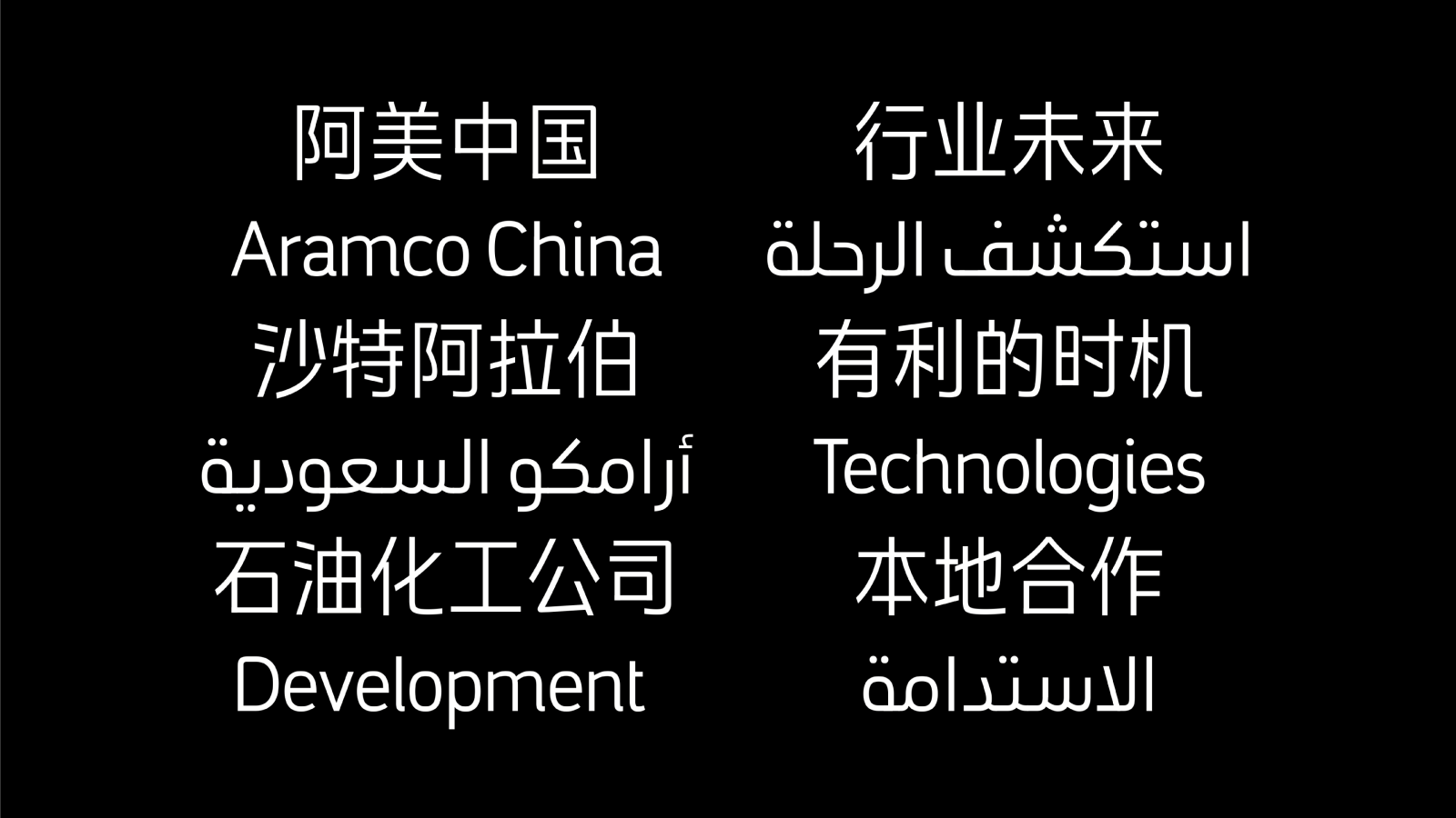
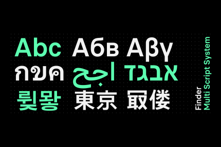
Brand typefaces end to end, from research and creative direction to mastering and maintenance. Google CJK: a 65,000-glyph family across Simplified and Traditional Chinese, Japanese and Korean. Finder for Stellantis: one UI typeface in nine writing systems. Instagram Sans in Japanese and Korean, with Colophon. Manifa for Aramco: Latin and Simplified Chinese. Flexis Soft/Tech with Pixelis: Grand Prix Stratégies du Design 2026.
CJK from scratch
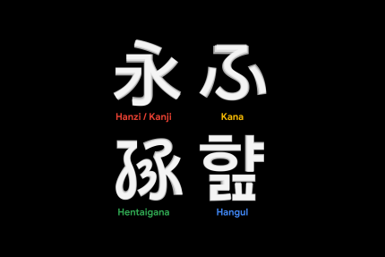
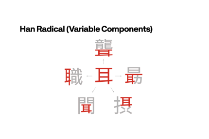
Since 2017 we have been designing Chinese, Japanese and Korean typefaces from the ground up. Our Han database describes every character by radicals, structure and composition across GB, Big5, JIS and KS encodings; stroke and radical shapes are built as variable components, so a 30,000-glyph family stays consistent and is fast to adapt when a brand's Latin changes.
Fontra, a variable-first font editor
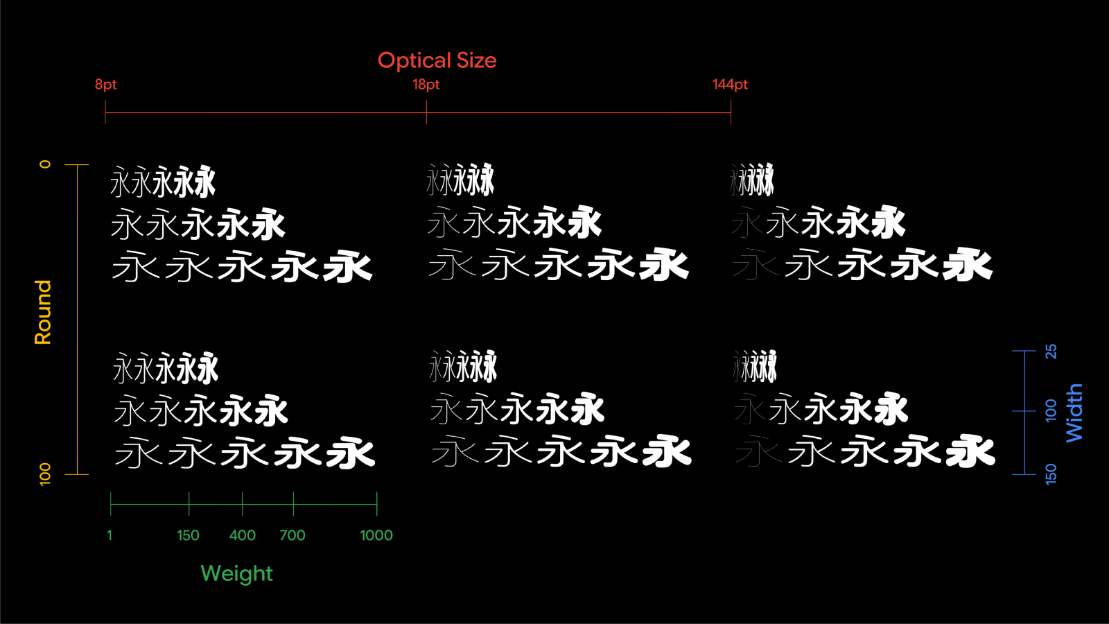
Fontra is the browser-based, collaborative font editor we developed to make variable components a design tool rather than a trick: several designers work simultaneously on one source, radicals and strokes carry their own axes, and the result compiles to standard fonts, as well as the VARC table proposed for OpenType 2.0.
Part of the community
U+ Type sponsors the Unicode Technology Workshop 2026 in Nancy (20–23 October), where Jérémie joins the panel on typefaces for the internationalisation of brand discourse and supports GRANSHAN as a member of the Supporting Foundries Club, because the world doesn't write in Latin alone, and brands are starting to notice.
An asymmetry nobody budgets for
A Latin brand typeface is a few hundred glyphs. Its Simplified Chinese companion is seven to twenty-eight thousand, depending on the standard you pick, and the Traditional Chinese, Japanese and Korean versions add localised forms on top. The first challenge of multi-script design is not aesthetic, it is arithmetic: the same brand that approved a Latin in three months expects the Chinese in the same window, from the same budget line, and the industry has spent decades pretending that this is a matter of finding the right freelancer.
The second challenge is that expertise does not travel. A designer who reads Thai, one who reads Hangul, one who reads Han; and you might need all three, and they need to work in the same rhythm, with the same understanding of the brand, on the same source file. Most tools were built for one person drawing one script; collaboration is bolted on afterwards.
The third is the temptation to match shapes instead of matching voice. A Latin geometric sans "translated" stroke by stroke into Arabic or Devanagari produces something that looks consistent to the brand manager and wrong to every native reader. The coherence a brand needs is one of weight, rhythm, contrast and tone, not of outlines.
What changed on our side
Our answer to the arithmetic has been structural. Instead of drawing thirty thousand characters, we describe them: a pan-CJK database that knows how each character is composed, a set of strokes and radicals drawn once as variable components, and a way of assembling glyphs from those parts with parameters (weight, width, height, the position of a radical inside a character). The designer's judgement goes into a few hundred control characters and the rules; the machine does the assembly; humans proof, correct and refine. The same logic works for Hangul syllables, and it is why a team of about seven can deliver a family that used to require twenty.
The tool came with it. Fontra, the editor we developed, is browser-based and collaborative by design: designers in France, China, and other parts of the globe, edit the same source at the same time, and variable components are first-class objects rather than a plug-in. The output compiles into ordinary fonts, and into the VARC table now on its way into OpenType, so the structure survives into the binary.
The next decade
Three things seem clear to us. First, multi-script will stop being an option a brand adds later and become the default brief: a brand that speaks in twelve markets needs one voice in twelve writing systems, and the cost of not having it (a fallback system font next to a carefully drawn Latin) is now visible to everyone on a phone.
Second, generative models will take over the boring part. For Chinese, raster generation of new glyphs in a given style is already close to production quality, and the large Chinese foundries are opening their catalogues to train it. What the models do not do is decide what the style should be, keep a family coherent, or produce clean vectors; which is exactly where a structural, component-based pipeline lets designers stay in control while accepting help. We expect the next decade to be about combining the two, not choosing between them.
Third, and most important, the opportunity is cultural before it is technical. Every script has its own logic of proportion, stroke and space, and the brands that will be trusted in a market are those whose typography reads as native rather than imported. That is a job for people who know their script from the inside, working with people who know the brand from the inside. Tools like ours exist to make that collaboration possible at scale; they do not replace it. Making each script visible on its own terms is also, as it happens, what GRANSHAN has been doing for fifteen years.
About U+ Type
U+ Type is an independent type foundry founded in 2025 by Jérémie Hornus, co-founder of Black Foundry, where he led custom and multi-script projects for global brands between 2014 and 2025. The foundry designs and engineers brand typefaces across Latin, Greek, Cyrillic, Arabic, Hebrew, Thai, Devanagari, Tamil, Georgian, Ethiopic and the CJK scripts, and builds the tools it needs to do so: a pan-CJK glyph database, a component-based design method, and Fontra, a variable-first collaborative font editor.
In 2026, Flexis Soft/Tech, designed with Pixelis for Flexis Mobility, was awarded at the Grand Prix Stratégies du Design.
Based in Paris, U+ Type works with brands, agencies and other foundries, from a single custom Latin to a full CJK family, and takes on the engineering side of large multi-script projects for partners. It sponsors the Unicode Technology Workshop 2026 in Nancy and is a member of the GRANSHAN Supporting Foundries Club.
Contact: jeremie@uplustype.com · uplustype.com