
Content provided by GRANSHAN Supporting Foundries Club member TypeType
The combination of a sans serif and a serif is a common variant of a font pair. There is an explanation for this, because in order for fonts to be combined with each other, several criteria must be met. Fonts should be different, have something in common and together make the necessary impression on the viewer. The latter is a bit like magic, because there should be chemistry between the fonts that allows you to evoke emotions. But the first two criteria can be explained, and we have prepared recommendations that will help you choose a font pair in the future.
Fonts must be different from each other. Sans serifs and serifs can often be seen together because their designs initially have differences in serifs and contrast. However, choosing any serif and sans serif does not imply choosing a font pair.
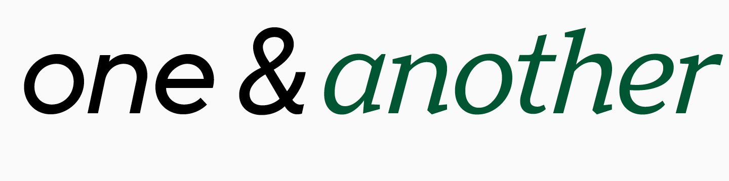
Fonts must have intersection points. They may be similar in the design of some characters or have the same proportions, refer to the same historical era or have a similar character.
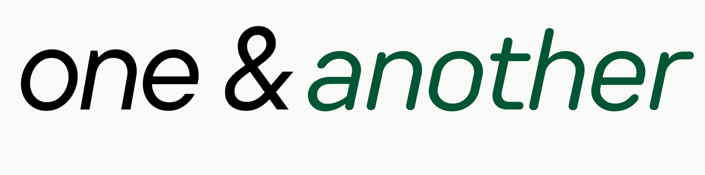
Fonts should look good together. This is a difficult criterion, because it is only intuitively possible to determine how attractive fonts are in combination. However, there is a way to understand compatibility. Try to look at the font from a distance and imagine its character as if you were describing a person. Answer these questions: what this person is wearing, how old they are, what kind of voice they have, and what style of clothing they prefer. By imagining the look of the font, you can guess what character is missing next to it. This may be a character that complements the first one by having the missing features.
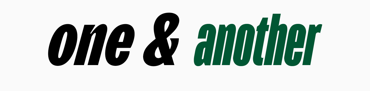
Don't be afraid to experiment by trying different combinations of fonts; trust your intuition. Visual experience, which allows you to easily find pairs among various fonts, comes with tenure in the field.
Where to use font pairs
We see font pairs every day when walking around the city or browsing websites. For example, when designing posters and posters, two fonts are almost always used – one for a bright headline, the other for information about an event or project.
Headlines on websites, books, magazines and newspapers are often set in a separate font. Some brands use a second font for a separate site block if its content is fundamentally different from others. This method can be used by companies that want to separate the commercial block from the social block or highlight a blog with long reads.
Tips for pairing typefaces
Now, let's explore the ways of marrying two typefaces.
Remember that first, you have to determine your project's goal. Without it, your decisions don't have any support. After that, you must establish the hierarchy—decide which font will be primary and which will be secondary. For the primary font, we recommend choosing the one you will use the most. However, the final decision depends on a specific project.
The key requirement to keep in mind when mixing typefaces is that there must be a clear, visible connection between them. Their similarities and differences must be very obvious. Thus, fonts that are too similar don't work well together, as well as ones that don't have a clear connection.
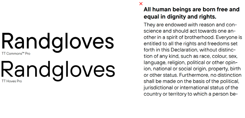
Let's begin with a bad example. Here, we can see two sans serifs with the same proportions and related forms. Both fonts aren't display font. This is an example of two similar fonts. The purpose of using both of these sans serifs in one mockup is unclear because using only one of them would have sufficed. Mixing sans serifs is quite risky, and many designers don't recommend doing this. Personally, we don't mind sans-serif combinations if they are thought through carefully enough. A little later, we will explain what we mean.
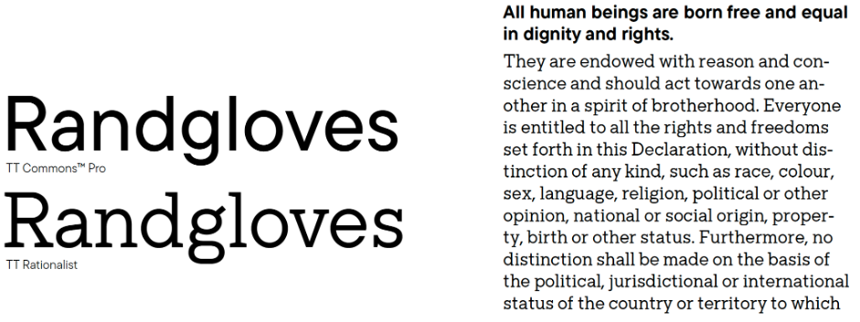
Here is what could have been done. We kept TT Commons and selected a font pair similar in nature, proportions, and glyph forms but belonging to another type category - slab serifs. In this case, the differences became apparent. The mix of a sans serif and a serif (slab serif in our case) can be called classic. You can use it without hesitation.
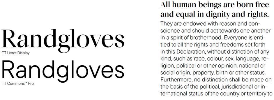
Consider another similar example, but the serif here works in the headline, and the fonts are not that similar already. Here, the resemblance is only perceivable in the typesetting textures. They are relatively dense in both fonts. To clarify, we will give you an example where the textures don't work so well together.
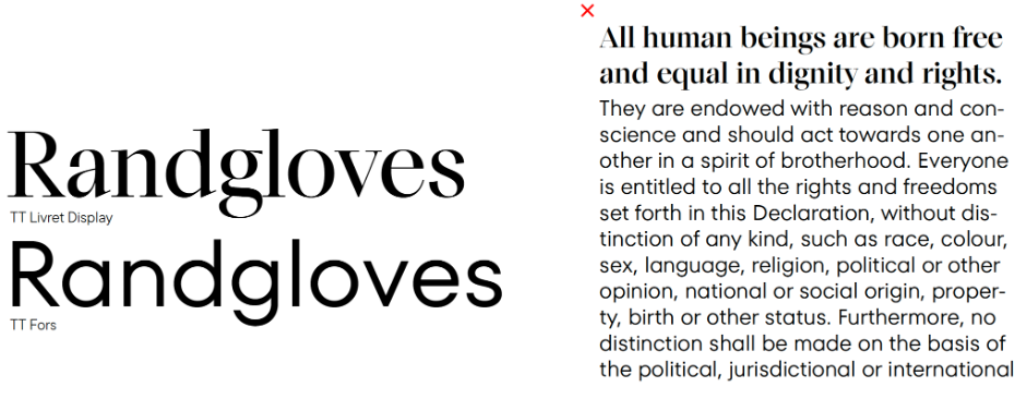
Here, we used another sans serif, and it's become evident that its texture is much looser than the serif's. You can feel the dissonance between them. However, it's possible to eliminate this feeling without changing the fonts.
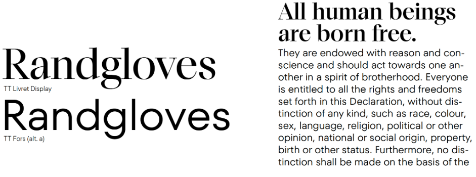
We made the serif a little larger to literally have more white space inside. For the sans serif, we added the context alternate for the letter a, transforming it from a rounded single-story glyph into a double-story one, which made the typesetting a little less airy. Now, the fonts complement each other better as a pair.
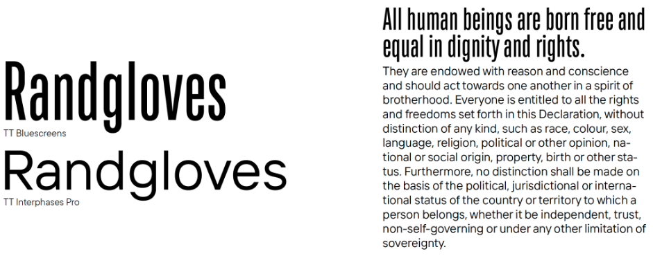
Take a look at this example of combining two sans-serif fonts. In this case, we've employed a clear contrast in width — another effective technique in font pairing. It requires precise work with the size of the narrow font. To make its texture less dense compared to the text typeface, the heading should be significantly larger.
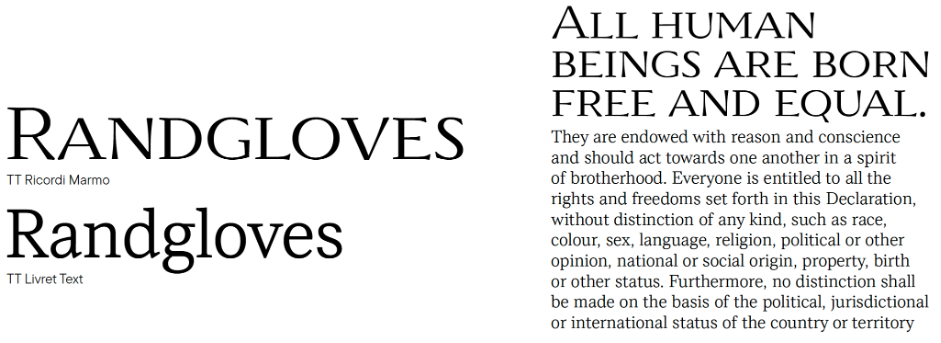
Now, let's look at the combination of serifs, which is also challenging to create. In this case, we use TT Ricordi Marmo as a display pair for TT Livret. Their graphics are obviously different. However, these fonts are similar in glyph textures—and this is what unites them.
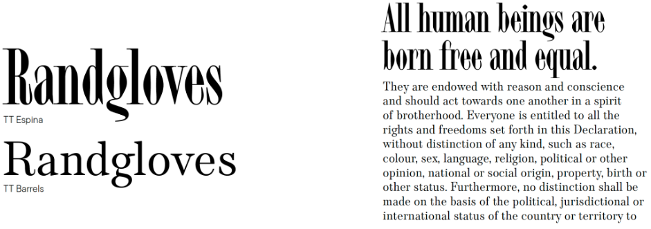
Observe another similar example that features an even more vivid font blend. Here, we can see the difference in widths and expressiveness of the fonts and their similarities in the glyph forms, graphic solutions, and the overall design texture.
Finally, we explored various ways of combining font graphics. Now, we can move on to the next level and learn how to blend their personalities. We always choose specific fonts for a reason: to convey information. We always recommend visualising how they will work together in the mockup. You can even imagine how the fonts would communicate with each other if they were people.
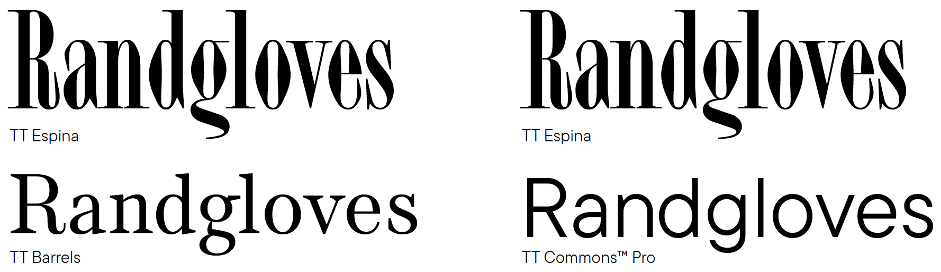
Let's take the mix of a display serif TT Espina and a text serif TT Barrels and replace the latter with TT Commons.
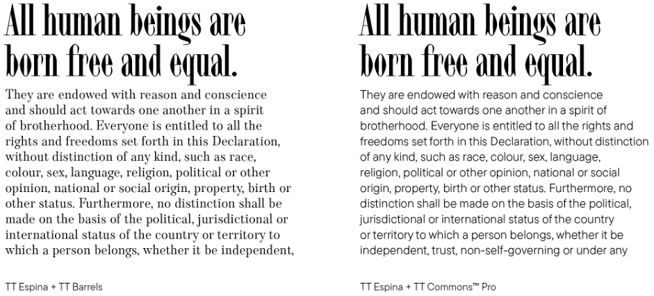
In our opinion, the nature of TT Espina tends to be anxious. TT Barrels doesn't calm it down. On the contrary, it seems to join TT Espina in this nervousness. The final combination turns out to be disturbing. This isn't good or bad—this is a fact. It would work, for example, for an atmospheric project with a Gothic aesthetic. TT Commons, in turn, matches TT Espina in fragility and elegance, but its character is also exceptionally calm. As a font pair for TT Espina, TT Commons doesn't suppress it or amplify its nervousness but serves as a background for the expressiveness of this serif.
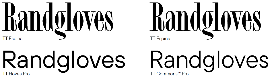
Taking things further, let's try pairing TT Espina with a confident font like TT Hoves. Curiously, these two typefaces together in large point sizes and similarly scaled don't make an impression of a balanced font pair. The solid nature of TT Hoves stifles the fragility of TT Espina. In this size, the combination with TT Commons works better.
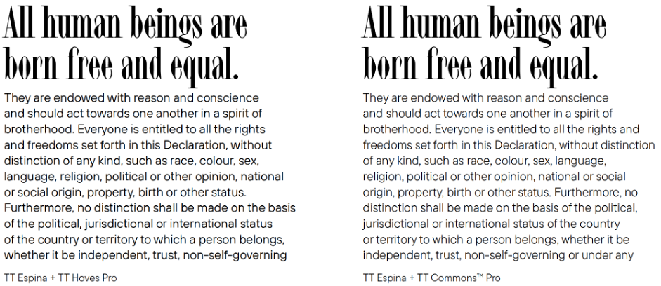
But if TT Hoves is made considerably smaller and used for text typing, it won't suppress TT Espina anymore. This way, TT Hoves offers its pair a strong shoulder while the visible contrast between the two fonts remains. TT Commons noticeably underperforms in this context.
Fonts can have surprisingly deep relationship dynamics!
Lifehacks
All this information can be unclear and scary at first. So, if you begin having doubts when choosing and mixing typefaces, feel free to use these lifehacks. First, try combining different subfamilies within one type family.
Second, consider fonts designed by one author, as they usually go amazingly well together. See it for yourself.
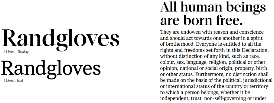
Here is a classic combination of display and text subfamilies that belong to the same typeface. This is probably the safest option.
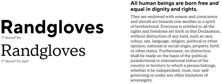
Here, you can see a standard mix of sans serif and serif from one family. However, it's a challenge to find such comprehensive typefaces.
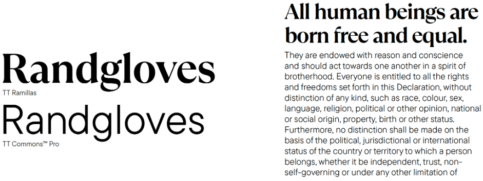
It's much easier to find fonts created by the same author. Each font designer has their signature style. Because of this, it's possible to find similarities even between entirely different fonts—in glyph constructions or design nature. This means that we still work with similarities and differences between two fonts while backing ourselves up by staying within the bounds of a particular author's style. Here, for example, TT Ramillas and TT Commons belong to different classification categories and have distinct glyph constructions, but they are still similar in proportions and overall design elegance.
Final thoughts
Let's summarise everything you need to know to mix typefaces. One essential thing is to learn to analyse fonts to feel and understand them better. This comes with a lot of practice, experiments, and attempts to find out why you like a certain typeface or font pair. Also, looking at the examples set by other projects is always useful. Another essential thing is having a very well-defined idea of your project and the font's place in it.
We called the previous section of the article "tips," not "rules," for pairing fonts for a reason. No matter how much we wish to define what's right or wrong, there aren't explicit rules for mixing typefaces. However, there are basic principles you can use to make your own decisions. After all, with skill and courage, even two fonts that seem incompatible can be made to complement each other.
Useful resources
To make it easier for you to dive deeper into the font pair analysis, we will share several valuable resources with you.
fontsinuse.com. Here, you will find real-life examples of specific fonts in various projects, see how different designers use a typeface you like, and what other typefaces they combine it with.
awwwards.com. This website features excellent examples of modern and bold web typography.
If you noticed a particular font combination on a website, these two plugins will help you find out what fonts they are:
Font Ninja is the most functional. In addition to showing font titles, it allows you to try them out for your text.
Sometimes, we switch to the second plugin, WhatFont. Its functions are more basic, but it shows the font titles when you hover over the text.
TypeType is a Supporting Foundry of GRANSHAN. This article was produced in the framework of the GRANSHAN–TypeType partnership.