
Content provided by GRANSHAN Supporting Foundries Club member TypeType.
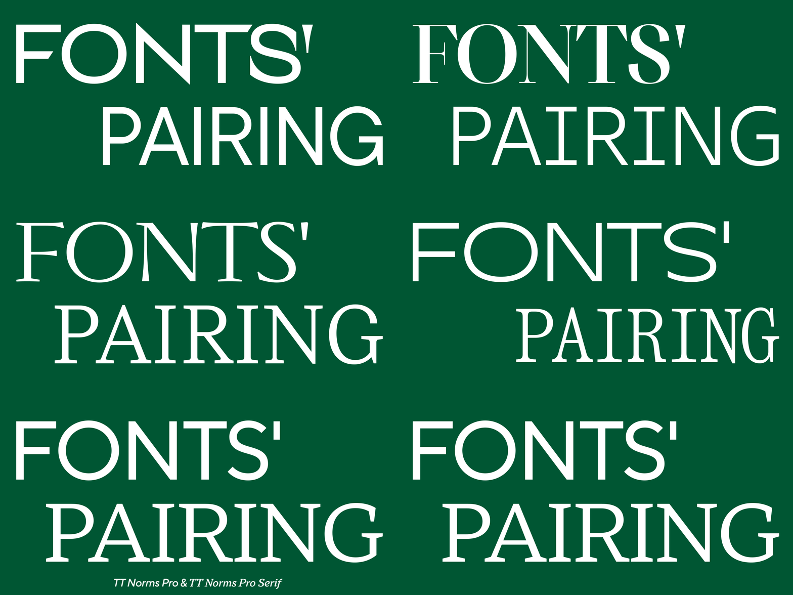
In almost any musical track where vocals play the main role, there is more than one voice part. Sometimes you don’t notice it right away, but the moments that make you get goosebumps are supplemented by another part – a tone lower or higher to accentuate and enhance the effect. Often such fragments are performed by backing vocalists so that the difference for the listener is more emotional thanks to the difference in tones.
A font can be easily imagined as a voice, because it not only conveys information to the reader, but is also a source of emotions. We have said before that the voice of a brand is its font. It’s time to talk about how to amplify the main voice of the brand using type pairs, and what the smart ways to manage the combination of typefaces to produce the desired effect on the reader are.
Moreover, using the example of creating TT Norms® Pro Serif, you can learn how font pairs are created within the same family and where they are best used.
What is a font pair?
Not all fonts will look nice in the same project. Designers know that choosing even one suitable font for a project can be difficult, and finding the perfect pair is even more difficult. But first, let’s find out what is generally called a font pair.
A font pair is a combination of two fonts in one project. The peculiarity is that in such a combination each font has its own task. As a rule, one should attract attention, and the other should convey information and not interfere with reading the text. Headings and emphases are set in the first typeface, and the main text array is set in the second.
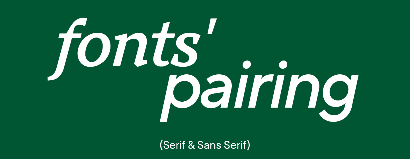
An important factor is that there must be chemistry between the two selected fonts; they must complement each other well. Otherwise, magic will not happen, and the reader will not experience the emotion inherent in the brand.
The process of choosing such fonts is creative. There is no set of rules that determines exactly whether fonts will fit together or not.
What font pairs are for
Of course, you can use one typeface for a brand without making the task more complicated by searching for a pair. This is the easiest and safest way for a designer.
The truth is that this path is not always suitable. Human attention works in such a way that it is difficult for us to focus on monotonous things for a long time; we need anchors. When reading, such anchors are sections of text that stand out visually.
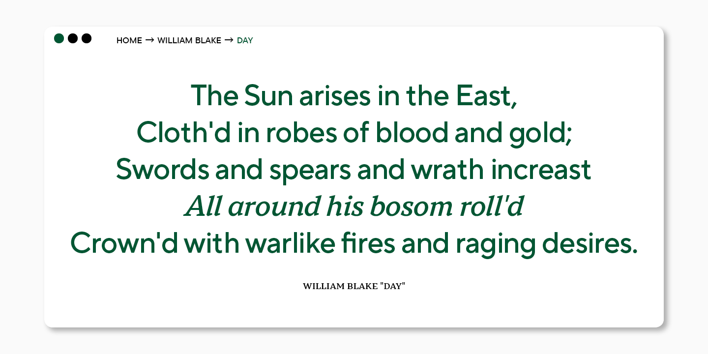
The font pair helps to direct the reader’s attention. A larger font size and an expressive font that differs from the one in which the bulk of the text is set will help to read the title. Highlighting functions in the main body of the text will be taken over by italics or bold.
By using two different fonts, you will make it easier for the audience and strengthen the emotional message of the brand.
Font combination principles
You can find dozens of articles about font pairs, but none of them provides clear rules for choosing one. Many components are responsible for the chemistry between fonts; not all of them can be formulated as instructions.
However, we will talk about creating a font pair for the studio’s best-selling TT Norms® Pro, so that later we can provide recommendations from the studio. They will help in the future when choosing a harmonious combination of fonts.
TT Norms® Pro Sans and TT Norms® Pro Serif
TT Norms® Pro is TypeType Studio’s number one bestseller. The font has become the voice of brands like Cartoon Network, Sartorius, Intercom, CSN and many more.
Part of its popularity is thanks to the fact that TT Norms® Pro is a geometric sans serif with a neutral character. This is a versatile typeface, modern and stylish; its character can be easily adapted to different areas.
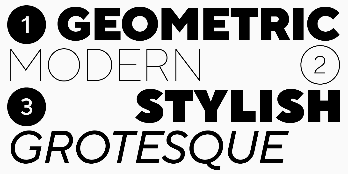
The font family has been expanded several times, with the addition of a monospace version of TT Norms® Pro Mono, new styles and languages. Due to its versatility, choosing a font pair for TT Norms® Pro is not difficult, but TypeType Studio decided to develop the perfect pair and create a serif font that would harmoniously complement the sans serif.
We wanted to create not just an addition to the classic version, but a text font that designers can use on its own or in combination with other fonts.
We started with a research project in which we studied large font families from other studios and authors, in which both serifs and sans serifs were present. In the test version, we were exploring how similar to TT Norms® Pro we would want the new serif.
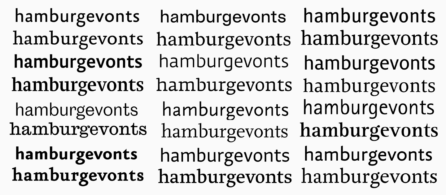
The final version of TT Norms® Pro Serif is a balance between the similarity of characters and the visual difference in forms.
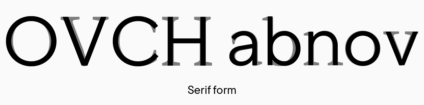
TT Norms® Pro is a sans serif with low contrast and moderate character. As you know, serifs and high stroke contrast are notable for serif fonts, but changing these two components is not enough to create a pair.
In order for the fonts to blend flawlessly and have chemistry between them, you need to add something else that will make the serif a truly standalone font.
TT Norms® Pro Serif has its own distinctive features.
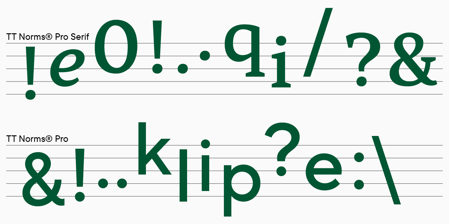
The font has become harder. The inflows of the arches and the shape of the semi-ovals have changed.
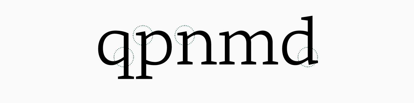
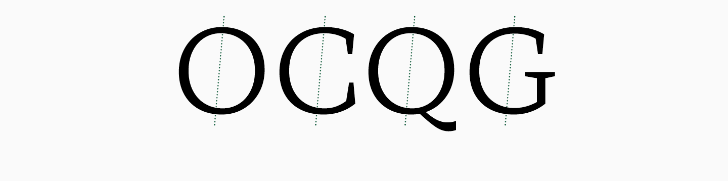
The circles of signs remained round, and ovals have become more dynamic. In TT Norms® Pro, the oval is vertically symmetrical, while in TT Norms® Pro Serif, a slope appears in round characters.
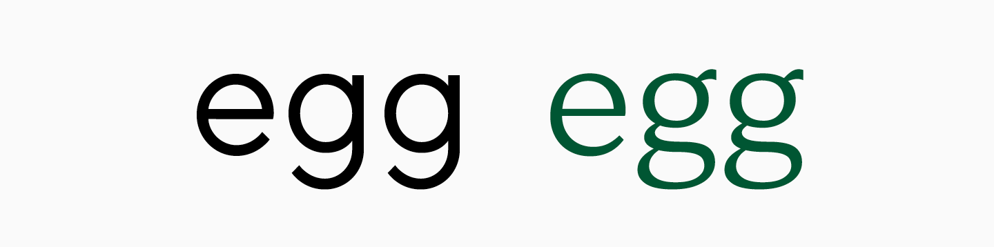
The letter g changed its shape and became two-storey, which is typical for most serifs, but rarely found in grotesques.
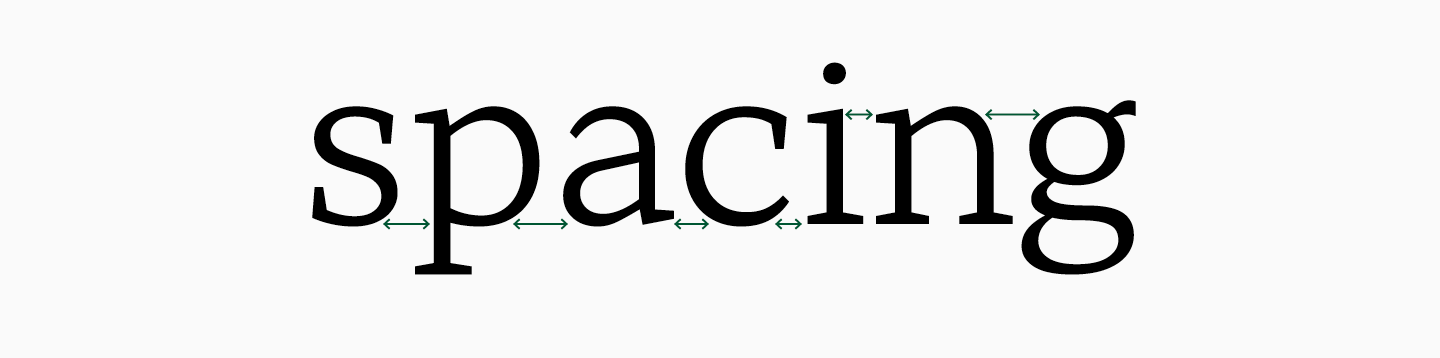
The font has become slightly wider due to the serifs, but the spacing looks denser as the serifs visually take up more white space.
Despite the differences, the characters of the fonts are similar in many ways. This can be perceived visually and is apparent when looking at the structures carefully.
The height and proportions of the characters remain the same. This makes it easier to use them together, because you can put fonts side by side, even on the same line, without losing visual harmony.
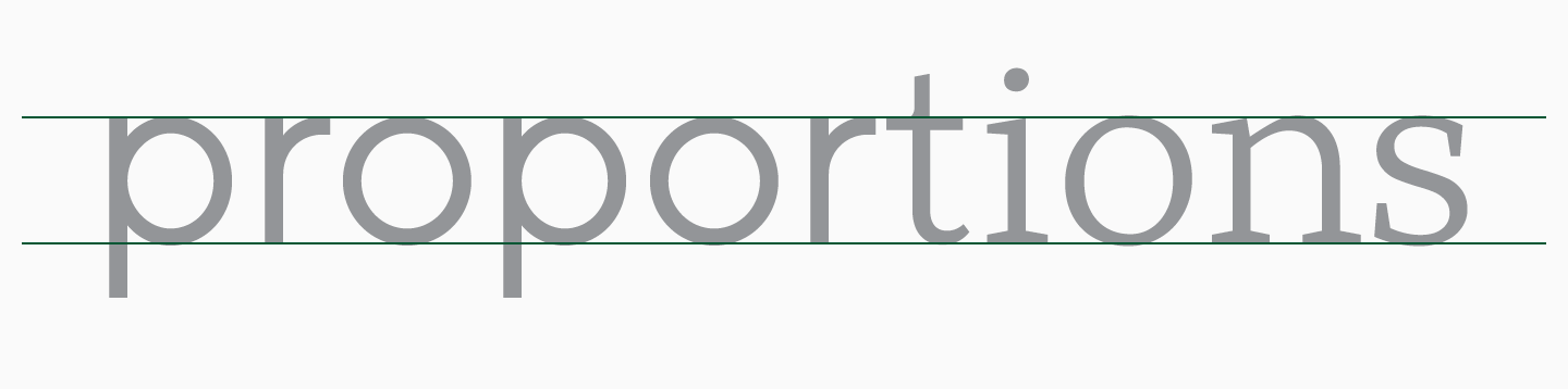
The same openness of apertures and the similar construction of many characters, such as t, k, r, and q, help fonts blend.
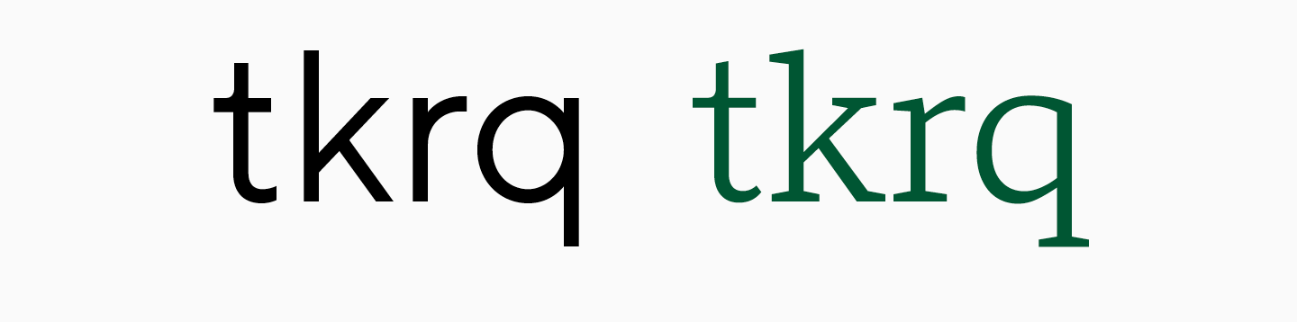
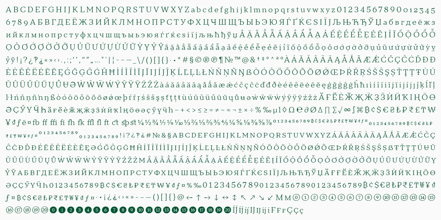
The character set of the fonts is almost identical; TT Norms® Pro Serif has extended Cyrillic and Latin, a variety of currencies and punctuation marks.
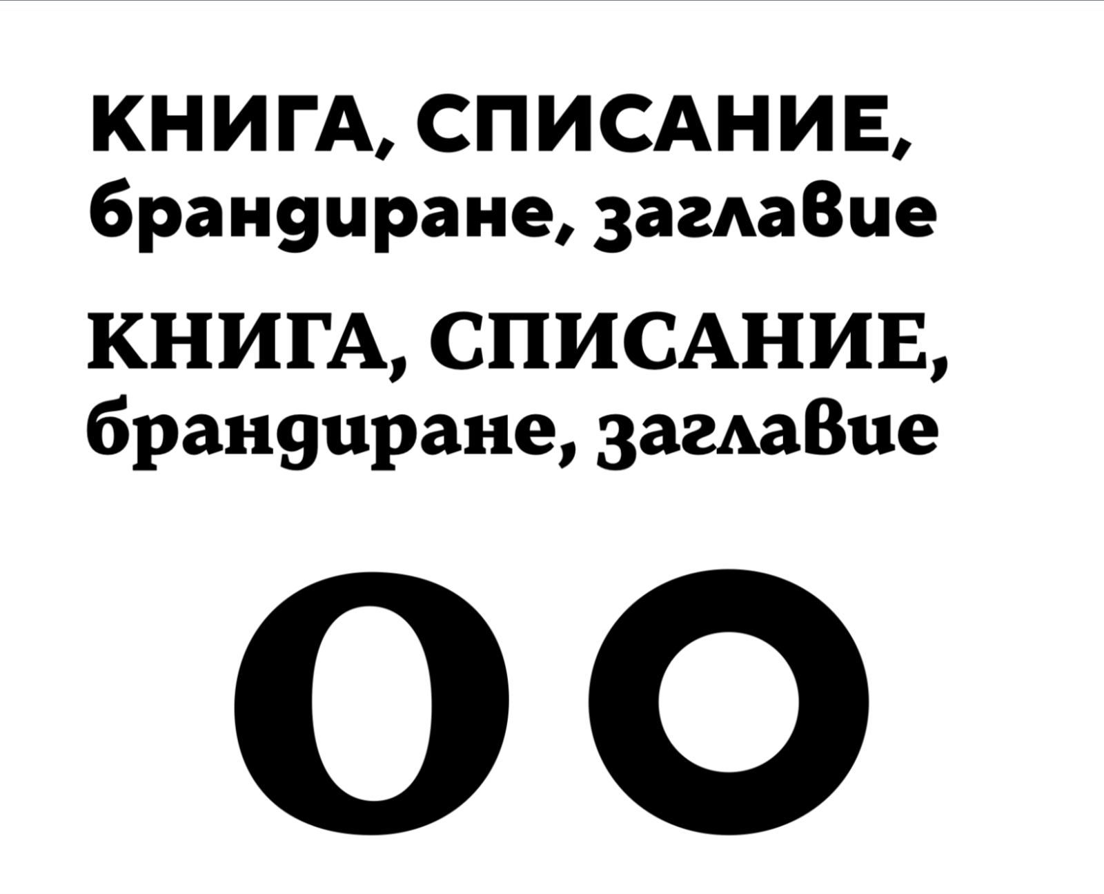
Where the pair actually holds beyond Latin: Cyrillic
Notice that Serif's character set stops at Latin and Cyrillic - no Greek, no Arabic. So Cyrillic is the only non-Latin script with a real pair, and TypeType could explain exactly how the relationship survives there.
Serif's proportions follow the sans, but serifs and contrast introduce their own shifts: Cyrillic round characters in the serif read more elongated than the sans's near-geometric ones - visible in the letter "б." Contrast makes the lowercase read more dynamically, and looser spacing in the serif keeps the running text density matching the sans. There's also a deliberate slant-axis shift in round characters - absent in the sans, present in the serif - specifically so the serif reads as self-sufficient rather than a copy. None of this is a Cyrillic-only rule, per TypeType: the same design logic that governs the Latin pair applies here too.
Greek
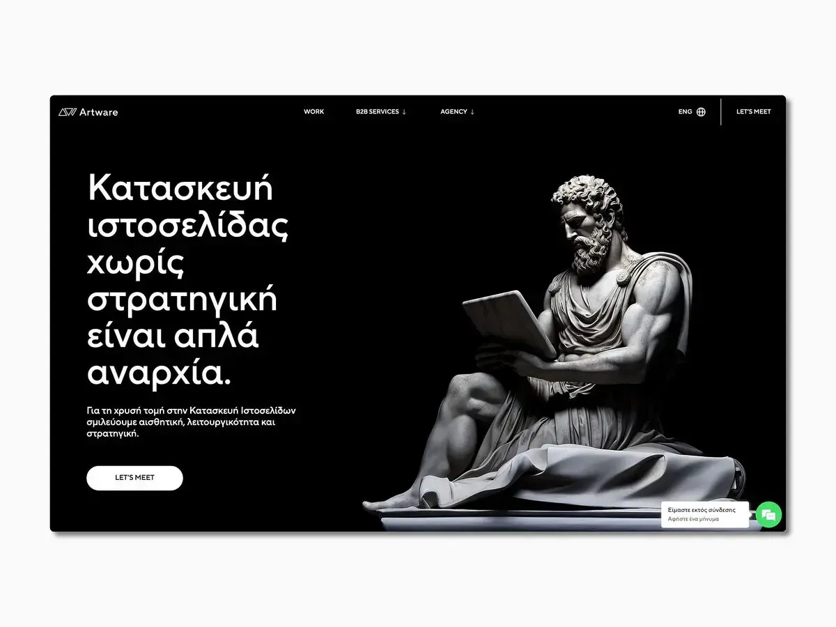
TT Norms® Pro's sans also covers Greek. Each script was treated as its own design project - researched independently and reviewed with outside specialists.
TypeType is a Supporting Foundry of GRANSHAN. This article was produced in the framework of the GRANSHAN–TypeType partnership.