Supporting foundries are essential to GRANSHAN’s daily operations. This partner plays a crucial role in our success, and we are grateful for their support. Explore this page to learn more about the foundry that helps make our work possible.
TypeType
TypeType studio is a type foundry that has spent the last eleven years mastering the craft of creating typefaces. Our collection features more than 75 font families, from neutral sans serif to elegant serif typefaces, providing versatile fonts with unlimited potential as well as expressive display fonts with distinctive character.
TypeType’s central values, in addition to our dedication to the craft, are constant self-improvement and striving for excellence. Our mission is to create and share well-designed, highly functional, versatile typefaces while remaining visionaries and passionate artists.
Here are some of our typefaces.
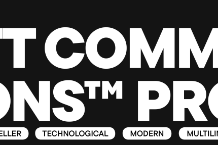
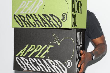
TT Commons™ Pro is a geometric sans serif with limitless scope. This is one of the studio’s most popular fonts, known for its versatile nature and functionality.
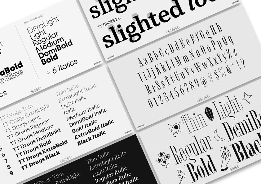
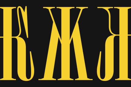
TT Espina is a charming display Antiqua with expressive serifs, closed aperture, and diamond-shaped circles. It’s one of our most awarded typefaces.
TT Biersal is a unique and energetic typeface inspired by early 20th-century typography. Its main feature is the ability to slant on both sides.
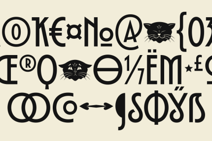
Fluid lines and delicate Art Nouveau forms in TT Modernoir blend seamlessly with the rhythmic flow and improvisational freedom of jazz.

What are the challenges and opportunities in designing multiscript fonts? How do you see multi script typography develop and used now and in the next decade?
»Various linguistic cultures are rich in traditions that have been shaped not only by writing instruments, such as broad-nibbed pens and the angle and direction of pen strokes but also by historical contexts that determine the specific way a glyph is drawn.
People who possess knowledge about Arabic, Greek, or Cyrillic writing systems are aware of all mentioned above. However, when non-speakers encounter a new alphabet, they face challenges because of unfamiliarity with these specifics. This is the main issue when designing multiscript fonts.
Fifteen years ago, many studios entered the Cyrillic typeface market with their versions of famous European font families. Due to the font brands being well-known in European countries, these typefaces gained immense popularity within Cyrillic regions. At the same time, these typefaces appeared somewhat inconsistent in the graphic representation of certain letters, mainly because of the unfamiliarity with certain Cyrillic traditions. This situation has taken a turn for the better over the last few years, as font experts specializing in Cyrillic began to be involved in solving tasks related to this script.
Font families, especially the most popular worldwide, have a tendency to expand with the addition of new scripts. However, without local experts, this expansion is not possible. For this reason, we are collaborating with typography experts who work with their native languages and teach our type designers all the distinctive traits of their typography culture.
A clear example of the need for language extensions in fonts is technological companies aiming to have a presence in various parts of the world and maintain consistency in their brand typography across the regions they serve. In many cases, companies choose their fonts not just for the graphic style of the family but also for their language support, ensuring they encompass the regions where they have a presence.
I believe this trend will persist over the next 5-10 years, possibly beyond, because broad language support significantly expands the capabilities of typefaces, positioning them at the forefront of their competitors.«

