The Hinglish Font
Despite the superficial distinctiveness of English and Hindi, the two borrow from the same phonetic pool - the Indo-European group of languages. Shirin Johari’s font design playfully highlights these commonalities and makes Hindi more approachable.
“More than 10 million tourists visit India every year. They’re faced with a million signs everywhere, most of which are in Hindi. I wanted to demystify it and have fun while doing so. And so I designed a typeface - The Hinglish Font. A typeface that would make Hindi less intimidating and more friendly.”
– Shirin Johari
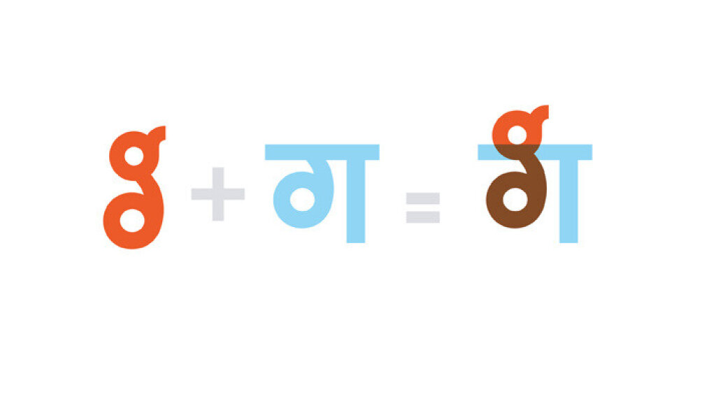
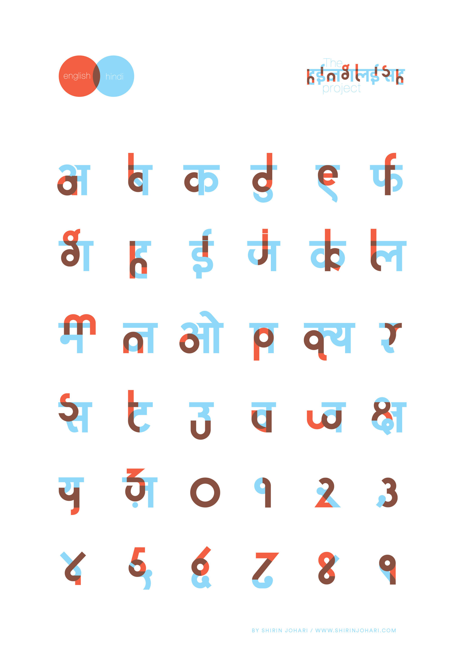
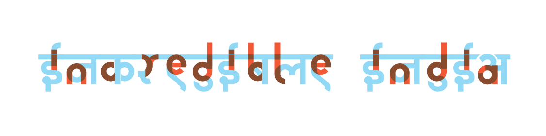
Through this unique fusion-font design, you can tell the phonetic sound of a Hindi character by looking at the corresponding English alphabet superimposed on it. While this font cannot teach you how to read words as they are spelt in Hindi, it demystifies individual letters.
The Hinglish Font has received wide recognition for its innovative approach to script design. It was awarded Gold in Typography at the Cannes International Awards in 2012 and exhibited at the Triennale Design Museum in Milan in 2013. The font has been leased by major brands including Microsoft, Signal, the Hyatt Group of Hotels, and Eki Beki. Its collaterals have ranked among the top five best-selling merchandise at Kulture Shop between 2014 and 2024. The project has also been featured in several prominent publications such as Biscriptual, The Times of India, Business Standard, and The Economist.
The Hinglish Font merchandise is now selling at the Linden Museum Shop in Stuttgart.