As part of GRANSHAN’s mission to celebrate global typographic diversity, we continue our interview series Talking with GRANSHAN Script Experts.
In each edition, we speak with the people shaping the future of the world’s writing systems, exploring their stories, challenges, and visions for type design across cultures.
Our third interview features Titus Nemeth, a typographic designer and historian from Vienna with more than twenty years of experience. Working at the intersection of design and historical research, Titus focuses on Arabic and multilingual typography and holds a PhD from the University of Reading, UK.
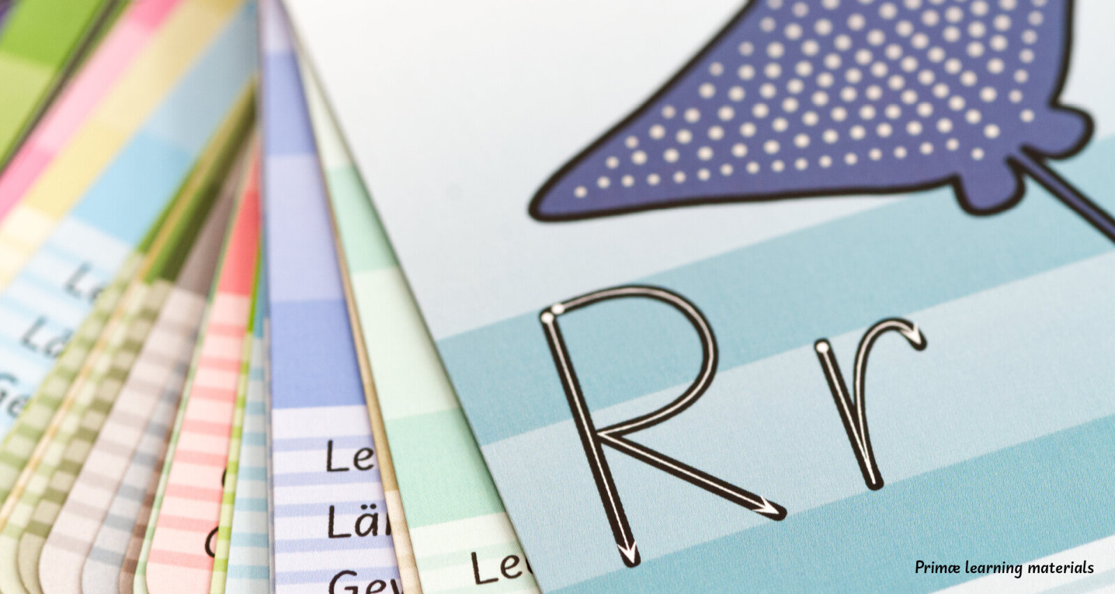
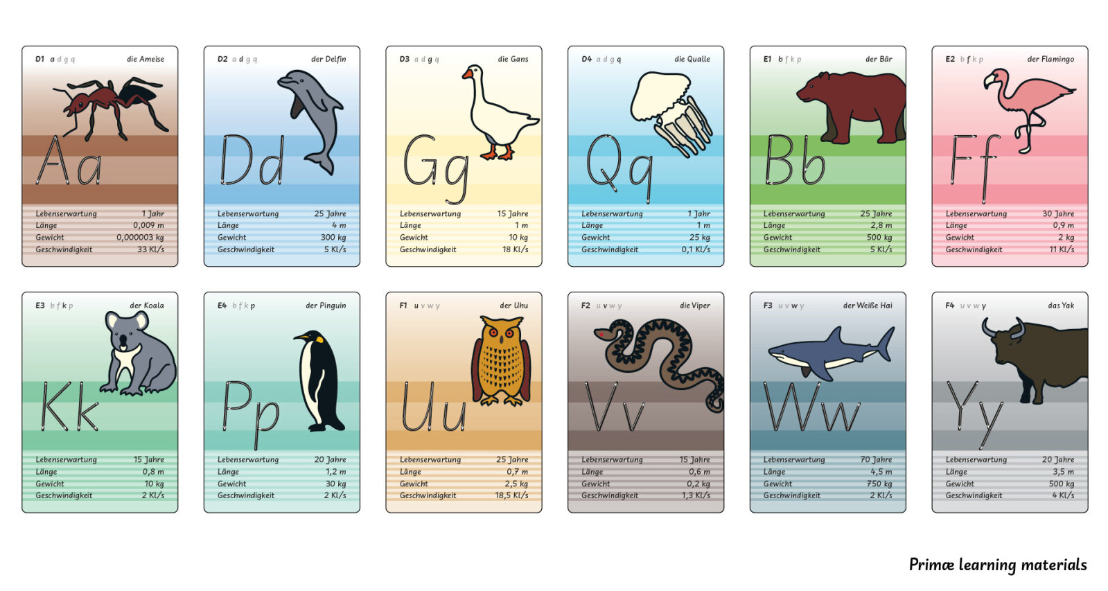
Your type designs have won multiple renowned awards and are widely used for complex cross-cultural visual communications. However, you have also recently spent a considerable amount of time working on teaching materials for children learning to read and write. For example you have developed the Austrian school font Primæ together with Martin Tiefenthaler. Could something like this also be transferred to the Arabic script?
Two years ago, I had the idea of adapting Primæ for Arabic and offered it to a Saudi institution I had met through scholar and type designer Thomas Milo, who has been working on improving Arabic typography for many years. Unfortunately, nothing came of it. As far as I know, this field is pretty much untapped, which is a shame because there is definitely a need for it.
You are active in the Script Group Arabic at the GRANSHAN Type Design Competition, contributing a historically informed design perspective. Could you briefly describe the script?
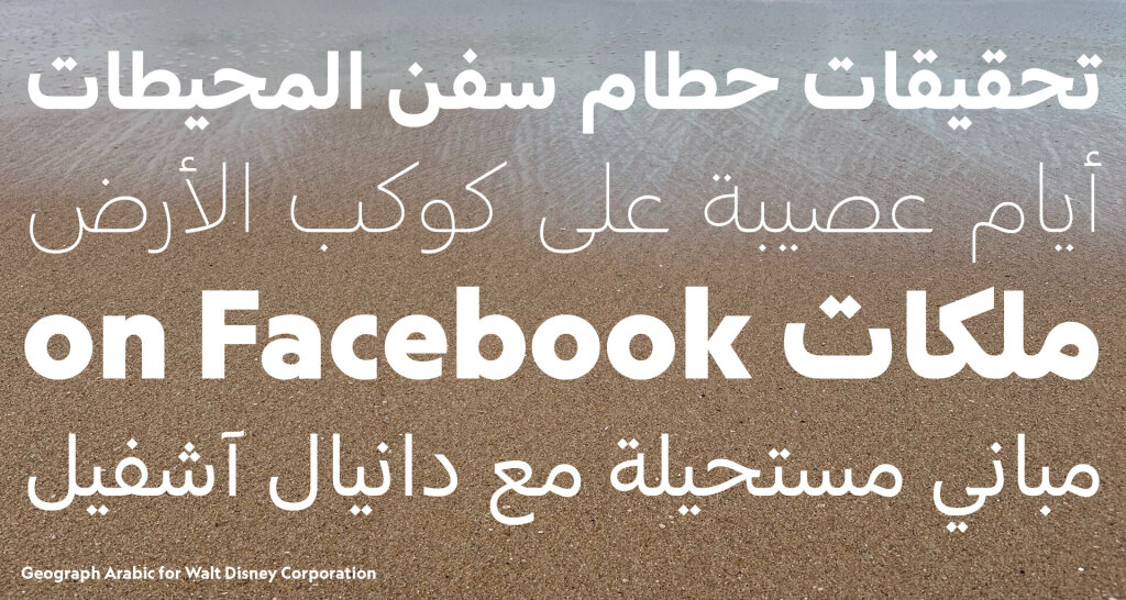
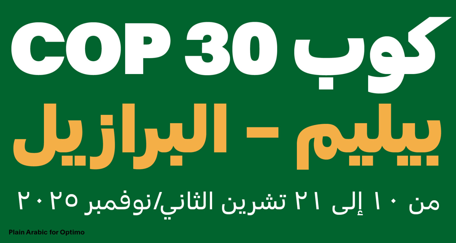
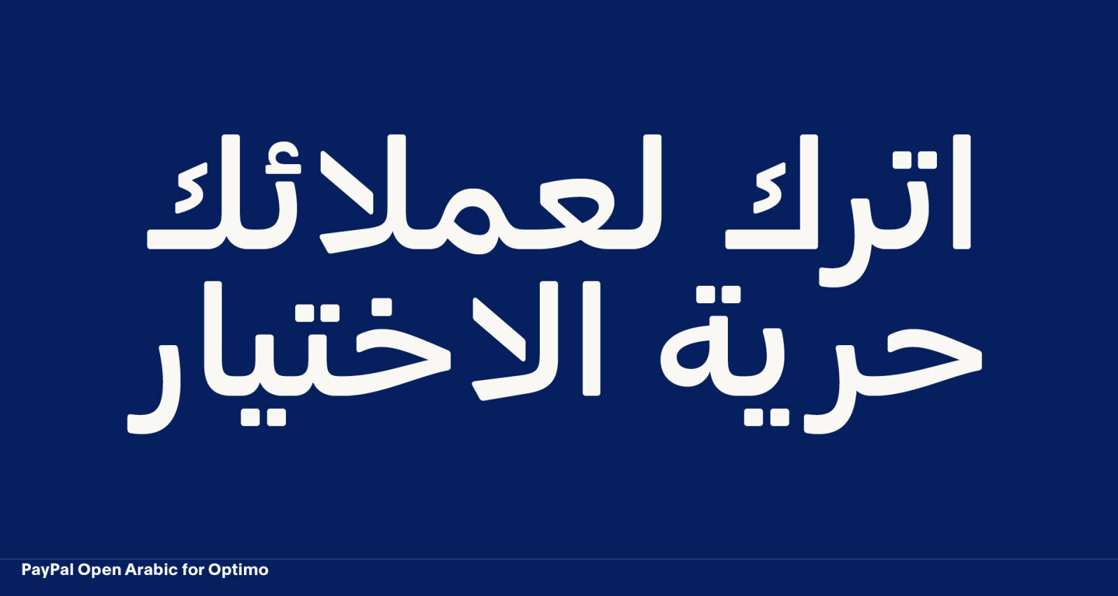
Arabic is renowned for its fabulously rich manuscript culture. As with many scripts around the world, its typographic history is much shorter, but its evolution has sped up considerably in the last quarter of a century. The tension between its past grandeur, the globalised typographic design language, and the attempts to conceive suitable forms of Arabic script in this context define much of what is happening in this field today. Although Arabic is one of the world’s most widely used scripts, it is widely associated with the Arabic language. This is somewhat reductive when you consider the diverse and exciting writing cultures that have evolved in other languages, such as Urdu, Persian, and Uyghur.
Do all these writing cultures use the same letters?
Arabic is mostly used as a consonantal script, meaning that it primarily represents consonants and a subset of vowels, which are used only in certain contexts. The 29 letters that are used to represent the Arabic language are written from right to left in a joined manner, but six letters only join from the right and require an interruption on the left hand side. Languages like Persian, Urdu, or Pashto require additional letters and differ in orthographic details. Kurdish written with Arabic letters is altogether different, in that it employs the script in an alphabetic fashion.
What are the major technical challenges in working with this script?
I see the biggest technical challenge for Arabic typography in the inadequate support and controls of layout software. Font technology could do much more if the applications would offer more complete implementations of technical specifications. Interfaces for the control of Arabic script characteristics are minimally developed and have barely evolved over the last twenty years. The principal players seem to have little interest in changing this situation.
Given that Arabic is one of the most widely used scripts in the world, do you have any idea why this is the case?
Of course, you would have to ask the software manufacturers, but as an outsider looking in, you could interpret this as simply meaning that there is no business case. You can still sell licences and digital services even if only minimal language support is provided. This has been the case since around Windows 2000 – end of interest. Potential customers are of course also partly responsible; here it is more a question of education. But as we know, typographical quality is not one of the Middle East’s most pressing problems.
Many people associate Arabic script with calligraphy. However, there are also geometric, low-contrast fonts. Is the association with calligraphy a misunderstanding?
Due to Arabic’s rich manuscript culture, there is a romanticised and misconceived notion of the script’s »calligraphic« nature. Just because letters are written in a joined form does not make it calligraphic per se and not every Arabic scribble is calligraphy. What is more, Arabic calligraphy is often completely misunderstood as an artistic expression marked by freedom and individuality. Traditional Arabic calligraphy is utterly rules-bound and only permits the narrowest of margins for individual interpretation. Thomas Milo described this very well, comparing it to different conductors performing the same musical piece. They cannot and don’t change the score, but may still perform the nominally »same« music quite differently. Artistic forms of calligraphy are of course a different story, but also of minor relevance for typography.
Interview by Antje Dohmann