Splinter
by Namrata Goyal, Frederik Berlaen
Script group:
Indic/South Asian Scripts
Category:
A2 Display Typeface
Typeface competition:
13th GRANSHAN Type Design Competition 2023/2024
Remarks of the jury
The panel felt that this entry deserved special mention for the effort to approach design in an experimental manner and with a technical effort that was commendable. The design had potential and needs work to refine this further and to ensure the typeface is legible. However, with this addressed, it would could be a unique display typeface that brings together research, historical relevance for contemporary and modern use.
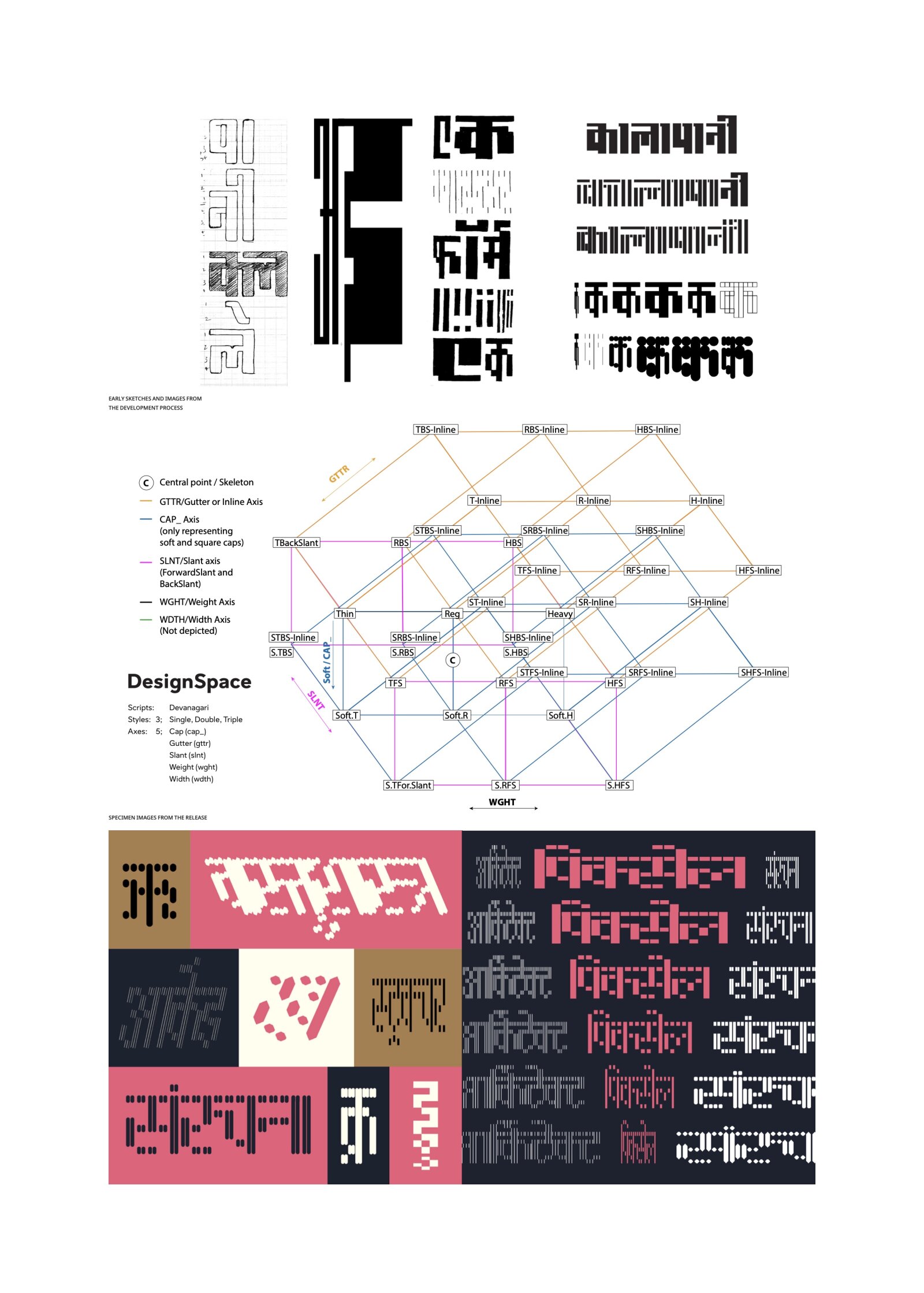
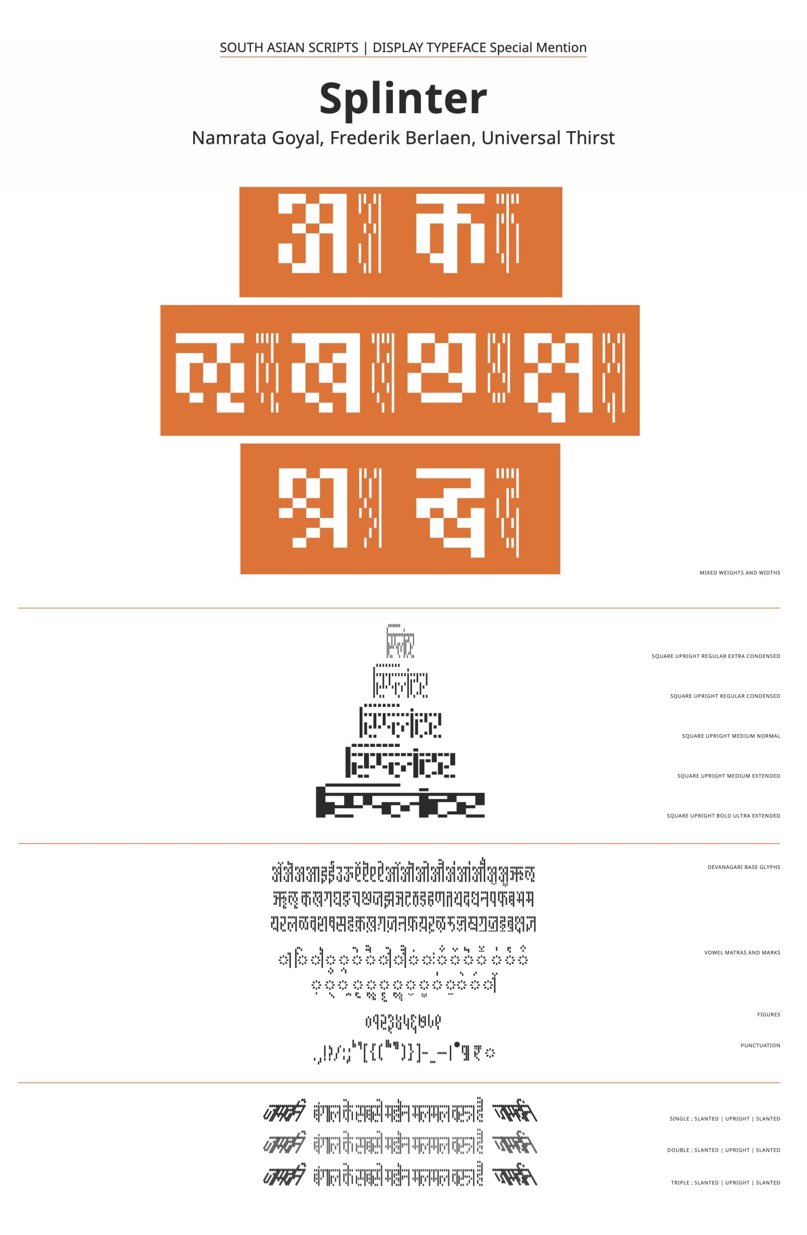
Description of the typeface by the submitter
The seed of this design lies in a piece of lettering found in a long-forgotten book on an old bookshelf, which was filled with 1960s-70s titles, mostly in Hindi. This typeface explores variable axes in a grid-based modular design space, pushing legibility to the extremes and creating letterforms that can be used beyond text– as patterns, or other graphic elements. It would not be a stretch to say it is the first of its kind in modern Indic Types. At the centre of the design space is a pliable, pixel font. This source stretches into five variable axes and three binaries for inline styles. Presently, the typeface supports the basic Devanagari unicode sets, some (not extensive) support for conjuncts, Marathi and Nepali glyphs, numerals, symbols and punctuation. As it develops– alongside more experiments with the design space, the font will expand to cover Latin diacritics followed by other scripts down the line. Version 1 was published in November 2023.

