Special Mention
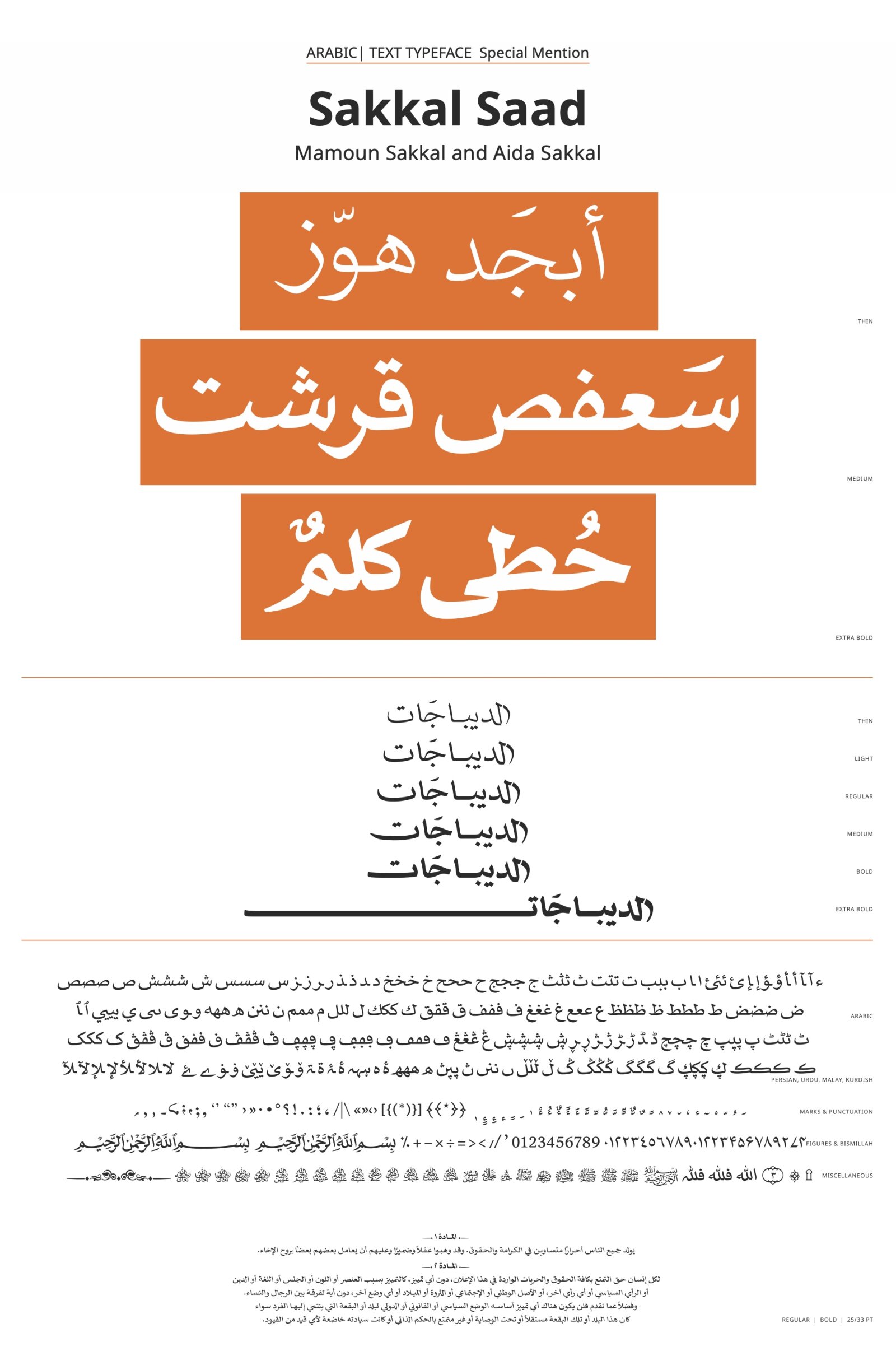
Sakkal Saad
by Mamoun Sakkal, Aida Sakkal
Script group:
Arabic derived Scripts
Category:
A1 Text Typefaces
Typeface competition:
13th GRANSHAN Type Design Competition 2023/2024
Remarks of the jury
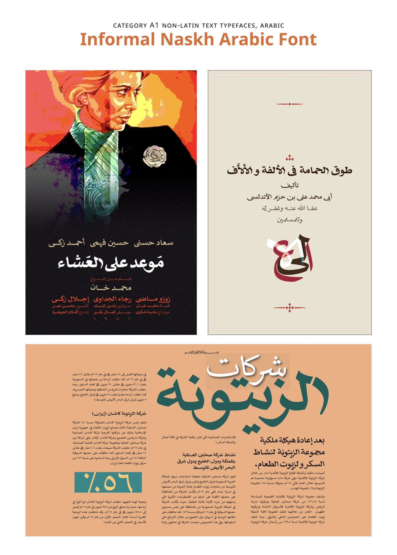
The typeface evokes a vintage aesthetic and effectively draws inspiration from popular Arabic film poster lettering. Its inspiration comes from the mid-20th-century newspaper Naskh, a renowned and well-established style. However, it would be beneficial to see interpretations that extend beyond the traditional Naskh models utilized in its creation.

Description of the typeface by the submitter
A little bold, a little chunky, a little playful - this font is a fun Naskh with both traditional and modern design elements. The flat baseline connection is broken up by the occasional dropped connection and contrasted with sharp angles, both contributing to the font’s overall informal yet regular rhythm. With six weights from Thin to Extra Bold, the font is ideal for long text setting especially for books and magazines. It has very compact vertical proportions for space economy while maintaining legibility. The sharp strokes of the pen are clearly expressed for a contemporary look and the fine characteristics of Naskh calligraphy are emphasized. We have also introduced a large number of fine contemporary typographic details for visual appeal. There are three swash options and a compact option; many alternate marks, letter forms, and spacing options; as well as flat tails to emphasize the bold baseline.