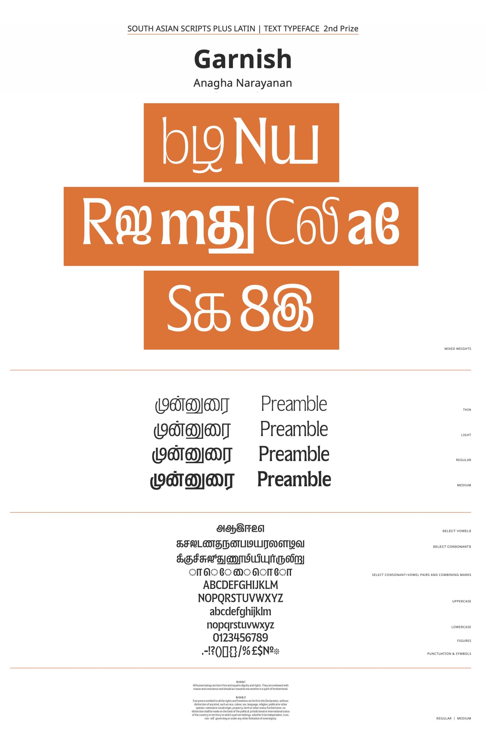
Second Prize
Garnish
by Anagha Narayanan
Script group:
Indic/South Asian Scripts
Category:
B1 Text Typefaces with a latin complement
Typeface competition:
13th GRANSHAN Type Design Competition 2023/2024

Description of the typeface by the submitter
These text and sans styles are part of a larger family that also consists of a display style. The Latin & Tamil type family consisting of 3 subfamilies is designed to provide a rich typographic palette for editorial design. It questions the idea of optical sizes by proposing a display that is “same but different” from the text styles. The design space is inspired by typesetting of Tamil magazines which feature varied fonts in use in a single book. The modulated text subfamily is the basis of the 2 text subfamilies. This style does not tone-down the display but instead starts at a different point. It is a sturdy serif with wide proportions, generous curves and a fusion of varied references. The italic has vertical cut-offs on select terminals which is a take on Tamil’s italics being not a "true Italic" but more of a slanted style. The Sans is a grotesque that retains some of the peculiarities from the text style and the text duo is a nod to antique-grotesque pairs from 19th century.