Complete the sentence: Everyone is searching for. and finds it too.
What are the most important factors in assessing font quality? What challenges need to be addressed, and what do you pay special attention to within the script group?
The most important factors in assessing font quality include legibility, artistic value, technological sophistication, and cost-effectiveness. Additionally, the clarity of letter shapes and ease of readability are crucial. Fonts must adhere to graphically consistent criteria, such as the distinctive individuality of letterforms, simplicity in the contours of glyphs, precise and well-defined shapes, and rhythmic font graphics.
The main challenge in the Georgian script group, which remains unresolved, is the lack of well-developed printing fonts.
What are the most common mistakes font designers make?
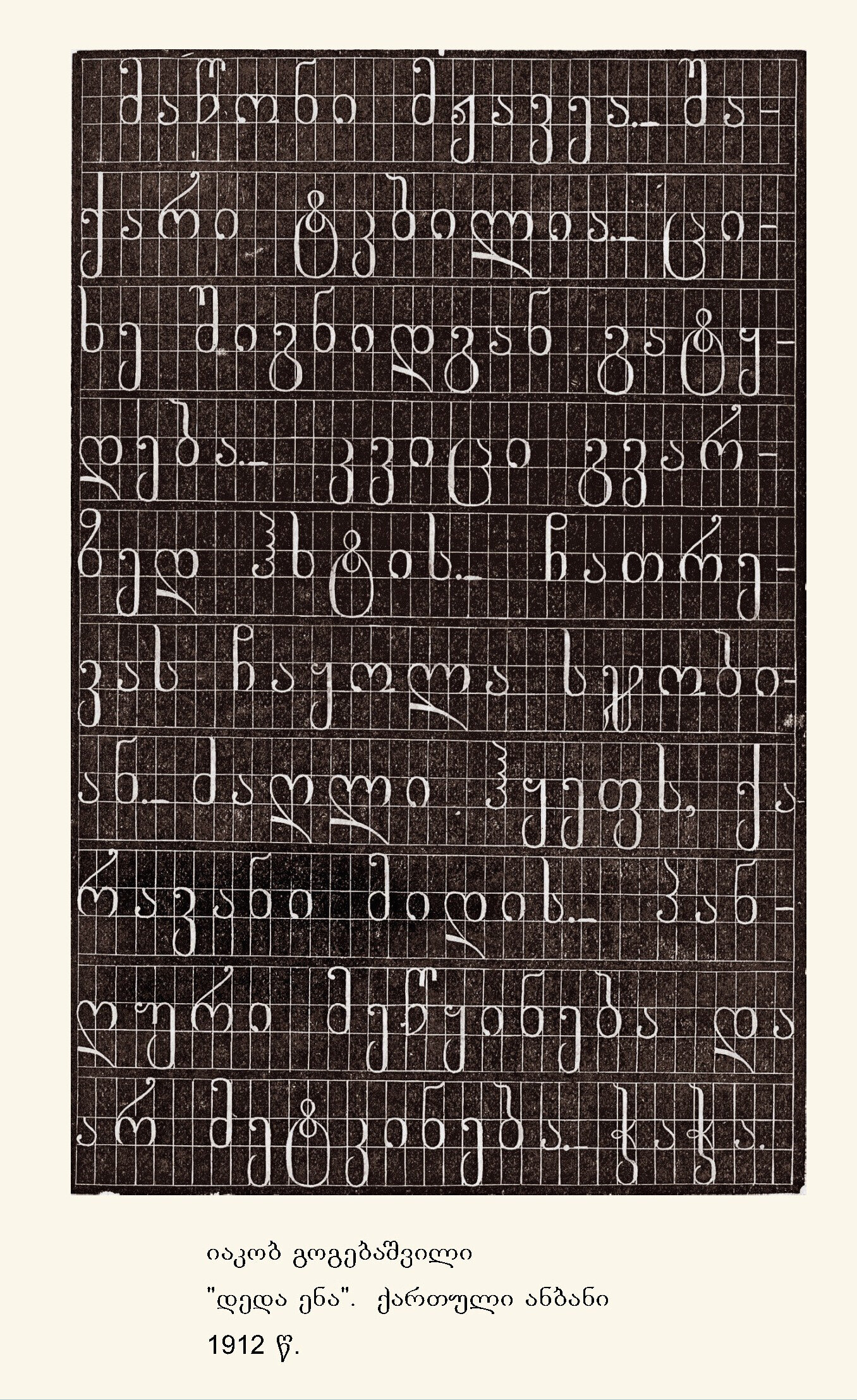
Simply put: quality and kerning. Artistic fonts rarely face issues, but when it comes to text typography, traditional graphemes are often altered in the name of modernity. This transformation can compromise the classical forms and result in unsuccessful visuals. For example, the Georgian letter ‘’ტ’’ is often simplified in a modern design, appearing as a circle with a descending line. Yet, the classical form has such beautiful graphemes!
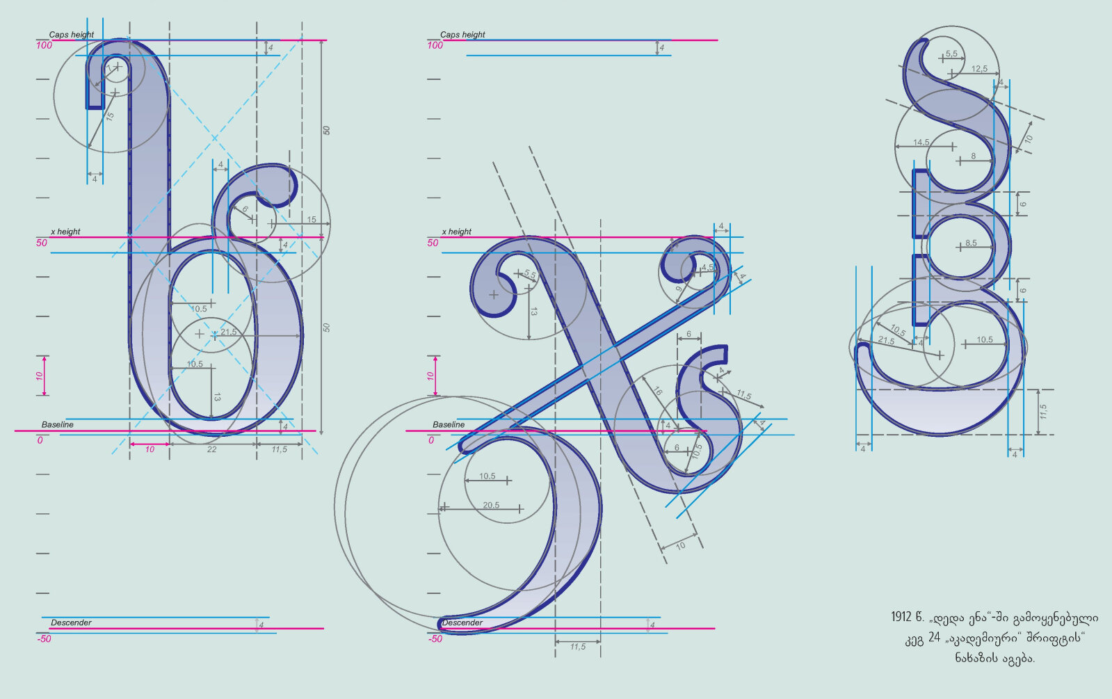
Georgian letter modules are proportional (middle, upper, and lower sections are balanced), whereas Latin letters predominantly have an extended middle section. When adapting Georgian to Latin standards, we are compelled to expand the middle section of Georgian letters to align with Latin proportions, which creates a divergence from Georgian classical standards. This is why I believe fonts should first be developed natively for Georgian script and later adapted to Latin.
