Second Prize
Snark
by Anna Uppit
Script group:
Cyrillic
Category:
B2 Display Typefaces with a latin complement
Typeface competition:
13th GRANSHAN Type Design Competition 2023/2024
Description of the typeface by the submitter
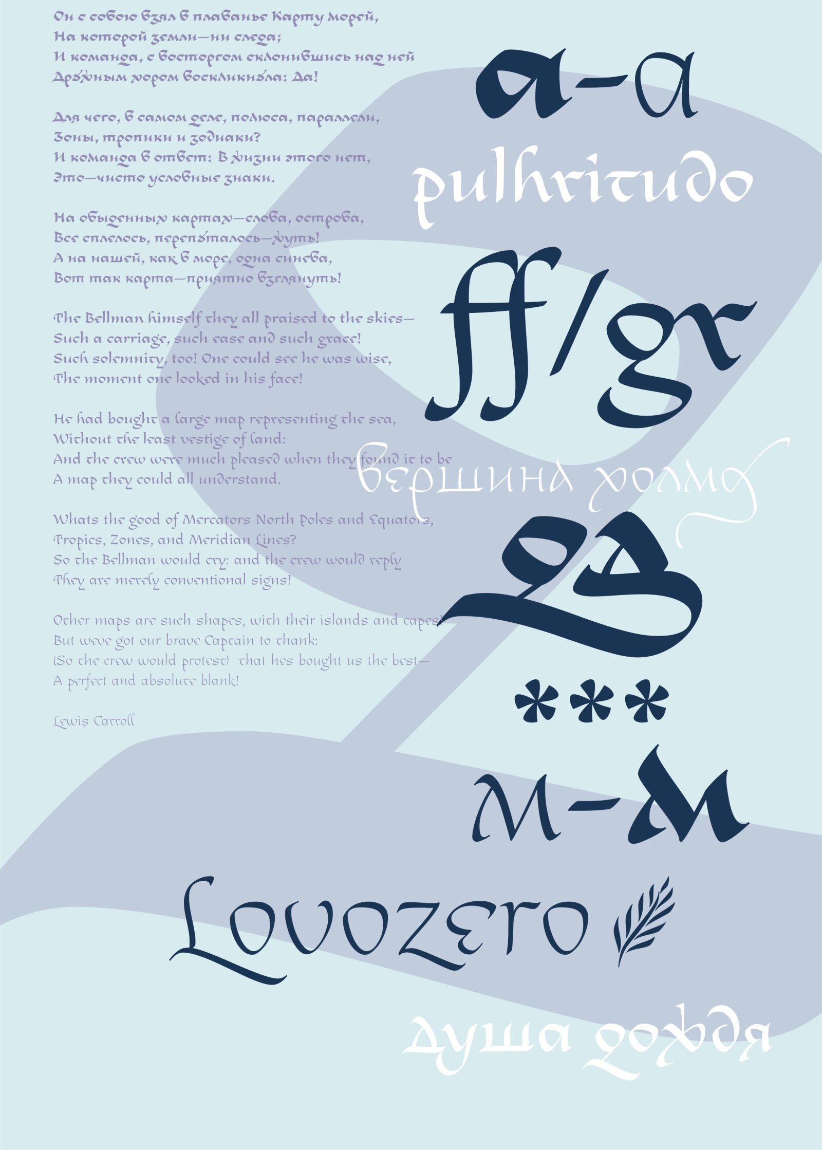
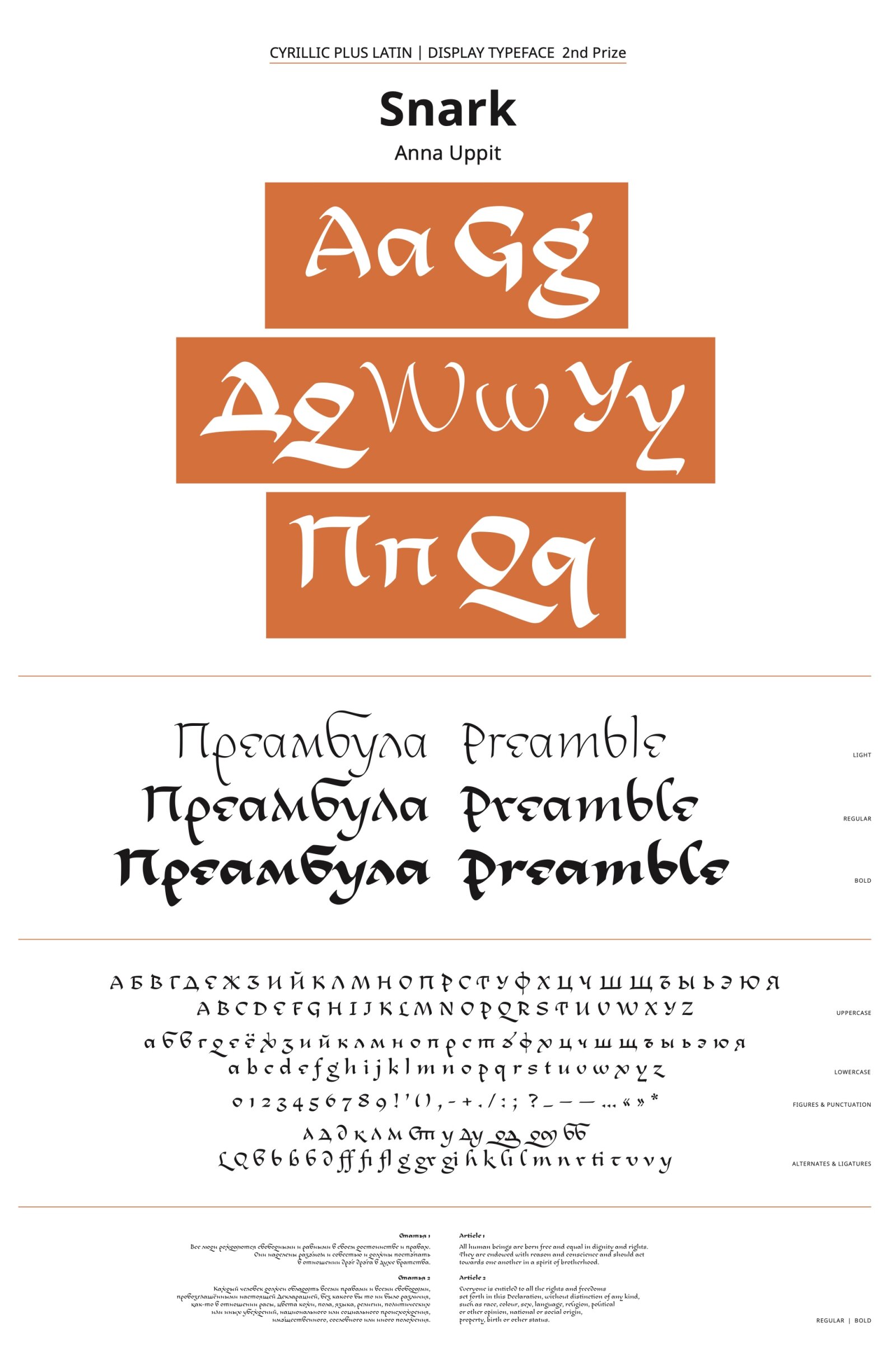
Snark is a calligraphic typeface based on the author’s interpretation of Russian unique script from the 16th–17th centuries which is called Skoropis’. Its name comes from Lewis Carroll’s poem “The Hunting of the Snark” and, like the poem itself, symbolizes the pursuit of happiness. The idea for the typeface was born during the study of historical scripts and calligraphic experiments with them. Skoropis’ is one of my favorite writing styles—bright, distinctive, and polyphonic, with wonderful graphic techniques that can work in modern design. Despite the typeface being a modern interpretation, it still retains the main features of Skoropis’. Snark works well in both large sizes and texts, and is particularly suited to poetry.

