SFT Sushka
by Yulia Gonina
Script group:
Cyrillic
Category:
B2 Display Typefaces with a latin complement
Typeface competition:
13th GRANSHAN Type Design Competition 2023/2024
Remarks of the jury
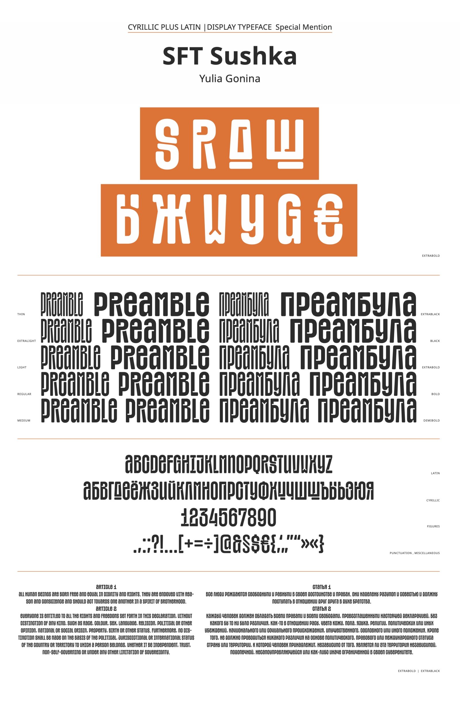
Exciting idea of unicase letterforms both in Latin and Cyrillic that enjoys liberal intrusion of counterforms.
Due to the jury’s decision, this typeface has been moved from the B1 Cyrillic-Latin Text Typefaces to B2 Cyrillic-Latin Display Typefaces Category.
Description of the typeface by the submitter
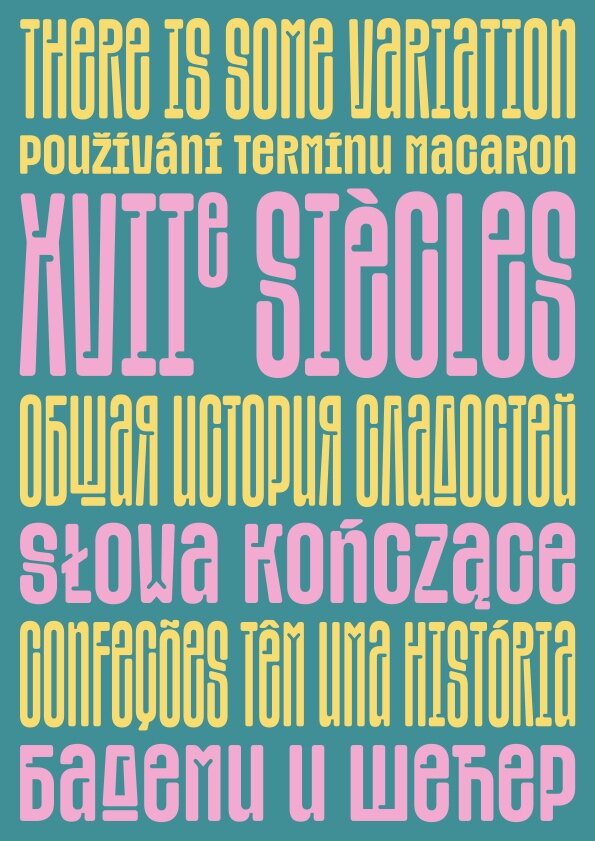
The driving idea behind this typeface was my observation of designers constantly grappling with protruding diacritics in narrow line spacing. When it comes to large headlines, and the desire to reduce white space, it’s not just about adjusting letter spacing — designers also want to narrow the line spacing. This is not a problem in English, but many other languages are less fortunate due to diacritics. I wanted to fundamentally solve this problem. It was an interesting graphic challenge to make the letters with accents shorter so that the diacritics would only slightly protrude above the line, both top and bottom. Regarding font family – I intrigued by the idea to achieve an effect where the font appeared to stretch and compress vertically. So I had to change the width and thickness of the fonts simultaneously. As a result, the family turned out to be compact and functional – it allows for selecting the necessary width, thickness, and even the height of the typeface simultaneously.

