Second Prize
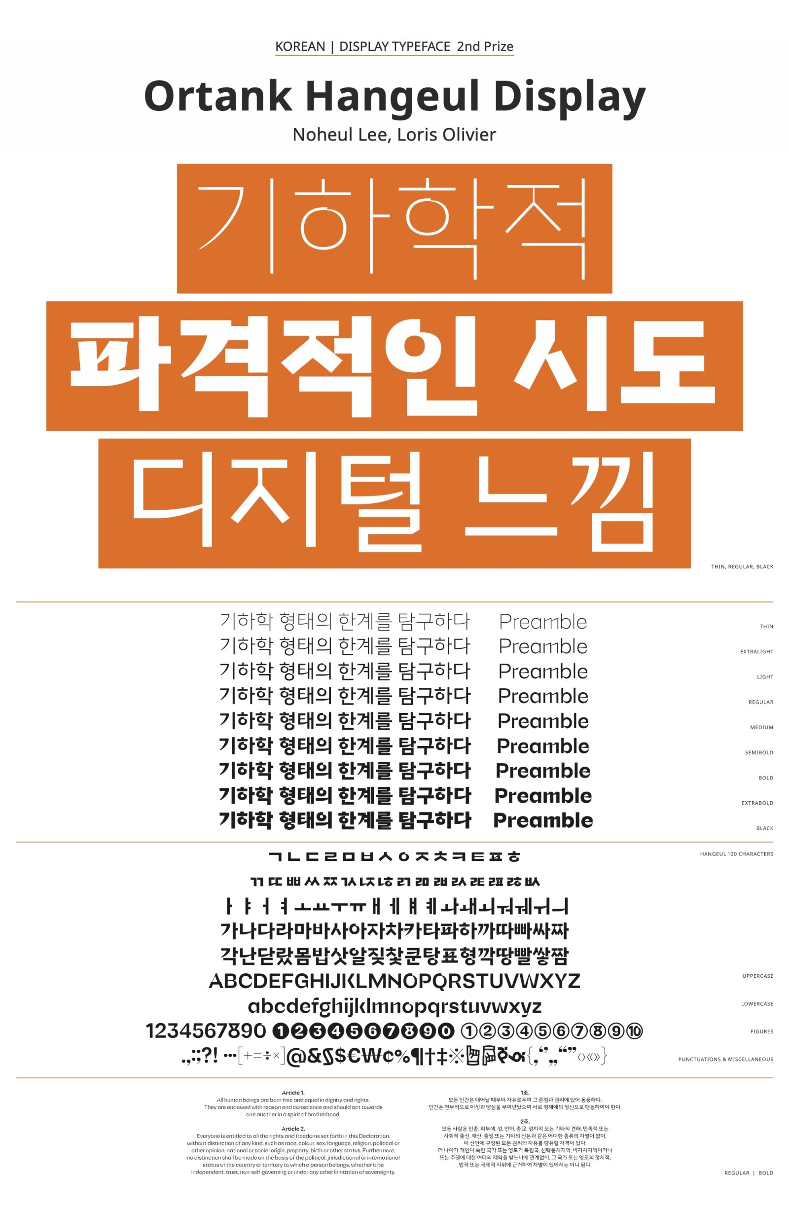
Ortank Hangeul Display
by Noheul Lee, Loris Olivier
Script group:
Korean
Category:
A2 Display Typeface
Typeface competition:
13th GRANSHAN Type Design Competition 2023/2024
Description of the typeface by the submitter
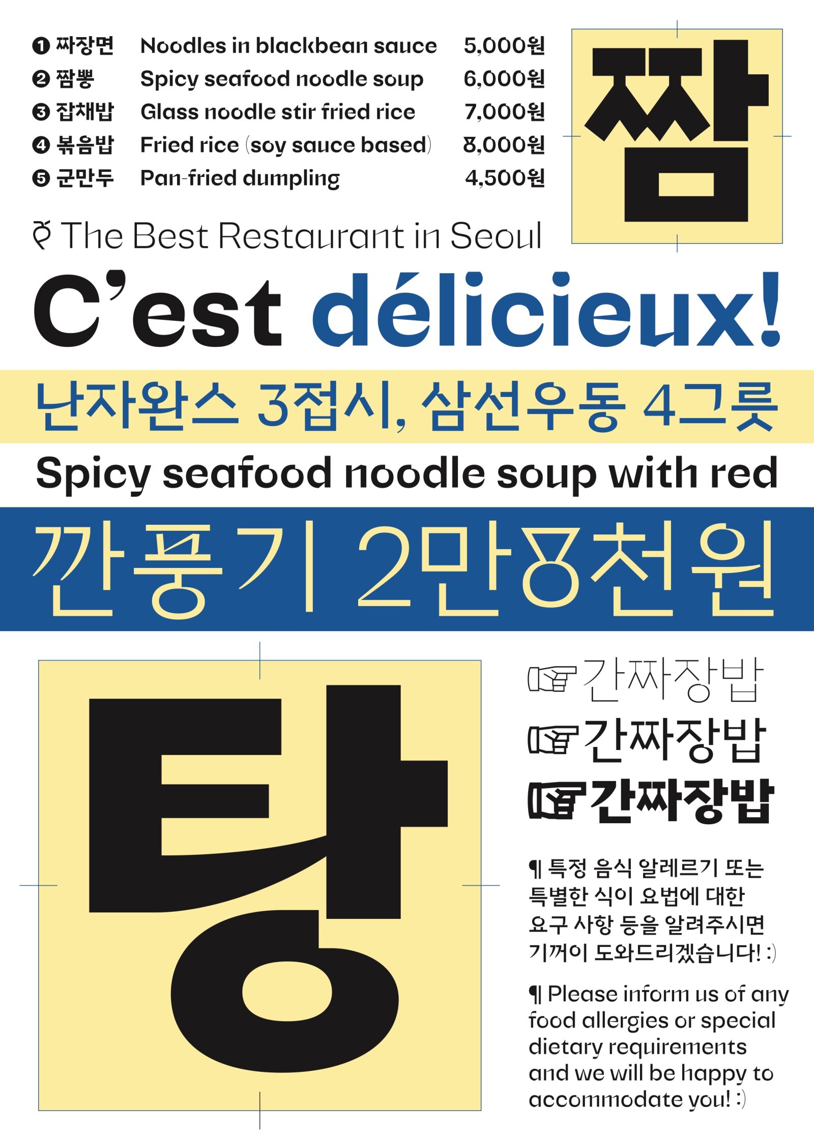
The typeface carefully explores the limits of geometry in the grotesque typefaces tradition. While it maintains an overall proportion reminiscent of Futura, it also aims to create some distance from it. Many terminals in the text version adopt an enclosed shape to balance out the more experimental forms of letters like "n", "m", or "u". While primitive geometric shapes provide a strong visual vocabulary, the text style of the font takes a more formal approach. In its display form, the entire typeface introduces dynamism and acceleration in the curves. Both the text and display versions are built around the same skeleton and structure, with one being more lively and the other more accessible.

