First Prize
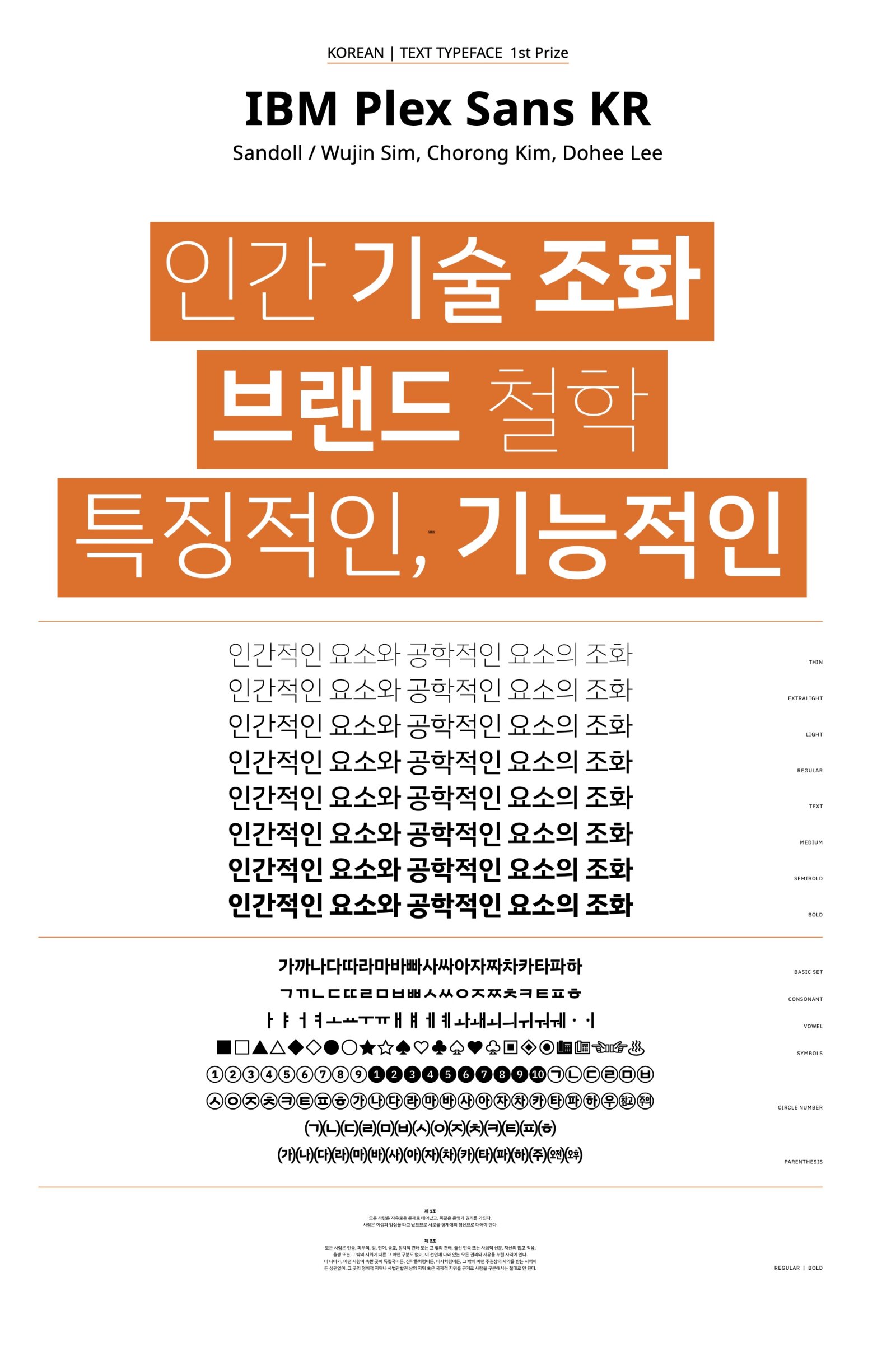
IBM Plex Sans KR
by Wujin Sim, Chorong Kim, Dohee Lee
Script group:
Korean
Category:
A1 Text Typefaces
Typeface competition:
13th GRANSHAN Type Design Competition 2023/2024
Description of the typeface by the submitter
The concept of this typeface is a harmony of two styles: “mankind-natural” design and “machine-engineered” design based on the client’s brand design principles. When examining the details, first, in the ‘ , , ’ series, a refined ᄎᄌᄉ connection that seems to be systematized based on the writing form structure harmoniously blends natural and engineered styles. Second, in the ‘ , ’ series, a combination of smooth outer curves and ᄒᄋ mechanically systematized inner curves creates a unique impression. In addition, a strong ink trap is applied at the connection of the straight line and curve of ‘ ’ to maintain personality while ensuring consistent gray ᄒ balance. Third, the bottom ‘ , , , ’ are composed of a rounded left bottom and ᄇᄆᄅᄂ a squared inner part, creating a smooth and robust structure. Thus, this typeface is flexible, allowing for individualistic expression when used on a large scale and ensuring readability when used on a small scale, making it suitable for various situations.

