Glovo Sans
by Pilar Cano, Ferran Milan
Script group:
Georgian
Category:
A1 Text Typefaces
Typeface competition:
13th GRANSHAN Type Design Competition 2023/2024
Remarks of the jury
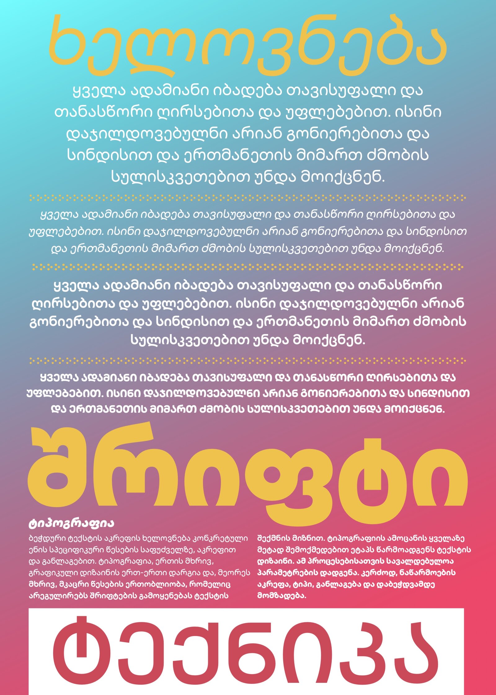
The font uses the proportions of Latin letters and signs, reflecting a modern trend in Georgian typography. This approach requires the designer to exercise moderation to ensure the font retains the characteristic proportions of the Georgian "Mkhedruli" script. This challenge is successfully addressed in the presented font.
Due to the jury’s decision, this typeface has been moved from the C1 Multiscript Text Typefaces to the A1 Georgian Text Typefaces Category.
Description of the typeface by the submitter
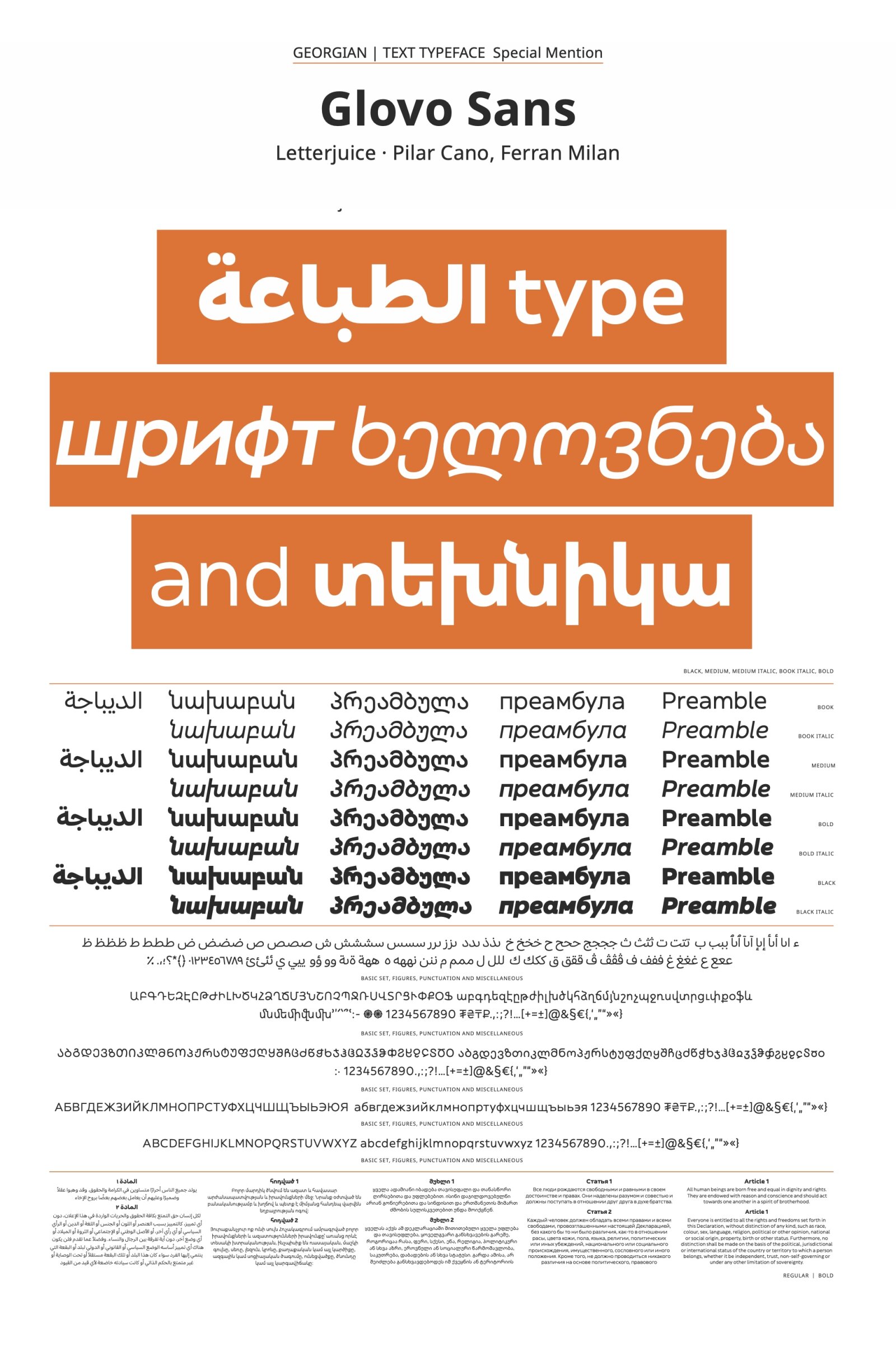
In 2023 we started the design of a bespoke typeface for Glovo. The typeface covers Arabic (with Moroccan specific letters), Armenian, Cyrillic (with specific glyphs for Kazakh, Kyrgyz, and Montenegrin languages, and we added linguistic alternates for Bulgarian and Serbian to be as respectful as possible with cultural preferences), Georgian and Latin. The family has 4 weights and italics except from the Arabic which does not have italics. 8 styles bespoke typeface with 5 scripts. Technically we had some restriction given that they wanted to keep the metrics similar to those of the previous typeface they were using. The vetical metrics were very important given the use of the typeface in platforms which use a set bounding box. The brand identity coherence was one important issues. Another aspect was to add a new level of distinctiveness. The concepts were humanness, friendly and contemporary. The typeface had to add personality in big and small sizes as well as being highly legible and readable in small sizes as in the app the fonts are set at very small sizes. The typeface is conceptually open and friendly, while looking sharp, elegant, and contemporary. It takes on the idea of serious but fun. Generally, this typeface has a young professional feel to it which suits very well the Glovo brand and perception. The typeface has been implemented very successfully. Our approach to multiscript type design is to analyse the typeface and look for the most important characteristics to apply into the new script without pushing features from previous writing systems into the rest of the scripts. This and matching the colour, texture and size are the key factors for a successful multiscript match. Generally we really enjoyed this project and the fact that it gave us the possibility to work on 5 different writing systems. Overall we are very satisfied of how it looks and its performance, in the Glovo app and its website.

