Special Mention
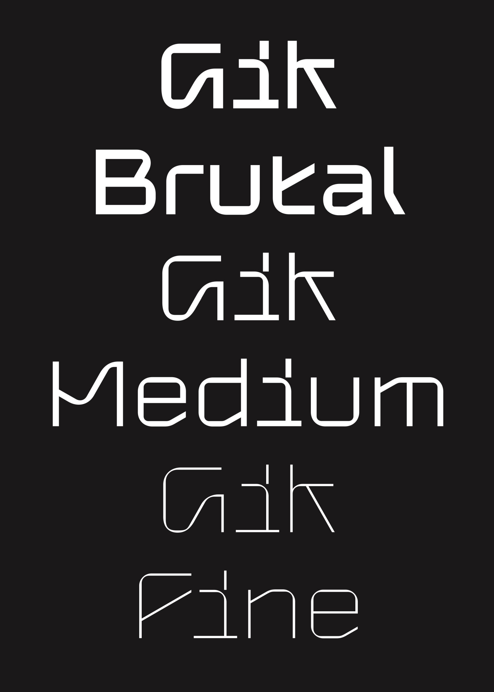
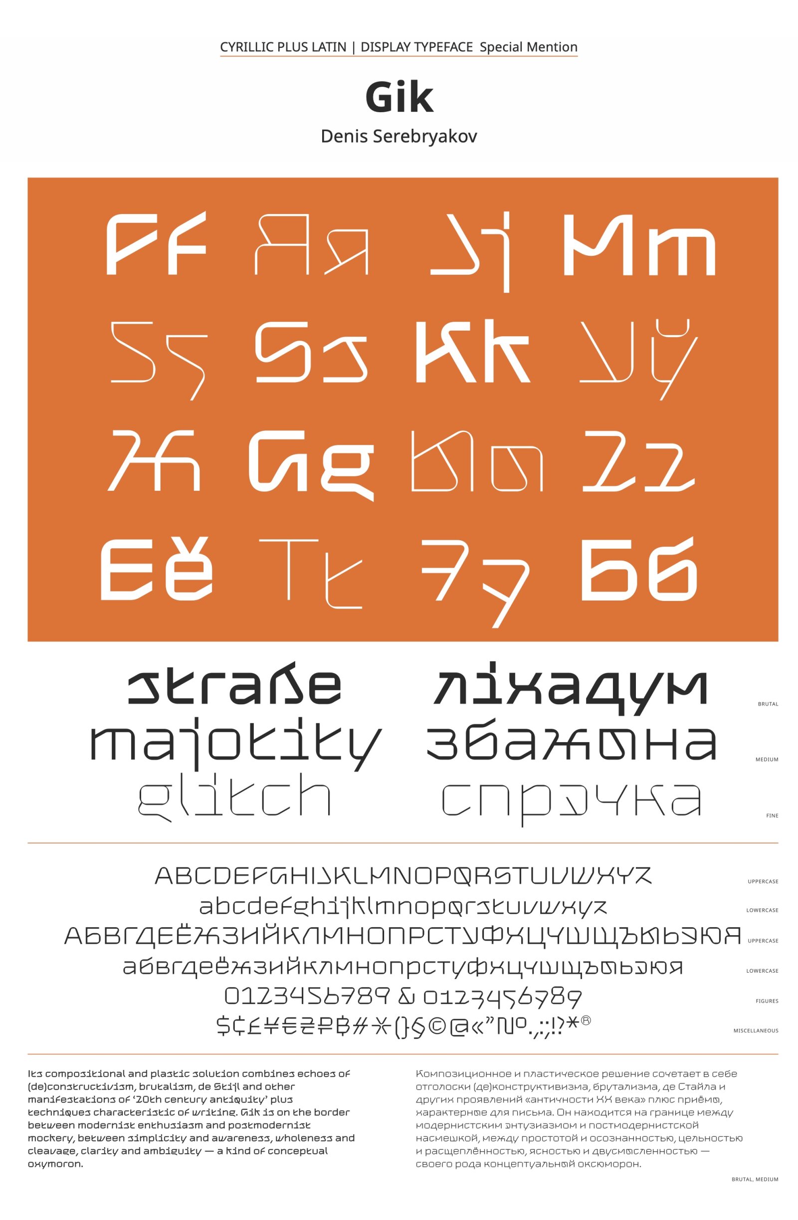
Gik
by Denis Serebryakov
Script group:
Cyrillic
Category:
B2 Display Typefaces with a latin complement
Typeface competition:
13th GRANSHAN Type Design Competition 2023/2024
Remarks of the jury
Interesting concept of mechanical construction and unconventional skeletons make unique texture which is admittedly sometimes challenging to decipher.

Description of the typeface by the submitter
Gik is a three styles modular sans font-family. The compositional and plastic solution of the typeface combines echoes of (de)constructivism, brutalism, de Stijl, . and other manifestations of ‘antiquity of the 20th century’, with techniques characteristic of italics. This does not make old-fashioned look; on the contrary, it helps to understand how to use it. This typeface a product of the metamodernism era. It is on the edge between modernist enthusiasm and postmodernist mockery, between simplicity and awareness, wholeness and cleavage, clarity and ambiguity – a kind of conceptual oxymoron. Looking at Gik! In this typeface embedded a message for both the designer and the gazer, it stimulates the imagination, it is the anthology of all fonts of the Future.