Garnish
by Anagha Narayanan
Script group:
Indic/South Asian Scripts
Category:
A2 Display Typeface
Typeface competition:
13th GRANSHAN Type Design Competition 2023/2024
Remarks of the jury
Due to the jury’s decision, this typeface has been moved from the B2 South Asian Display Typefaces to the A2 South Asian Display Typefaces Category.
Description of the typeface by the submitter
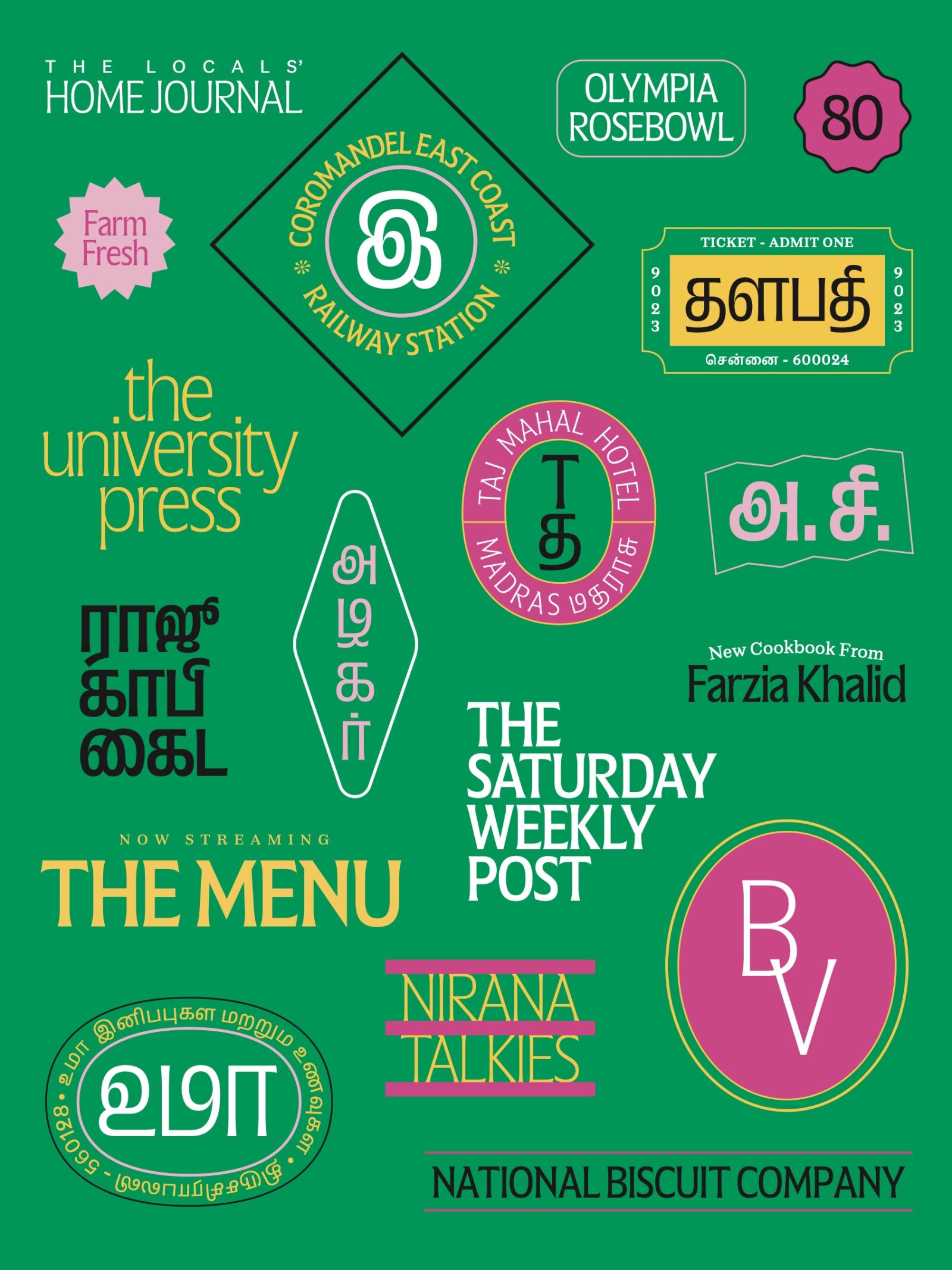
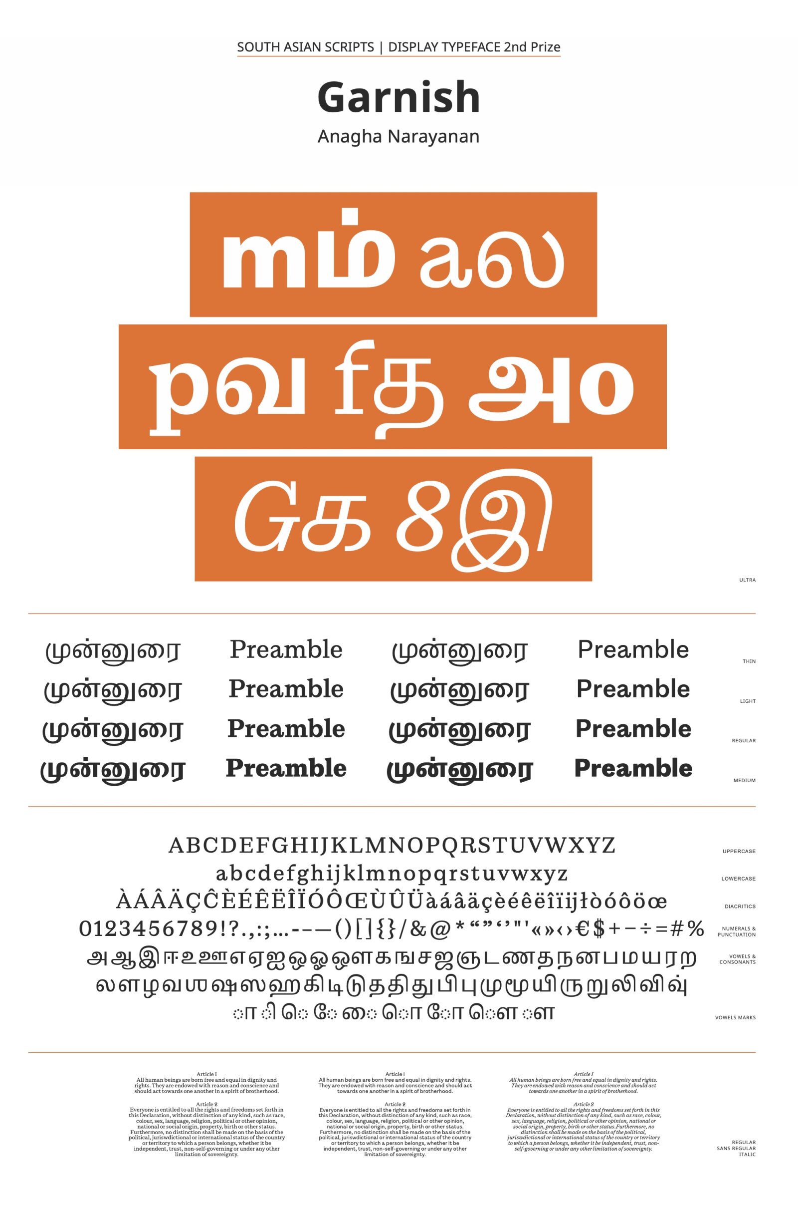
This display style is part of a larger family that consists of two other styles, text and sans. This Latin and Tamil type family consisting of three subfamilies is designed to provide a rich typographic palette for editorial design. The family questions the idea of optical sizes by proposing a display that is “same but different” from the text styles. The display style has flared stems that reference Tamil sign paintings. What fascinated me about this art form is how the artists challenge the structure of letterforms, something that I, too sought to attempt. The typeface portrays delicate joineries, narrow proportions and squarish-round curves. For the editorial context, the short ascenders and descenders lend themselves to setting tight headliners. The narrow proportions allow for more letters to sit on a line, which is particularly useful for the long words of the Tamil language. The letterforms are compressed vertically and horizontally and are structurally changed.

